



2025. The Author(s). This open-access article is distributed under a Creative Commons Attribution
(CC-BY-SA) 4.0 license.
Aldo Lovely Arief Suyoso,
Golden Ratio of Marketing and Applied Psychology of Business
, Vol.5, Issue. 1 (2025)
https://doi.org/10.52970/grmapb.v5i1.796
Website:
https://goldenratio.id/index.php/grmapb
ISSN [Online]:
2776-6349
Page
208
of
218
Received:
October 31, 2024
Revised:
November 06, 2024
Accepted:
January 29, 2025
*
Corresponding author:
Sri Sulistyawati,
Department of Management, Faculty of
Economics and Business, Universitas
Airlangga, Surabaya, Indonesia.
E-mail:
aldo.lovely.arief-2023@feb.unair.ac.id
MARKETING | RESEARCH ARTICLE
Implementation of Power BI for Dashboard
Visualization on Brand Product Sales Dataset
Adidas in the United States from Kaggle
Sri Sulistyawati
1
, Aldo Lovely Arief Suyoso
2
, Dien Mardhiyah
3
1,3
Department of Management, Faculty of Economics and Business, Universitas Airlangga,
Surabaya, Indonesia.
2
Department of Human Resource Development, Postgraduate School of Universitas Airlangga,
Surabaya, Indonesia. Email:
aldo.lovely.arief-2023@pasca.unair.ac.id*
Abstract:
This article describes the implementation of Power BI to create an interactive
dashboard based on a dataset of Adidas product sales in the United States from Kaggle. Power
BI processes sales data to provide deep insights into sales trends, product performance, market
analysis, and consumer preferences. The result is a clear and intuitive dashboard that assists
management in strategic decision-making. This dashboard shows Total Sales of 899.90 million
USD, Units Sold of 2 million units, and Operating Profit of 332.13 million USD, with the
highest sales in New York, California, Florida, and Texas. Profitability analysis shows strong
profit margins in New York and Florida, while the Men's Street Footwear product category is
the top seller. This information is essential for identifying popular products and developing
effective business strategies.
Keywords
: Power BI, Data Visualization, Adidas Product Sales, Kaggle.
JEL Classification Code
:
C81, L25, M15, L67
1.
INTRODUCTION
The current digital era demands data as a very valuable asset for companies. Collecting, analyzing,
and visualizing data can provide a significant competitive advantage. Large companies such as Adidas,
with a global sales network, rely heavily on data to drive their business strategies. This context discusses
how data visualization tools such as Power BI are relevant to optimizing data-based understanding
and decision-making (Iskandar et al., 2024). Data visualization transforms raw data into easy-to-
understand graphical representations, such as graphs and charts. Effective data visualization allows
complex information to be presented intuitively, allowing users to recognize patterns, trends, and
anomalies quickly. Power BI, as one of the leading data visualization tools, offers a variety of features
that support the creation of interactive dashboards, which can be used for various analytical purposes
in a business context, thus helping the decision-making process by management (Mira, 2024).
As one of the leading brands in the apparel and footwear industry, Adidas has a massive volume
of sales data, especially in the United States market. Understanding sales trends and consumer
preferences in this market is essential for developing effective marketing and product strategies.
Implementing data visualization with Power BI on the Adidas product sales dataset in the United
States using data obtained from Kaggle allows Adidas to present sales data in the form of a dashboard
that provides a comprehensive overview of their sales performance (Shiddieq & Hilyah, 2024). The
implementation of Power BI for data visualization aims to provide in-depth insights into product
performance, market analysis, and consumer preferences. The dashboard generated from this process
will enable Adidas management to identify the best-selling products, peak sales periods, and emerging
consumer trends. This dashboard can also help identify areas that need attention or improvement
(Luthfi, 2024). This article emphasizes the importance of using data visualization tools in modern
business. A case study based on the Adidas product sales dataset in the United States, taken from
Kaggle, shows how Power BI can process sales data into valuable insights. The results of this article


2025. The Author(s). This open-access article is distributed under a Creative Commons Attribution
(CC-BY-SA) 4.0 license.
Aldo Lovely Arief Suyoso,
Golden Ratio of Marketing and Applied Psychology of Business
, Vol.5, Issue. 1 (2025)
https://doi.org/10.52970/grmapb.v5i1.796
Website:
https://goldenratio.id/index.php/grmapb
ISSN [Online]:
2776-6349
Page
209
of
218
are expected to be a reference for other companies to adopt similar technologies for better decision-
making.
2.
LITERATURE REVIEW
2.1.
Power BI
Power BI is an analytics application that analyzes data and shares knowledge in business. Power
BI has cloud integration that offers data warehouse capabilities such as data preparation, data
discovery, and interactive dashboards. Microsoft released an additional Embedded Power BI feature
on the Azure cloud platform (Kurniawan et al., 2024). Power BI can also combine various databases,
files, and web services to make changes or fix data and problems automatically and quickly. Power BI
also ensures security in publishing reports created within the company and automatically organizes
data with updated information. Power BI can also integrate all data within the company, both in the
cloud and on-premises, because Power BI has a gateway that allows connections to SQL Server
databases, Analysis Services models, and many other data sources on the dashboard. Power BI can
also combine various databases, files, and web services to make changes or fix data and problems
automatically and quickly. Power BI also ensures security in publishing reports created within the
company and automatically organizes data with updated information. Power BI can also integrate all
data within the company, both in the cloud and on-premises, because Power BI has a gateway that
allows connections to SQL Server databases, Analysis Services models, and many other data sources
on the dashboard (Andriyani et al., 2024).
2.2.
Business Intelligence
Benefits of Implementing Power BI for Dashboard Visualization on Adidas Brand Product Sales
Dataset in the United States from Kaggle (Kusuma & Hidayat, 2024), (Nugroho & Hidayat, 2024),
(Susanto & Thantawi, 2024).
a.
Automate and Improve Business Planning: Power BI implementation enables automation and
improvement of business planning by consistently providing the required information. This
includes performance planning, variance analysis, root cause identification, and corrective
action planning.
b.
Accelerate Generation of Corporate Reports: Power BI accelerates the generation of accurate
and timely corporate reports. This includes creating dashboards for business units, which help
focus on key customers and strategies that drive the desired results.
c.
Trade Promotion Effectiveness Analysis: Power BI supports trade promotion effectiveness
analysis, enabling companies to optimize sales support through advertising and marketing.
d.
Provision of Historical Business Information: Power BI provides easy and fast access to
comprehensive historical business information. This supports budget and corporate plans with
accurate and relevant data, enabling management to make better and more efficient decisions.
e.
Monitoring Business and Financial Performance: Power BI supports companies in directly
monitoring business and financial performance. This includes monitoring profitability and
performance by segmentation, such as customers, product categories, and brands. This
information is crucial for optimizing sales strategies, reducing costs, improving services, and
maximizing profits.
f.
Easy-to-Use Business Information Delivery: Power BI provides a user-friendly business
information and analytics platform. This allows users from various backgrounds to access and
understand the data presented easily.
g.
Reduce Performance Issues: Power BI implementation helps companies address performance
issues by reimagining existing reporting. This is done by providing a comprehensive
framework to support the company’s IT governance and management objectives effectively.


2025. The Author(s). This open-access article is distributed under a Creative Commons Attribution
(CC-BY-SA) 4.0 license.
Aldo Lovely Arief Suyoso,
Golden Ratio of Marketing and Applied Psychology of Business
, Vol.5, Issue. 1 (2025)
https://doi.org/10.52970/grmapb.v5i1.796
Website:
https://goldenratio.id/index.php/grmapb
ISSN [Online]:
2776-6349
Page
210
of
218
2.3.
Dashboard Performance
Performance dashboard is a tool for displaying statistical data in graphical form for strategic
purposes. This dashboard is part of an interactive decision support system, allowing users to obtain
layered information needed for decision-making. This dashboard presents information visually about
exception conditions in the upper layer, will enable users to explore data from various dimensions in
the middle layer, and provides access to examine individual transactions and operational reports in
the lower layer. Performance dashboard is thus a layered information system that makes it easy for
business users to monitor and analyze business processes effectively, allowing management to
understand complex data through a single view (Quoc, Thi, Ngoc, & Dieu, 2024).
3.
RESEARCH METHOD AND MATERIALS
3.1.
Data Collection
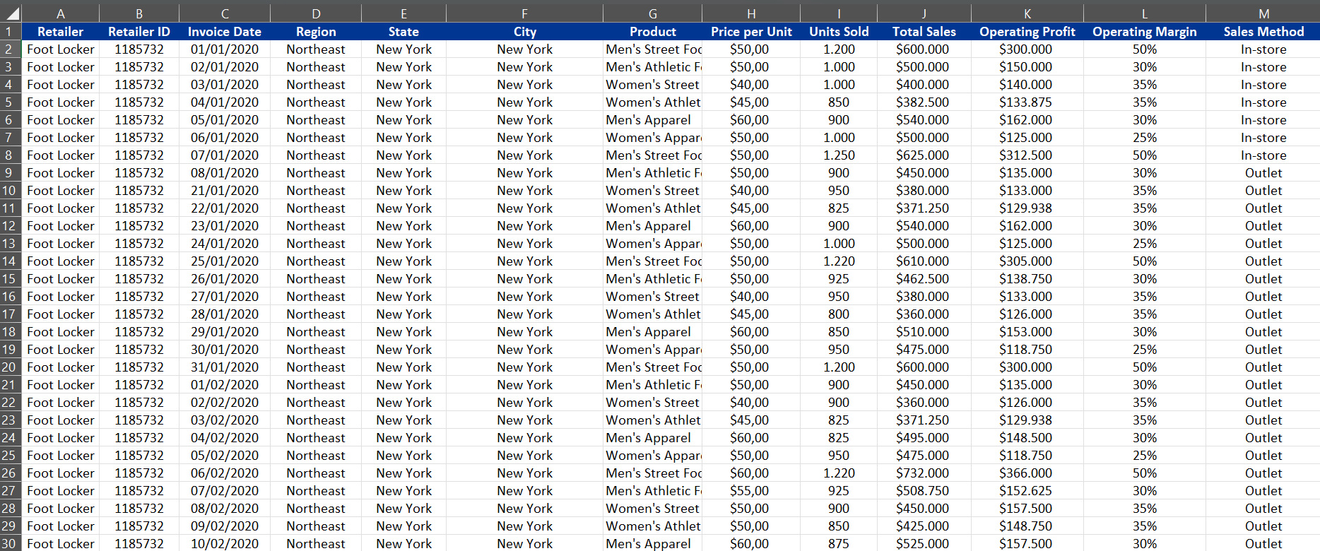
The Adidas product sales dataset in the United States consists of 125,537 entries taken from the
Kaggle platform. This data set contains information related to product sales, including sales date,
number of products sold, product category, price per unit, and sales location. Each data entry records
the retailer, retailer ID, invoice date, region, state, city, products sold, price per unit, number of units
sold, total sales, operating profit, operating margin, and sales method used. This data will be
downloaded and stored in a format that Power BI, such as CSV or Excel, can be used to further
analyze sales performance and profitability of various products across locations.
3.2.
Dashboard Design and Implementation
a.
Visualization Design: Design effective and intuitive data visualizations, such as line graphs, bar
graphs, geographic maps, and pivot tables. This design must pay attention to the principles of
good data visualization to ensure that information is presented clearly and easily understood
(Sifa, 2024).
b.
Dashboard Creation: Leveraging Power BI to create an interactive dashboard that combines all
the visualizations created is a strategic step in managing business data. This dashboard should
allow users to explore the data easily. Users can gain deep insights into their business
performance and make more informed and timely decisions (Nurohim, Akbar, & Wati, 2024).
3.3.
Result Evaluation
a.
Data Validation: Verifying that the data displayed in the dashboard is accurate and by the source
data. This is important to ensure the reliability of the information presented (Mokoginta et al.,
2024).
b.
User Feedback: Collect feedback from end users (e.g., Adidas management or sales team) to
evaluate whether the dashboard provides the expected insights and meets user needs (Goh &
Trisnawarman, 2024).


2025. The Author(s). This open-access article is distributed under a Creative Commons Attribution
(CC-BY-SA) 4.0 license.
Aldo Lovely Arief Suyoso,
Golden Ratio of Marketing and Applied Psychology of Business
, Vol.5, Issue. 1 (2025)
https://doi.org/10.52970/grmapb.v5i1.796
Website:
https://goldenratio.id/index.php/grmapb
ISSN [Online]:
2776-6349
Page
211
of
218
4.
RESULTS AND DISCUSSION
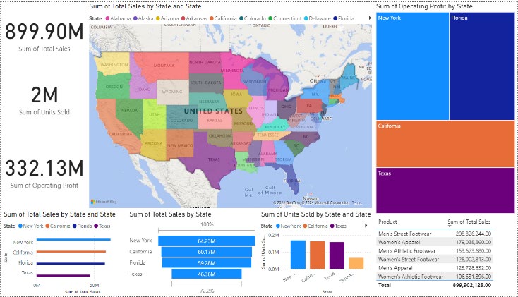
Figure 1. Visualization Results of Adidas Product Sales Dataset in the United States Using
Power BI
4.1.
Discussion
4.1.1
Data Preparation
a.
Make sure your data is in the appropriate format (e.g., Excel, CSV) with relevant columns such
as State, Product, Total Sales, Units Sold, Operating Profit, etc.
b.
Load your data into Power BI by selecting "Get Data" and selecting your data source
Figure 2. Adidas Product Sales Dataset in the United States
(January 2020 – February 2021)
4.1.2
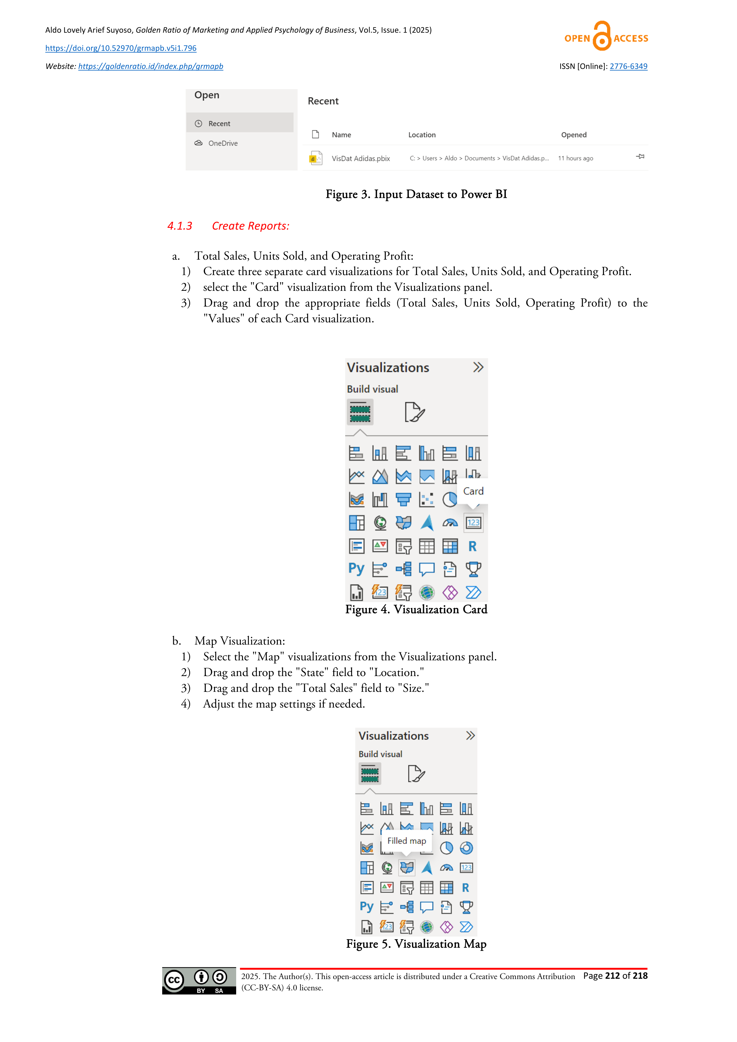
Load Data into Power BI
a.
Click "Home" > "Get Data" > Select your data source (Excel, CSV, etc.).
b.
Load data into Power BI.



2025. The Author(s). This open-access article is distributed under a Creative Commons Attribution
(CC-BY-SA) 4.0 license.
Aldo Lovely Arief Suyoso,
Golden Ratio of Marketing and Applied Psychology of Business
, Vol.5, Issue. 1 (2025)
https://doi.org/10.52970/grmapb.v5i1.796
Website:
https://goldenratio.id/index.php/grmapb
ISSN [Online]:
2776-6349
Page
212
of
218
Figure 3. Input Dataset to Power BI
4.1.3
Create Reports:
a.
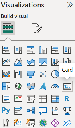
Total Sales, Units Sold, and Operating Profit:
1)
Create three separate card visualizations for Total Sales, Units Sold, and Operating Profit.
2)
select the "Card" visualization from the Visualizations panel.
3)
Drag and drop the appropriate fields (Total Sales, Units Sold, Operating Profit) to the
"Values" of each Card visualization.
Figure 4. Visualization Card
b.
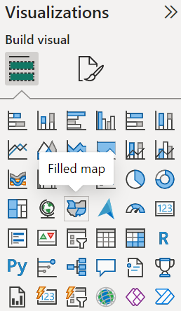
Map Visualization:
1)
Select the "Map" visualizations from the Visualizations panel.
2)
Drag and drop the "State" field to "Location."
3)
Drag and drop the "Total Sales" field to "Size."
4)
Adjust the map settings if needed.
Figure 5. Visualization Map


2025. The Author(s). This open-access article is distributed under a Creative Commons Attribution
(CC-BY-SA) 4.0 license.
Aldo Lovely Arief Suyoso,
Golden Ratio of Marketing and Applied Psychology of Business
, Vol.5, Issue. 1 (2025)
https://doi.org/10.52970/grmapb.v5i1.796
Website:
https://goldenratio.id/index.php/grmapb
ISSN [Online]:
2776-6349
Page
213
of
218
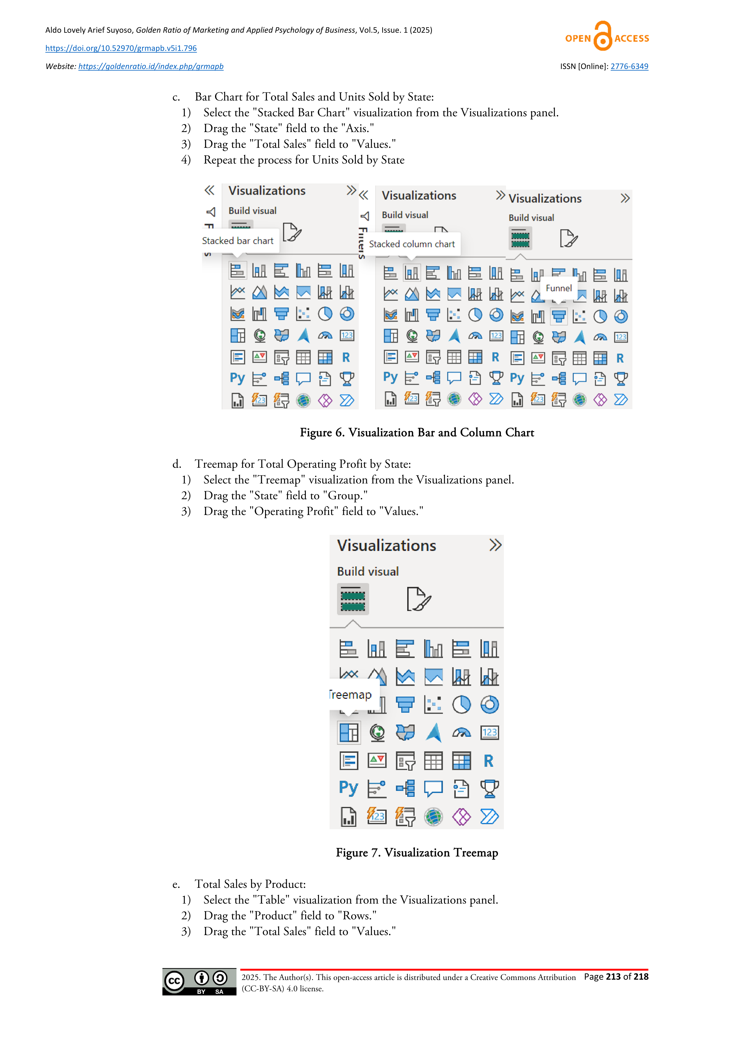
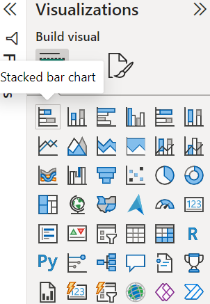
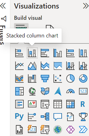
c.
Bar Chart for Total Sales and Units Sold by State:
1)
Select the "Stacked Bar Chart" visualization from the Visualizations panel.
2)
Drag the "State" field to the "Axis."
3)
Drag the "Total Sales" field to "Values."
4)
Repeat the process for Units Sold by State
Figure 6. Visualization Bar and Column Chart
d.
Treemap for Total Operating Profit by State:
1)
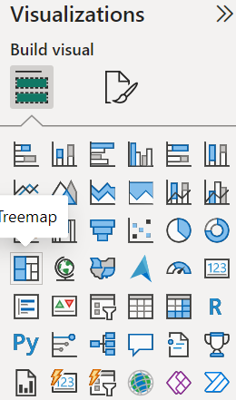
Select the "Treemap" visualization from the Visualizations panel.
2)
Drag the "State" field to "Group."
3)
Drag the "Operating Profit" field to "Values."
Figure 7. Visualization Treemap
e.
Total Sales by Product:
1)
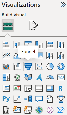
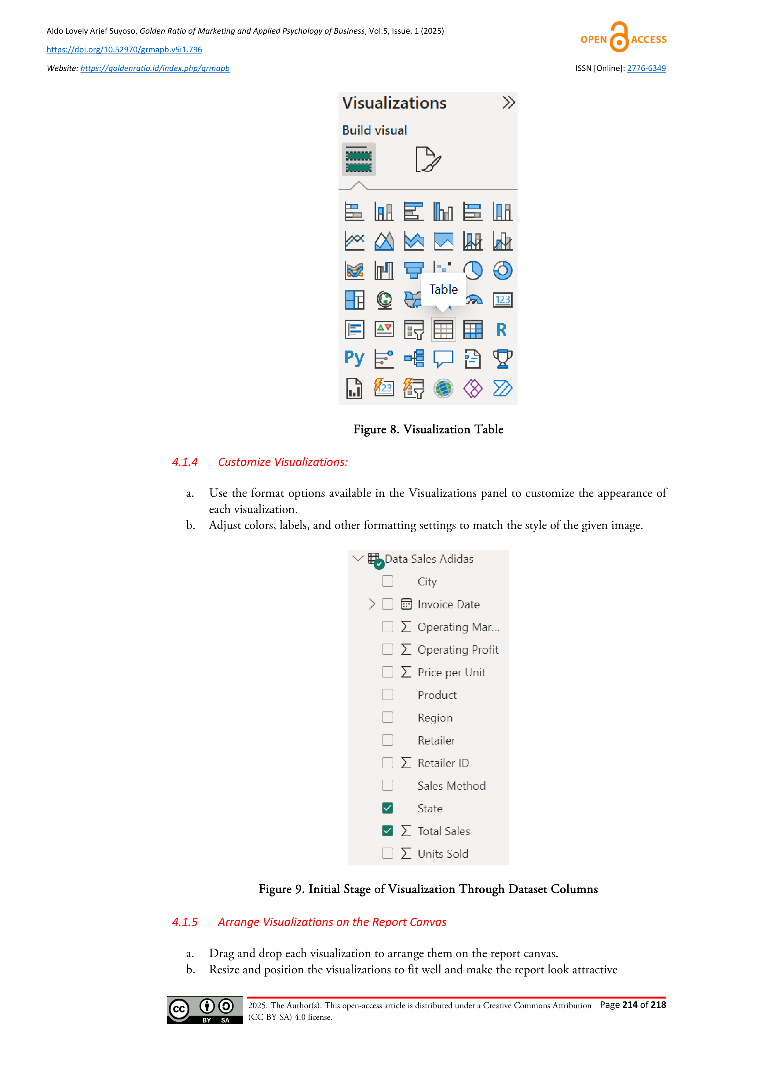
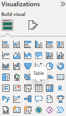
Select the "Table" visualization from the Visualizations panel.
2)
Drag the "Product" field to "Rows."
3)
Drag the "Total Sales" field to "Values."


2025. The Author(s). This open-access article is distributed under a Creative Commons Attribution
(CC-BY-SA) 4.0 license.
Aldo Lovely Arief Suyoso,
Golden Ratio of Marketing and Applied Psychology of Business
, Vol.5, Issue. 1 (2025)
https://doi.org/10.52970/grmapb.v5i1.796
Website:
https://goldenratio.id/index.php/grmapb
ISSN [Online]:
2776-6349
Page
214
of
218
Figure 8. Visualization Table
4.1.4
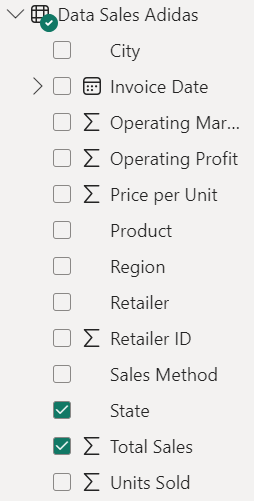
Customize Visualizations:
a.
Use the format options available in the Visualizations panel to customize the appearance of
each visualization.
b.
Adjust colors, labels, and other formatting settings to match the style of the given image.
Figure 9. Initial Stage of Visualization Through Dataset Columns
4.1.5
Arrange Visualizations on the Report Canvas
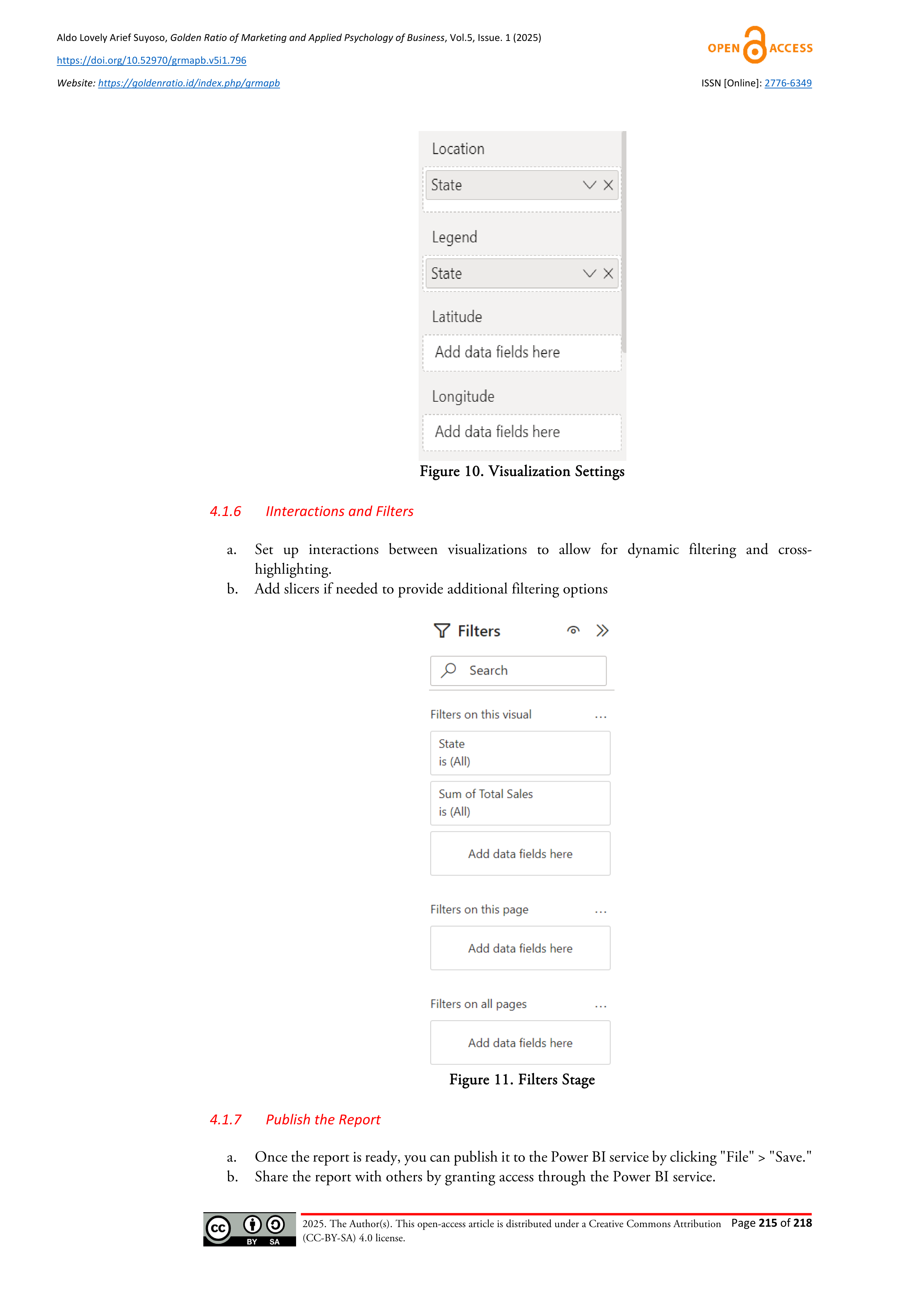
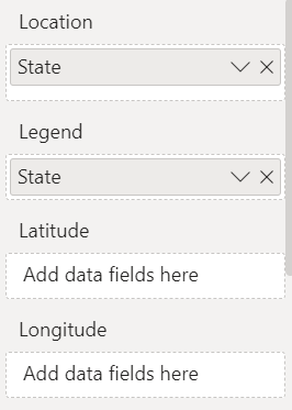
a.
Drag and drop each visualization to arrange them on the report canvas.
b.
Resize and position the visualizations to fit well and make the report look attractive


2025. The Author(s). This open-access article is distributed under a Creative Commons Attribution
(CC-BY-SA) 4.0 license.
Aldo Lovely Arief Suyoso,
Golden Ratio of Marketing and Applied Psychology of Business
, Vol.5, Issue. 1 (2025)
https://doi.org/10.52970/grmapb.v5i1.796
Website:
https://goldenratio.id/index.php/grmapb
ISSN [Online]:
2776-6349
Page
215
of
218
Figure 10. Visualization Settings
4.1.6
IInteractions and Filters
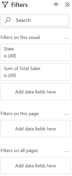
a.
Set up interactions between visualizations to allow for dynamic filtering and cross-
highlighting.
b.
Add slicers if needed to provide additional filtering options
Figure 11. Filters Stage
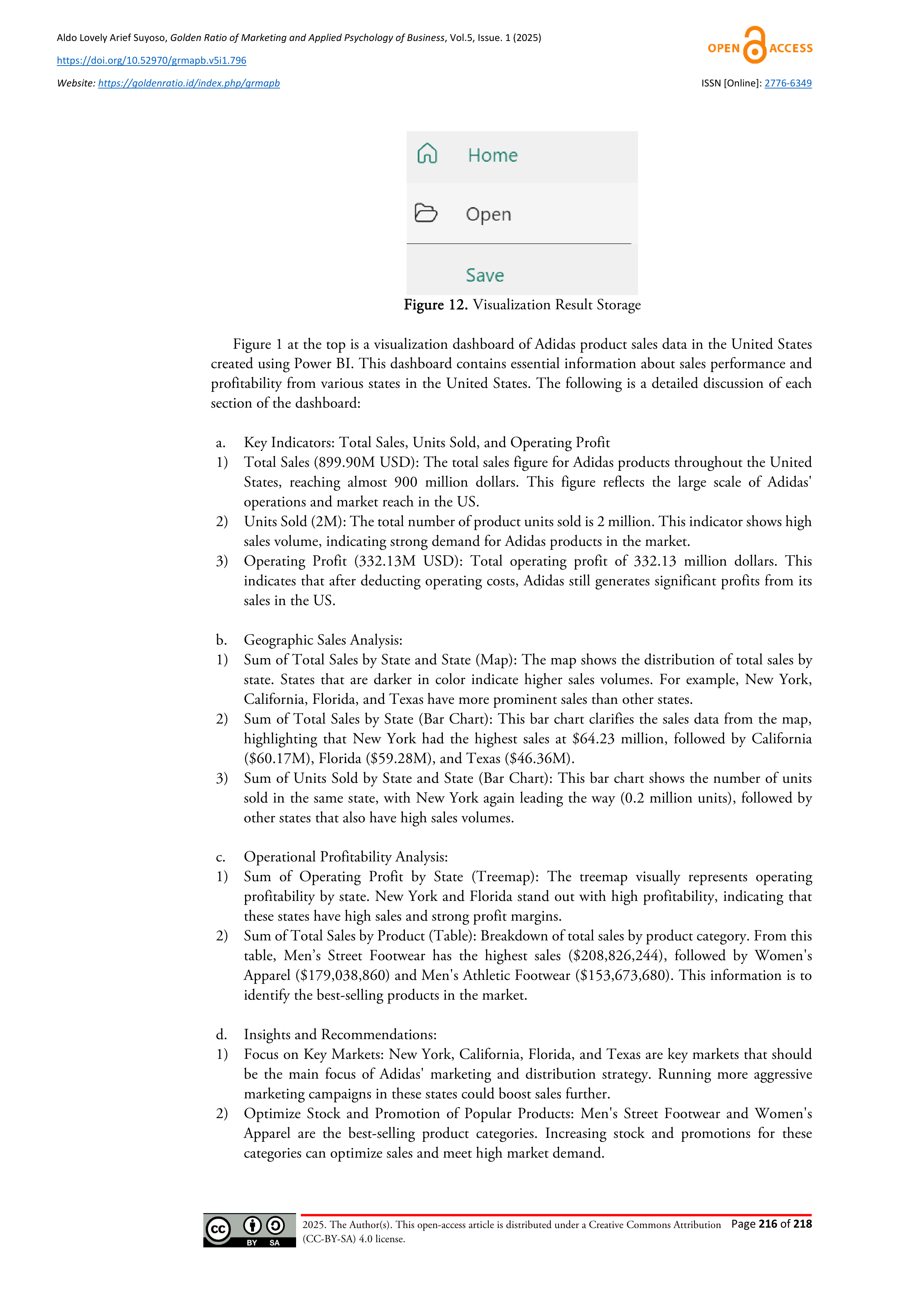
4.1.7
Publish the Report
a.
Once the report is ready, you can publish it to the Power BI service by clicking "File" > "Save."
b.
Share the report with others by granting access through the Power BI service.



2025. The Author(s). This open-access article is distributed under a Creative Commons Attribution
(CC-BY-SA) 4.0 license.
Aldo Lovely Arief Suyoso,
Golden Ratio of Marketing and Applied Psychology of Business
, Vol.5, Issue. 1 (2025)
https://doi.org/10.52970/grmapb.v5i1.796
Website:
https://goldenratio.id/index.php/grmapb
ISSN [Online]:
2776-6349
Page
216
of
218
Figure 12. Visualization Result Storage
Figure 1 at the top is a visualization dashboard of Adidas product sales data in the United States
created using Power BI. This dashboard contains essential information about sales performance and
profitability from various states in the United States. The following is a detailed discussion of each
section of the dashboard:
a.
Key Indicators: Total Sales, Units Sold, and Operating Profit
1)
Total Sales (899.90M USD): The total sales figure for Adidas products throughout the United
States, reaching almost 900 million dollars. This figure reflects the large scale of Adidas'
operations and market reach in the US.
2)
Units Sold (2M): The total number of product units sold is 2 million. This indicator shows high
sales volume, indicating strong demand for Adidas products in the market.
3)
Operating Profit (332.13M USD): Total operating profit of 332.13 million dollars. This
indicates that after deducting operating costs, Adidas still generates significant profits from its
sales in the US.
b.
Geographic Sales Analysis:
1)
Sum of Total Sales by State and State (Map): The map shows the distribution of total sales by
state. States that are darker in color indicate higher sales volumes. For example, New York,
California, Florida, and Texas have more prominent sales than other states.
2)
Sum of Total Sales by State (Bar Chart): This bar chart clarifies the sales data from the map,
highlighting that New York had the highest sales at $64.23 million, followed by California
($60.17M), Florida ($59.28M), and Texas ($46.36M).
3)
Sum of Units Sold by State and State (Bar Chart): This bar chart shows the number of units
sold in the same state, with New York again leading the way (0.2 million units), followed by
other states that also have high sales volumes.
c.
Operational Profitability Analysis:
1)
Sum of Operating Profit by State (Treemap): The treemap visually represents operating
profitability by state. New York and Florida stand out with high profitability, indicating that
these states have high sales and strong profit margins.
2)
Sum of Total Sales by Product (Table): Breakdown of total sales by product category. From this
table, Men’s Street Footwear has the highest sales ($208,826,244), followed by Women's
Apparel ($179,038,860) and Men's Athletic Footwear ($153,673,680). This information is to
identify the best-selling products in the market.
d.
Insights and Recommendations:
1)
Focus on Key Markets: New York, California, Florida, and Texas are key markets that should
be the main focus of Adidas' marketing and distribution strategy. Running more aggressive
marketing campaigns in these states could boost sales further.
2)
Optimize Stock and Promotion of Popular Products: Men's Street Footwear and Women's
Apparel are the best-selling product categories. Increasing stock and promotions for these
categories can optimize sales and meet high market demand.


2025. The Author(s). This open-access article is distributed under a Creative Commons Attribution
(CC-BY-SA) 4.0 license.
Aldo Lovely Arief Suyoso,
Golden Ratio of Marketing and Applied Psychology of Business
, Vol.5, Issue. 1 (2025)
https://doi.org/10.52970/grmapb.v5i1.796
Website:
https://goldenratio.id/index.php/grmapb
ISSN [Online]:
2776-6349
Page
217
of
218
3)
Market-Specific Success Factors Analysis: Identifying the factors that led to high sales and
profitability in New York and Florida can help Adidas implement similar strategies in other
states to improve sales and profitability performance.
4)
Product Development and Innovation: Based on sales and profitability data, Adidas can consider
developing more products in categories that have proven to be popular and profitable.
4.
CONCLUSION
Based on the analysis of the data displayed in the Power BI dashboard regarding the sales of Adidas
products in the United States, several main conclusions were obtained. First, the large scale of sales
can be seen from the total sales of Adidas products reaching nearly USD 900 million (899.90 million
USD) with a sales volume of 2 million product units, indicating the high demand for Adidas products
in the US. Secondly, Adidas also recorded a significant operating profit of USD 332.13 million,
suggesting that after deducting operating costs, Adidas still made a substantial profit from sales in the
US. Regarding location, the states with the highest sales were New York, California, Florida, and
Texas, with New York leading the sales at USD 64.23 million. The geographic distribution shows
that areas with darker colors on the map have higher sales volumes. In addition, New York and Florida
also stood out in terms of operational profitability, indicating strong profit margins in these two states.
In terms of product categories, the Men's Street Footwear category had the highest sales (USD 208.83
million), followed by Women's Apparel (USD 179.04 million) and Men's Athletic Footwear (USD
153.67 million), all of which performed very well in the market. Based on the results of this analysis,
some of the proposed strategy recommendations include focusing on key markets by conducting more
aggressive marketing campaigns in New York, California, Florida, and Texas, as well as stock
optimization and promotions for popular product categories such as Men's Street Footwear and
Women's Apparel. In addition, product development and innovation in proven and profitable
categories can contribute significantly to business growth.
REFERENCES
Andriyani, Dawis, natsir, Kholisatul, Diningrat, Makmur, Setiawan. (2024). Pengembangan Sistem Berbasis
Data. Jakarta: Tohar Media.
Goh, & Trisnawarman. (2024). Perancangan Prototipe Business Intelligence Dashboard Penjualan PT ABC.
Jurnal Ilmiah Universitas Batanghari, 15(24), 556–563.
Iskandar, Setiawan, Judijanto, Mahendra, Ardi, Putri, . . . Winahyu. (2024). Teknologi Big Data: Pengantar dan
Penerapan Teknologi Big Data di Berbagai Bidang. Jakarta: PT Green Pustaka Indonesia.
Kurniawan, Widiastuti, Hermanto, Mukhlis, Pipin, Surianto, Judijanto. (2024). Big Data: Mengenal Big Data
& Implementasinya di Berbagai Bidang. Jakarta: PT Sonpedia Publishing Indonesia.
Kusuma, & Hidayat. (2024). Penerapan Model Regresi Linear dalam Prediksi Harga Mobil Bekas di India dan
Visualisasi dengan Menggunakan Power BI. Jurnal Indonesia Manajemen Informatika dan Komunikasi,
5(2), 1097–1110.
Luthfi. (2024). Perancangan Self Service Business Intelligence Sebagai Alat Bantu Pengambilan Keputusan Pada
Pemenuhan Kebutuhan Part Service (Studi Kasus: PT Hasnur Riung Sinergi). Jakarta: Universitas Islam
Indonesia.
Mira, W. (2024). Visualisasi Data Penjualan di Dealer Yamaha PT Alfa Scorpii Teknofile. Jurnal Sistem
Informasi,2(1),11–15.
Mokoginta, D., Pratomo, Chafid, Ahkam, Hendrawan, & Buan. (2024). Exploring the Power of Big Data and
Data Analytics for Tomorrow's Insight. Jakarta: Cendikia Mulia Mandiri.
Nugroho, & Hidayat. (2024). Implementasi Intelejen Bisnis dengan Visualisasi Data Gaji dan Algoritma Linear
Regression. Jurnal Indonesia Manajemen Informatika dan Komunikasi,5(2),1245–1259.
Nurohim, Akbar, & Wati. (2024). Perancangan Dashboard untuk Manajemen Penjualan Produk Perusahaan
XYZ dalam pengambilan Keputusan Bisnis. Jurnal Sistem Informasi Akuntansi, 4(1),34-41.
Quoc, Thi, Ngoc, & Dieu. (2024). Optimize retail system performance by analyzing big data and visualizing it
with Power BI. International Journal of Intelligent Systems and Applications in Engineering,12(11),396-
405.
Shiddieq, & Hilyah. (2024). Pengembangan Dashboard Interaktif Untuk Meningkatkan Pemahaman dan
Pengambilan Keputusan. Journal of Engineering and Sustainable Technology,10(2), 999–1004.
Sifa. (2024). Visualisasi Data Pengunjung dan Peminjaman Buku di Perpustakaan Daerah Menggunakan Power



2025. The Author(s). This open-access article is distributed under a Creative Commons Attribution
(CC-BY-SA) 4.0 license.
Aldo Lovely Arief Suyoso,
Golden Ratio of Marketing and Applied Psychology of Business
, Vol.5, Issue. 1 (2025)
https://doi.org/10.52970/grmapb.v5i1.796
Website:
https://goldenratio.id/index.php/grmapb
ISSN [Online]:
2776-6349
Page
218
of
218
BI. Jurnal Sistem Informasi,2(3),142-151.
Susanto, & Thantawi. (2024). Implementasi Business Performance Dashboard untuk Memonitoring Booking
Pembiayaan Pada PT Internusa Tribuana Citra Multi Finance. Jurnal Komputer dan Informatika,8(2),200-
208.