
Symphony: Composing Interactive Interfaces for Machine
Learning
Alex Bäuerle
∗†
Ulm University
Ulm, Germany
alex.baeuerle@uni-ulm.de
Ángel Alexander Cabrera
∗†
Carnegie Mellon University
Pittsburgh, PA, USA
cabrera@cmu.edu
Fred Hohman
Apple
Seattle, WA, USA
fredhohman@apple.com
Megan Maher
Apple
Cupertino, CA, USA
megan_maher@apple.com
David Koski
Apple
Cupertino, CA, USA
dkoski@apple.com
Xavier Suau
Apple
Barcelona, Spain
xsuaucuadros@apple.com
Titus Barik
Apple
Seattle, WA, USA
tbarik@apple.com
Dominik Moritz
Apple
Pittsburgh, PA, USA
domoritz@apple.com
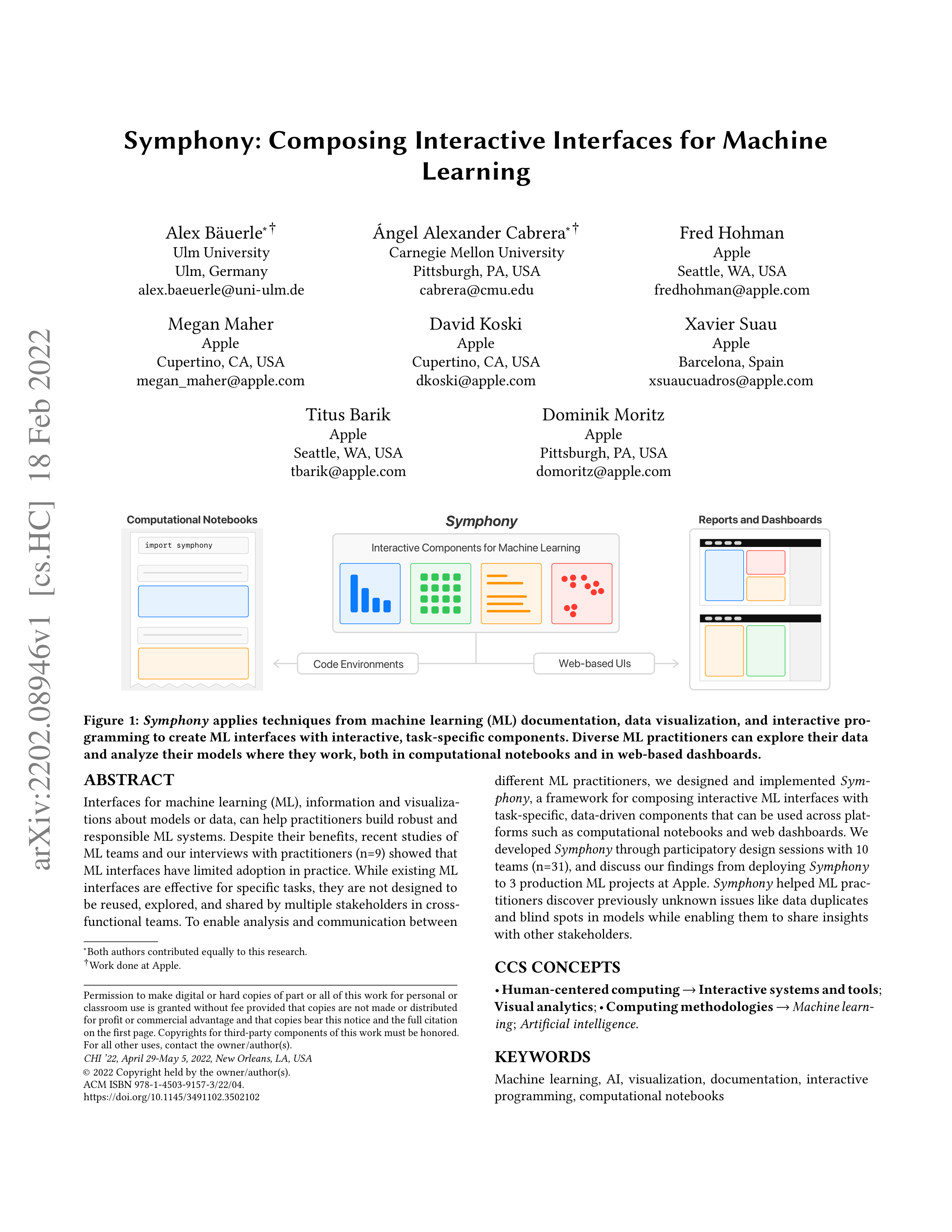
Computational Notebooks
import symphony
Reports and Dashboards
Interactive Components for Machine Learning
Code Environments
Web-based UIs
Symphony
Figure 1:
Symphony
applies techniques from machine learning (ML) documentation, data visualization, and interactive pro-
gramming to create ML interfaces with interactive, task-specific components. Diverse ML practitioners can explore their data
and analyze their models where they work, both in computational notebooks and in web-based dashboards.
ABSTRACT
Interfaces for machine learning (ML), information and visualiza-
tions about models or data, can help practitioners build robust and
responsible ML systems. Despite their benefits, recent studies of
ML teams and our interviews with practitioners (n=9) showed that
ML interfaces have limited adoption in practice. While existing ML
interfaces are effective for specific tasks, they are not designed to
be reused, explored, and shared by multiple stakeholders in cross-
functional teams. To enable analysis and communication between
∗
Both authors contributed equally to this research.
†
Work done at Apple.
Permission to make digital or hard copies of part or all of this work for personal or
classroom use is granted without fee provided that copies are not made or distributed
for profit or commercial advantage and that copies bear this notice and the full citation
on the first page. Copyrights for third-party components of this work must be honored.
For all other uses, contact the owner/author(s).
CHI ’22, April 29-May 5, 2022, New Orleans, LA, USA
© 2022 Copyright held by the owner/author(s).
ACM ISBN 978-1-4503-9157-3/22/04.
https://doi.org/10.1145/3491102.3502102
different
ML
practitioners,
we
designed
and
implemented
Sym-
phony
, a framework for composing interactive ML interfaces with
task-specific, data-driven components that can be used across plat-
forms such as computational notebooks and web dashboards. We
developed
Symphony
through participatory design sessions with 10
teams (n=31), and discuss our findings from deploying
Symphony
to 3 production ML projects at Apple.
Symphony
helped ML prac-
titioners discover previously unknown issues like data duplicates
and blind spots in models while enabling them to share insights
with other stakeholders.
CCS CONCEPTS
•
Human-centered computing
→
Interactive systems and tools
;
Visual analytics
;
•
Computing methodologies
→
Machine learn-
ing
;
Artificial intelligence
.
KEYWORDS
Machine
learning,
AI,
visualization,
documentation,
interactive
programming, computational notebooks
arXiv:2202.08946v1 [cs.HC] 18 Feb 2022
CHI ’22, April 29-May 5, 2022, New Orleans, LA, USA
Bäuerle and Cabrera, et al.
ACM Reference Format:
Alex Bäuerle, Ángel Alexander Cabrera, Fred Hohman, Megan Maher, David
Koski,
Xavier
Suau,
Titus
Barik,
and
Dominik
Moritz.
2022.
Symphony:
Composing Interactive Interfaces for Machine Learning. In
CHI Conference
on Human Factors in Computing Systems (CHI ’22), April 29-May 5, 2022, New
Orleans, LA, USA.
ACM, New York, NY, USA, 14 pages. https://doi.org/10.
1145/3491102.3502102
1
INTRODUCTION
Successfully deploying machine learning systems in production is
a complex, collaborative process that involves a wide range of ML
practitioners,
from
data
scientists
and
engineers
to
domain
ex-
perts and product managers. A substantial amount of research has
gone into creating ML interfaces for analyzing and sharing insights
about ML systems that practitioners can use to better understand
and improve deployed ML products. We describe
machine learn-
ing interfaces
as static or interactive artifacts, visualizations, and
information
that
communicate
details
about
ML
data
and
mod-
els.
ML
interfaces
include
documentation
methods
(e.g.,
Model
Cards [
46
], Datasheets [
17
]), visualization dashboards (e.g., What-if
Tool [
62
], ActiVis [
33
], among many others [
21
]), and interactive
programming widgets (e.g., ipywidgets [
32
], Streamlit [
31
]) that
give
practitioners
insights
into
what
their
datasets
contain
and
how their models behave. Despite the benefits and breadth of ML
interfaces, recent studies have found that they are not as widely
used and shared in practice as expected [
38
,
68
]. This underuse can
lead to missed data errors and model failures, a lack of shared team
understanding
of
model
behavior,
and,
ultimately,
deployed
ML
systems that may be biased [8] or unsafe [47].
To understand why ML interfaces are not used more frequently,
we
interviewed
9
ML
practitioners
at
Apple
about
their
current
machine
learning
practice
and
workflows.
We
found
that
while
ML practitioners want to use them, current interfaces have limita-
tions that make them either insufficient or too time consuming to
use. One category of ML interfaces are
ML documentation
methods,
such as Model Cards [
46
] and Datasheets [
17
], which describe the
details
and
records
the
provenance
of
an
ML
system’s
data
and
model. Documentation methods often lack the interactive tools and
visualizations necessary for specific analyses and have to be manu-
ally authored and updated separately from where ML development
happens. Another category of interfaces,
visualization dashboards
,
consist of multiple coordinated views tailored to specific domains
and tasks. ML practitioners must learn a new platform and wrangle
their data into the right format in order to use these bespoke sys-
tems, which also require significant work to reuse for different tasks.
Finally,
interactive programming widgets
can render web-based ML
visualizations
directly
in
code
environments.
However,
widgets
typically cannot be used outside of the platform in which they were
created and often lack complex visualizations required by modern
ML models and unstructured data—non-tabular data types such as
images, videos, audio, point-clouds, sensor data, etc. Overall, we
found that while current ML interfaces work well for specific tasks
and platforms, they are not designed to be reused, explored, and
shared by diverse stakeholders in cross-functional ML teams.
Our formative research showed that ML work requires bespoke
visualizations for complex models and data types which work across
the different platforms ML practitioners use. To address these needs,
we combined the affordances of existing ML interfaces to design and
implement
Symphony
, a framework for creating and composing
interactive ML interfaces with task-specific, data-driven visualiza-
tion components.
Symphony
supports two popular platforms used
by ML practitioners, code environments such as Jupyter notebooks
and no-code environments such as web-based UIs (Figure 1).
Sym-
phony
components are JavaScript modules that use custom code or
existing libraries to create task-specific visualizations of structured
and unstructured data. Each component is also fully interactive:
users can filter, group, or select instances either through a UI tool-
bar or code. These interactions are reactively synchronized across
Symphony
components, enabling linked visualizations.
Symphony
’s
cross-platform availability enables ML practitioners to use the same
components for both exploring
and
sharing insights about their
ML systems (Figure 2).
We worked with ML teams at Apple to both design
Symphony
and apply it to deployed ML projects. To collect the diverse require-
ments and use cases for ML interfaces, we conducted participatory
design sessions with 10 ML teams with a total of 31 ML practitioners.
Informed by these sessions, we implemented a set of 11 components
supporting
a
range
of
different
models
and
data
types.
We
then
worked with 3 teams from the design sessions to deploy
Symphony
in their machine learning workflows and ran a think-aloud study
with them to qualitatively evaluate
Symphony
.
Teams using
Symphony
with their real-world data and models
found surprising insights which they had not previously known,
such as duplicate instances, labeling errors, and model blind spots.
Participants
also
described
a
variety
of
use
cases
for
Symphony
,
from creating automated dataset reports to analyzing model perfor-
mance in computational notebooks. Moreover, participants that did
not previously share their analyses also showed interest in using
Symphony
in their teams to better communicate the state of their
ML system with other stakeholders.
The main contribution of this work is
Symphony
, a framework for
composing interactive ML interfaces with task-specific, data-driven
visualization components. To design
Symphony
, we conducted for-
mative interviews, participatory design sessions, and case studies
on
deployed
ML
workflows
with
a
total
of
39
ML
practitioners
across 15 teams.
Symphony
enabled ML practitioners to discover
significant
issues
like
dataset
duplicates
and
model
blind
spots,
and encouraged them to share their insights with other stakehold-
ers.
Symphony
combines the following principles to improve upon
existing ML interfaces:
•
Data-driven ML interfaces
derived from and updated with
ML data and models.
•
Task-specific
visualizations
for
unstructured
data
and
modern machine learning models.
•
Interactive
exploration
tools
for
exploring
different
di-
mensions of an ML system.
•
Reusable
components
that
can
be
used,
composed,
and
shared across different platforms.
2
BACKGROUND AND RELATED WORK
Symphony
bridges three areas of related work: ML documentation
methods, data visualization dashboards, and interactive program-
ming environments. First, the
Symphony
framework can be used

Symphony
CHI ’22, April 29-May 5, 2022, New Orleans, LA, USA
Symphony
in
Notebooks
Symphony
in
Web-based UIs
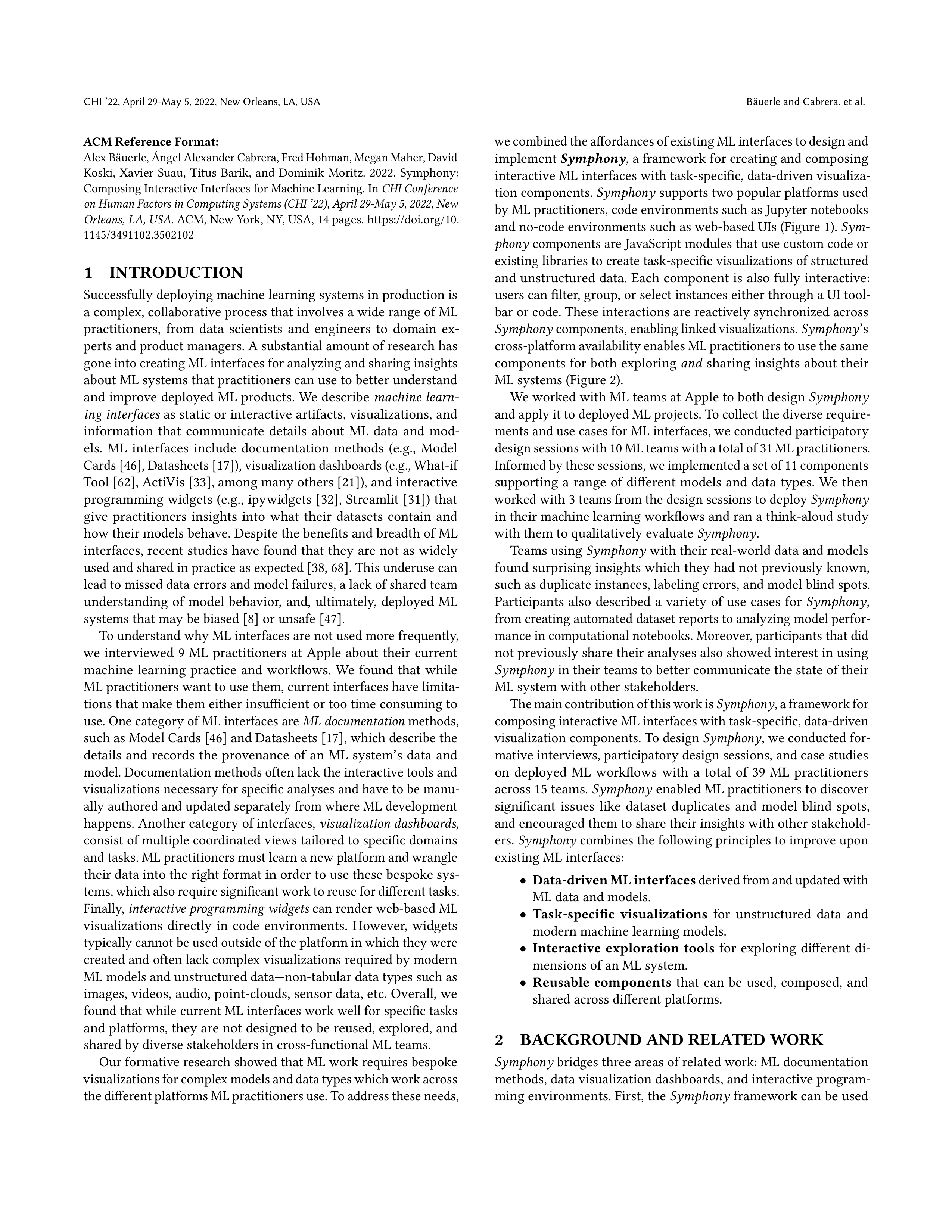
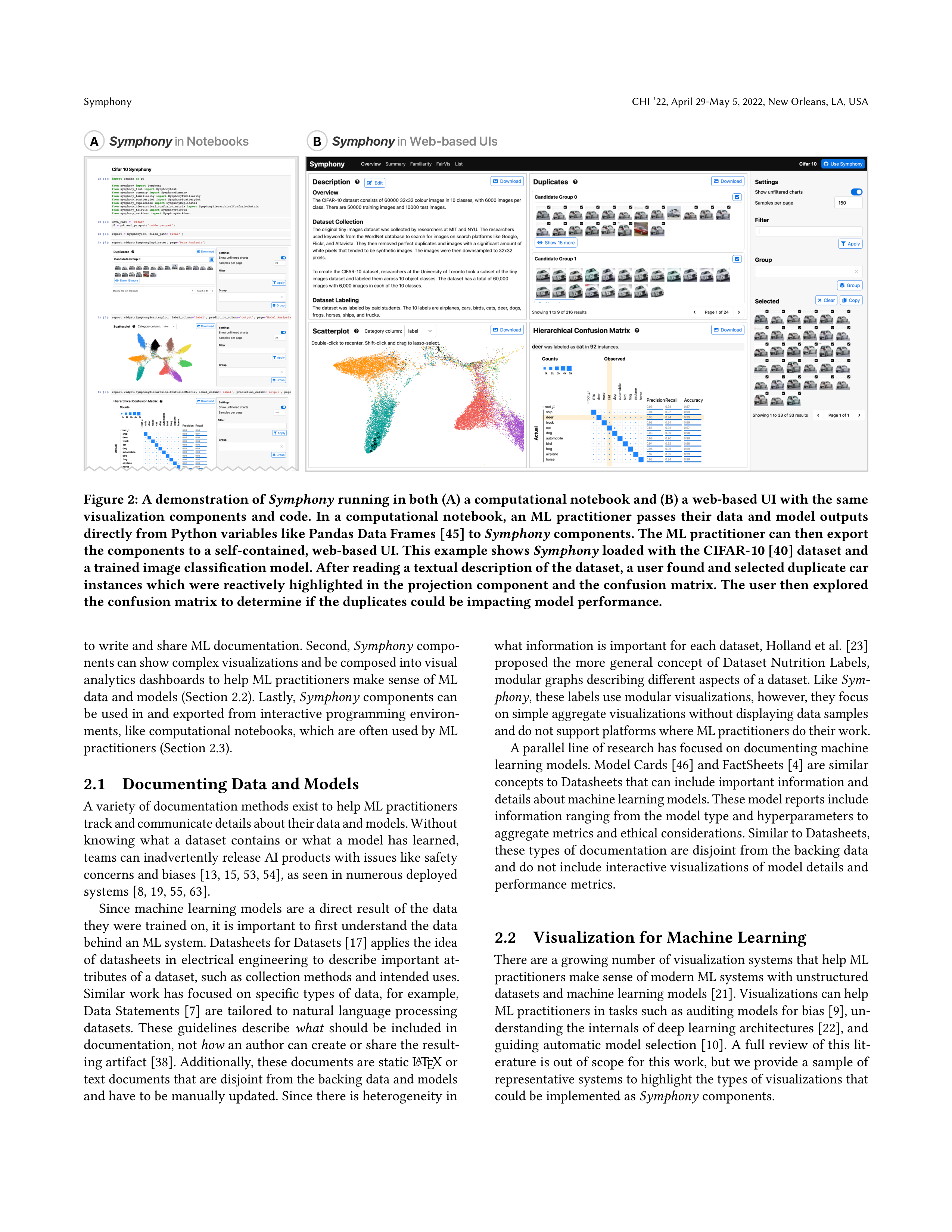
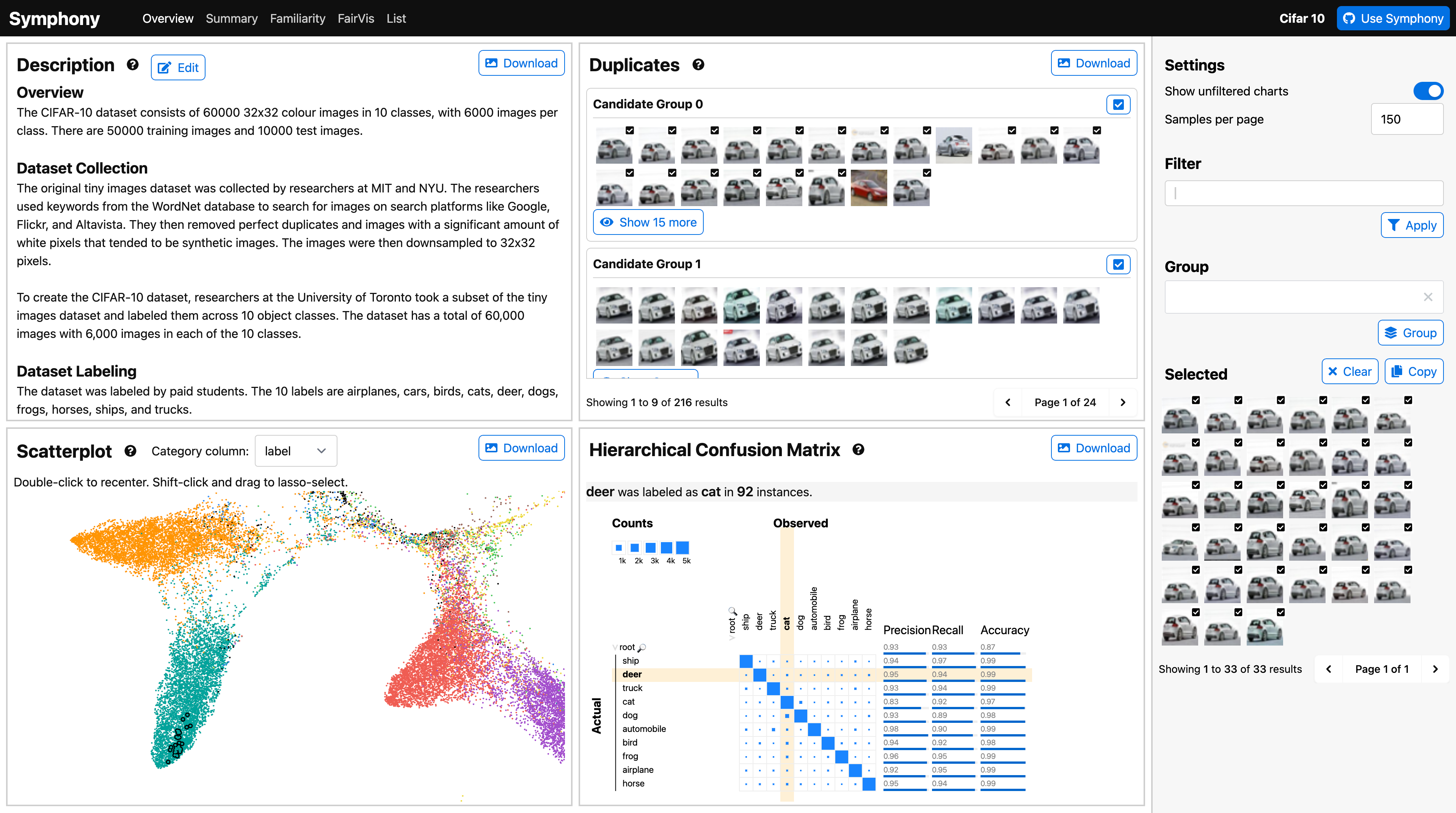
A
B
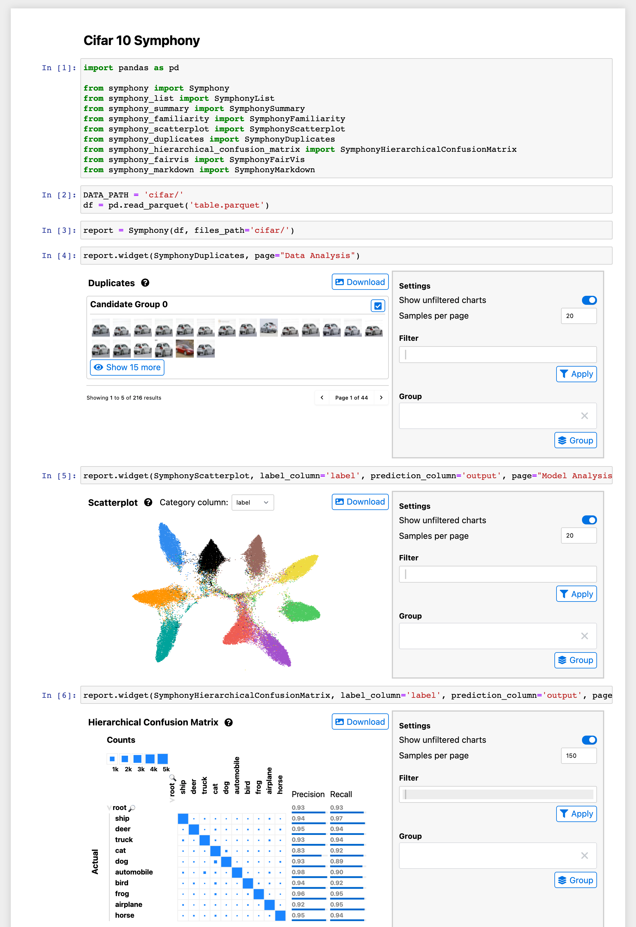
Figure 2: A demonstration of
Symphony
running in both (A) a computational notebook and (B) a web-based UI with the same
visualization
components
and
code.
In
a
computational
notebook,
an
ML
practitioner
passes
their
data
and
model
outputs
directly from Python variables like Pandas Data Frames [45] to
Symphony
components. The ML practitioner can then export
the components to a self-contained, web-based UI. This example shows
Symphony
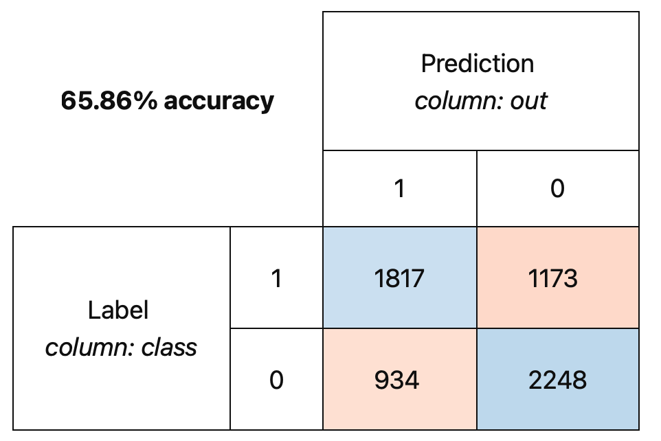
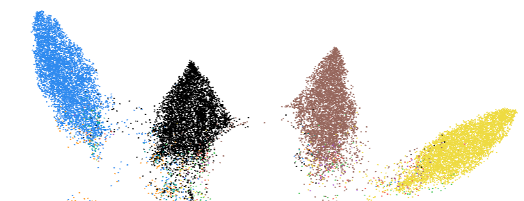
loaded with the CIFAR-10 [40] dataset and
a trained image classification model. After reading a textual description of the dataset, a user found and selected duplicate car
instances which were reactively highlighted in the projection component and the confusion matrix. The user then explored
the confusion matrix to determine if the duplicates could be impacting model performance.
to write and share ML documentation. Second,
Symphony
compo-
nents can show complex visualizations and be composed into visual
analytics dashboards to help ML practitioners make sense of ML
data and models (Section 2.2). Lastly,
Symphony
components can
be used in and exported from interactive programming environ-
ments, like computational notebooks, which are often used by ML
practitioners (Section 2.3).
2.1
Documenting Data and Models
A variety of documentation methods exist to help ML practitioners
track and communicate details about their data and models. Without
knowing
what
a
dataset
contains
or
what
a
model
has
learned,
teams can inadvertently release AI products with issues like safety
concerns and biases [
13
,
15
,
53
,
54
], as seen in numerous deployed
systems [8, 19, 55, 63].
Since
machine
learning
models
are
a
direct
result
of
the
data
they were trained on, it is important to first understand the data
behind an ML system. Datasheets for Datasets [
17
] applies the idea
of
datasheets
in
electrical
engineering
to
describe
important
at-
tributes of a dataset, such as collection methods and intended uses.
Similar work has focused on specific types of data, for example,
Data
Statements
[
7
]
are
tailored
to
natural
language
processing
datasets.
These
guidelines
describe
what
should
be
included
in
documentation, not
how
an author can create or share the result-
ing artifact [
38
]. Additionally, these documents are static L
A
T
E
X or
text documents that are disjoint from the backing data and models
and have to be manually updated. Since there is heterogeneity in
what information is important for each dataset, Holland et al
. [23]
proposed
the
more
general
concept
of
Dataset
Nutrition
Labels,
modular graphs describing different aspects of a dataset. Like
Sym-
phony
, these labels use modular visualizations, however, they focus
on simple aggregate visualizations without displaying data samples
and do not support platforms where ML practitioners do their work.
A parallel line of research has focused on documenting machine
learning models. Model Cards [
46
] and FactSheets [
4
] are similar
concepts to Datasheets that can include important information and
details about machine learning models. These model reports include
information ranging from the model type and hyperparameters to
aggregate metrics and ethical considerations. Similar to Datasheets,
these types of documentation are disjoint from the backing data
and do not include interactive visualizations of model details and
performance metrics.
2.2
Visualization for Machine Learning
There are a growing number of visualization systems that help ML
practitioners make sense of modern ML systems with unstructured
datasets and machine learning models [
21
]. Visualizations can help
ML practitioners in tasks such as auditing models for bias [
9
], un-
derstanding the internals of deep learning architectures [
22
], and
guiding automatic model selection [
10
]. A full review of this lit-
erature is out of scope for this work, but we provide a sample of
representative systems to highlight the types of visualizations that
could be implemented as
Symphony
components.
CHI ’22, April 29-May 5, 2022, New Orleans, LA, USA
Bäuerle and Cabrera, et al.
Data
science
work
often
starts
with
and
leads
back
to
under-
standing the backing data. Modern machine learning models and
tasks use
unstructured
data like images and audio that cannot be
visualized and explored with tables and histograms. Systems like
Know Your Data [
28
] and Facets [
27
] are visualization dashboards
for
exploring
unstructured
data.
Other
visual
analytics
systems
process the data further to derive insights like outliers [
11
], biases
in a dataset [
61
], or mislabeled data instances [
66
]. With a deeper
understanding of their data, ML practitioners can more effectively
debug and improve their models.
The models ML practitioners use are often large, complex black-
box models like deep learning systems. Visualization systems like
Summit [
22
] and Seq2Seq-Vis [
57
] can help ML practitioners de-
velop
a
better
mental
model
of
how
their
machine
learning
sys-
tems
work
and
what
they
are
learning.
Another
set
of
systems,
including Model Tracker [
3
], Squares [
50
], AnchorViz [
12
], Con-
fusionFlow
[
20
],
What-if
Tool
[
62
],
and
MLCube
[
34
],
focus
on
performance analysis and provide different views of a model’s er-
rors
Lastly,
there
are
tools
for
detecting
potential
biases
[
1
]
or
systematic errors [
6
,
64
] in training data. These various of visual-
izations can be repackaged as
Symphony
components, for example,
we implement a version of FairVis [
9
] as a component for auditing
classifiers for bias.
Lastly, there are integrated systems that help ML practitioners
both implement and visualize ML models. One of the first systems
describing
such
an
integrated
system
is
Gestalt
[
48
],
a
develop-
ment environment with visualizations for training and analyzing
classification models. A subsequent system focused on interactive
machine learning is Marcelle [
16
], which uses composable stages
and visualizations to create interactive ML interfaces. In contrast to
Gestalt and Marcell,
Symphony
is focused on the analysis stage of
ML systems, and includes important features such as cross-platform
support, reactivity, and a consistent data API which are not available
in Gestalt and Marcelle.
ML data and model visualizations are often deployed as visual
analytics dashboards that are separate from both interactive pro-
gramming environments that ML practitioners work with and ML
documentation shared with other stakeholders. This separation lim-
its who can use visualizations to understand ML data and models.
Symphony
aims to bridge these worlds by bringing visualizations
both into notebooks where data work happens and into the docu-
mentation shared with other stakeholders.
2.3
Interactive Programming Environments
ML practitioners often use interactive programming environments
for exploring and modeling data since they can interact with and
iterate on their ML systems [
35
]. These environments are most com-
monly implemented as computational notebooks like Jupyter [
37
],
DataBricks [
26
], and Observable [
29
]. While computational note-
books have extensions for creating interactive visualizations, such
as the ipywidgets API [
32
] for Jupyter, they are often underused [
5
]
and hard to share [18, 35].
Several libraries exist for interactively visualizing data in note-
books. Graphing libraries such as Altair [
58
] and Plotly [
30
] allow
users to create interactive charts but only support a finite set of
graphs and require users to manually define what visualizations
they want to use. Lux [
41
] and B2 [
65
] lower the cost of using visu-
alizations in notebooks by automatically providing relevant charts
for users’ data frames. These approaches help analyze tabular data,
but they lack the specific visual representations needed for machine
learning development.
A separate challenge is sharing visualizations and other note-
book outputs outside of the notebook context. Voilà [
60
] tackles
this
challenge
directly
by
exporting
full
Jupyter
notebooks
to
a
hosted website. ML practitioners can use Voilà to share notebooks
that contain
Symphony
components, but it requires a Python kernel
to be running and Voilà does not provide any visualizations itself.
Two visualization frameworks similar to
Symphony
, Panel [
24
] and
Plotly Dash [
49
], use independent components to create visualiza-
tions that can be used in both Jupyter notebooks and standalone
websites. However, these tools also have limitations for creating
complete ML interfaces: Panel visualizations are tied to the Jupyter
ecosystem and lack interactivity without a Python backend, while
Plotly Dash primarily supports Plotly charts and does not easily ex-
tend to custom visualizations.
Symphony
provides components that
are fully interactive in both notebooks and web UIs, and support any
JavaScript-based
visualization.
Additionally,
Symphony
’s
shared
state synchronizes its components, enabling reactive brushing and
linking between views.
More recent interactive programming environments have moved
away
from
the
notebook
paradigm.
For
example,
in
the
Stream-
lit
[
31
]
platform,
users
write
Python
scripts
using
a
library
that
renders interactive components in a separate website. While Stream-
lit supports interactive components like Jupyter notebooks, it is
primarily an environment focused on designing web applications
rather than exploratory data science or ML reporting. Exploratory
analysis
is
still
often
done
in
notebooks,
and
Streamlit
requires
users to learn a new platform. Other platforms are moving away
from programming altogether, such as Glinda [
14
], a declarative
language
that
lets
ML
practitioners
describe
analysis
steps
in
a
domain-specific language. Glinda does not define any specific visu-
alizations, but it could be complemented by
Symphony
components.
Since
Symphony
components are standalone JavaScript modules,
future wrappers could integrate
Symphony
components into data
science environments like Streamlit and Glinda.
3
FORMATIVE INTERVIEWS
To
understand
how
ML
interfaces
are
used
in
practice,
we
con-
ducted 7 semi-structured interviews with 9 participants at Apple.
We recruited participants through internal emails and messaging
boards and selected participants across a range of different roles,
including engineers, designers, researchers, and testing roles that
work on teams to build and deploy ML systems. Each interview
was
conducted
over
a
video
call
and
lasted
about
an
hour.
First,
we asked participants about how they currently create and use dif-
ferent ML interfaces like documentation, visualization dashboards,
and widgets. We then asked them what the main limitations and
pain points are in current tools and what types of improvements
they would find helpful. From these need-finding interviews we
identified the following themes.
Use cases for ML interfaces.
All participants agreed that creating
and sharing ML interfaces can help them build more robust and
Symphony
CHI ’22, April 29-May 5, 2022, New Orleans, LA, USA
capable ML products. Participants described use cases of ML in-
terfaces in myriad tasks, such as
“flagging failures for review,”
(P2)
“detecting systematic failures,”
(P4) and
“fairness and bias education.”
(P1) Participants also mentioned stages across the entire ML process
in which ML interfaces can be useful, from
“dataset curation and
sharing”
(P5) to analysis
“after an ML model has been trained,”
(P7)
or
“in all stages”
(P1). Consequently, since different stakeholders
involved
in
an
ML
product
need
specific
views
of
the
data
and
models, ML interfaces must be flexible enough to support analysis
across numerous tasks and domains.
Ad-hoc tools and analyses.
While all participants detailed clear
use cases for ML interfaces, they also mentioned limitations pre-
venting them from using existing tools or sharing insights. One
participant
bluntly
stated
“right
now,
we
basically
have
no
tools”
(P3) for analyzing ML systems. Instead, participants rely on ad-hoc,
hand-crafted visualizations for their specific analyses. For example,
one of our participants said their process for looking at instances
is to
“manually examine icons in a file explorer.”
(P9) Another par-
ticipant
“looks at handcrafted summaries of select data subsets”
(P4)
to do model analysis. Larger teams with more resources may have
bespoke tools, such as one participant that
“use[s] a team-internal
tool to analyze data”
(P6). Overall, a lack of adequate tooling leads to
ML practitioners using one-off, manual tools or ML teams investing
in their own, custom visualization systems.
Limitations of existing ML interfaces.
Participants detailed a vari-
ety of technical roadblocks and time-consuming processes prevent-
ing them from using existing ML interfaces. Many tools require
users to wrangle and export their data into a specific format be-
fore
loading
it
into
a
custom
system
or
dashboard.
However,
as
one
participant
stated,
“we
do
not
have
a
lot
of
time
for
creating
such visualizations:”
(P1) ML practitioners simply do not have the
bandwidth to do the setup and data wrangling work necessary to
use separate systems. ML practitioners’ main priority is working
on data and models, and
“if it takes longer than 5-10 minutes, I am
not going to [use an ML interface] immediately”
(P6).
Five participants mentioned explicitly that they do not use ML
interfaces because they are not available in the environments where
they work, and that
“people would want to use easier tools.”
(P3) For
example,
“many data scientists want to explore their data in notebooks”
(P2) without having to open a separate system. Additionally, since
data and models update frequently, one participant wanted to
“start
a job with checkboxes and buttons”
(P6) and produce a self-updating
web UI that they would not have to manually author.
Lastly, the teams we talked to work with myriad data types, such
as video, 3D point cloud, tabular, image, and audio data, and desired
bespoke visualizations supporting their analysis needs. One par-
ticipant mentioned running and visualizing specific data analyses,
and
“would want to specify algorithms because our problems are very
specialized.”
(P8) However, current data science tools often only
provide visualizations for a limited set of data types and models.
Lack of communication between stakeholders.
As a consequence
of limited, isolated interfaces, participants described various chal-
lenges
for
communicating
and
sharing
insights.
Since
different
stakeholders
prefer
different
environments,
such
as
code-based
notebooks or standalone dashboards, it can be challenging to share
insights with others. In addition to sharable interfaces, participants
also wanted cross-platform support for themselves, as one partici-
pant put it,
“I would like both an environment for experimentation
and always there reliable visualizations.”
(P2)
It
can
also
be
difficult
to
transfer
visualizations
and
findings
between platforms that different stakeholders work with. One par-
ticipant lamented that
“I am often not invited to the table until things
go wrong,”
(P4) and in some teams
“designers often times don’t have
access to data and model results.”
(P3) In turn, decisions about ML
systems are made without all team members having a shared under-
standing of the current state and limitations of the project. Despite
these
current
limitations,
participants
thought
that
“fostering
a
culture of sharing insights would be great.”
(P3)
4
DESIGN GOALS
Based on the challenges we identified in the formative interviews,
we found that a successful framework for ML interfaces must fulfill
the following:
Enable data-driven ML interfaces.
ML interfaces are often dis-
connected from an ML system’s backing data and model outputs [
17
,
46
]. ML practitioners should be able to create visualizations that
are up-to-date and reflect an ML systems’ current state.
Support task-specific visualizations.
Specialized visualizations
are often needed to make sense of the unstructured data and deep
learning models increasingly used in machine learning [
51
,
59
]. ML
interfaces should support these task-specific visualization needs.
Provide interactive exploration tools.
Static ML interfaces only
show
a
fixed
subset
of
the
possible
analyses
stakeholders
may
need [
38
]. Interactive visualizations let different stakeholders dis-
cover and validate the patterns most relevant to their goals.
Make components reusable.
Different stakeholders explore ML
systems
in
different
environments,
such
as
computational
note-
books and web-based UIs. ML interfaces should be available across
environments and reusable for different domains and tasks.
5
SYMPHONY: A FRAMEWORK FOR
COMPOSING INTERACTIVE INTERFACES
FOR MACHINE LEARNING
Based on these design goals we built
Symphony
, a framework for
composing
ML
interfaces
from
interactive
visualization
compo-
nents. ML practitioners can explore their data and models using
Symphony
components in a computational notebook and then com-
bine and transform them into web-based UIs.
Symphony
consists of
three primary features: modular components (Section 5.1), environ-
ment wrappers (Section 5.2), and interaction tools (Section 5.3). In
the following, we describe the specific design and implementation
choices we made to support these goals.
5.1
Modular Components
The building blocks of
Symphony
are independent, modular com-
ponents designed for task-specific visualizations (Figure 3, right).
A
Symphony
component is a JavaScript module that renders a web-
based visualization. We use the Svelte
1
web framework as the base
1
https://svelte.dev


CHI ’22, April 29-May 5, 2022, New Orleans, LA, USA
Bäuerle and Cabrera, et al.
Settings
Selection
Filters
Groups
Shared State
Components
UI Interaction
Code Interaction
Interaction Tools
Data Table & Files
Symphony
System
Wrapper
Symphony
Input
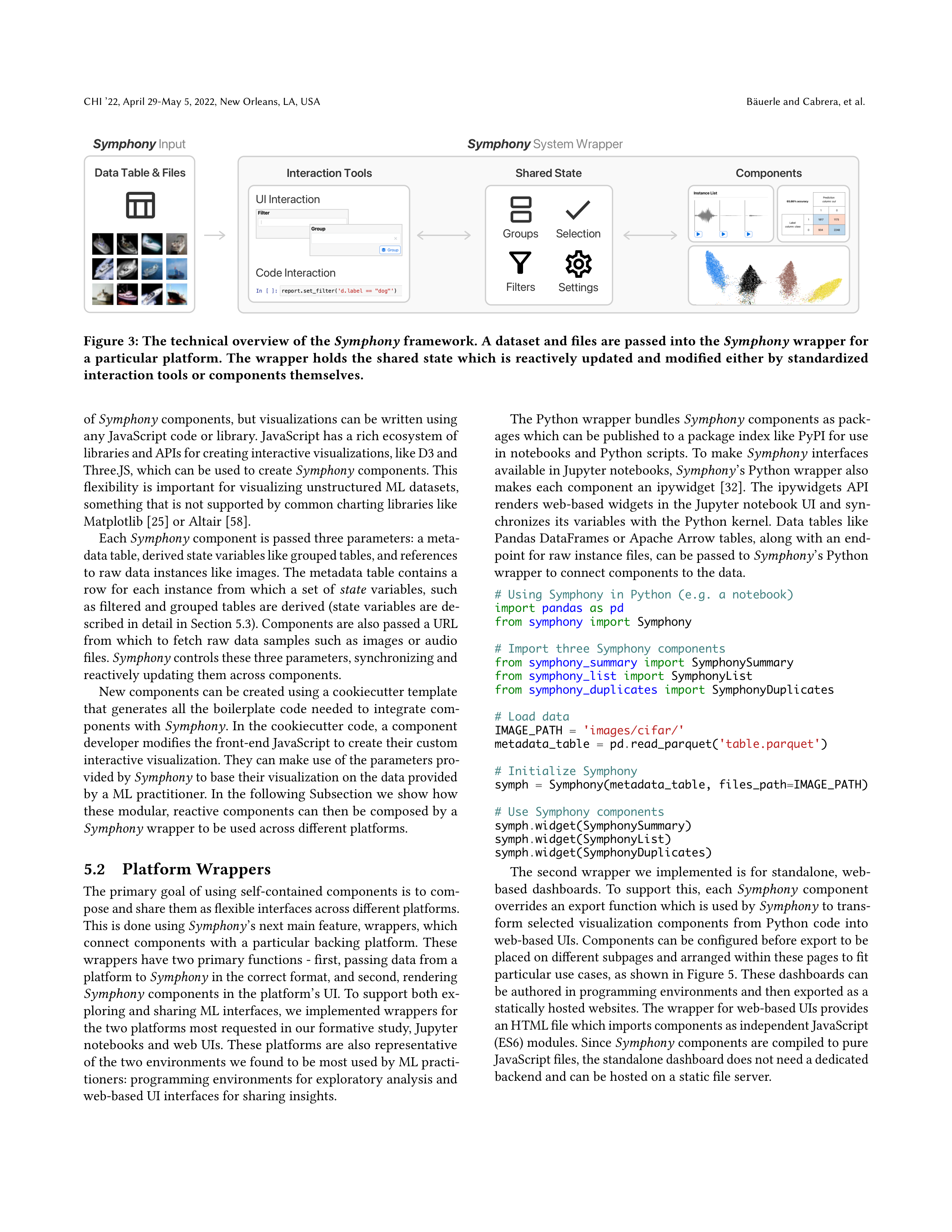
Figure 3: The technical overview of the
Symphony
framework. A dataset and files are passed into the
Symphony
wrapper for
a
particular
platform.
The
wrapper
holds
the
shared
state
which
is
reactively
updated
and
modified
either
by
standardized
interaction tools or components themselves.
of
Symphony
components, but visualizations can be written using
any JavaScript code or library. JavaScript has a rich ecosystem of
libraries and APIs for creating interactive visualizations, like D3 and
Three.JS, which can be used to create
Symphony
components. This
flexibility is important for visualizing unstructured ML datasets,
something that is not supported by common charting libraries like
Matplotlib [25] or Altair [58].
Each
Symphony
component is passed three parameters: a meta-
data table, derived state variables like grouped tables, and references
to raw data instances like images. The metadata table contains a
row
for
each
instance
from
which
a
set
of
state
variables,
such
as filtered and grouped tables are derived (state variables are de-
scribed in detail in Section 5.3). Components are also passed a URL
from
which
to
fetch
raw
data
samples
such
as
images
or
audio
files.
Symphony
controls these three parameters, synchronizing and
reactively updating them across components.
New components can be created using a cookiecutter template
that
generates
all
the
boilerplate
code
needed
to
integrate
com-
ponents with
Symphony
. In the cookiecutter code, a component
developer modifies the front-end JavaScript to create their custom
interactive visualization. They can make use of the parameters pro-
vided by
Symphony
to base their visualization on the data provided
by a ML practitioner. In the following Subsection we show how
these modular, reactive components can then be composed by a
Symphony
wrapper to be used across different platforms.
5.2
Platform Wrappers
The primary goal of using self-contained components is to com-
pose and share them as flexible interfaces across different platforms.
This is done using
Symphony
’s next main feature, wrappers, which
connect
components
with
a
particular
backing
platform.
These
wrappers have two primary functions - first, passing data from a
platform to
Symphony
in the correct format, and second, rendering
Symphony
components in the platform’s UI. To support both ex-
ploring and sharing ML interfaces, we implemented wrappers for
the two platforms most requested in our formative study, Jupyter
notebooks and web UIs. These platforms are also representative
of the two environments we found to be most used by ML practi-
tioners: programming environments for exploratory analysis and
web-based UI interfaces for sharing insights.
The Python wrapper bundles
Symphony
components as pack-
ages which can be published to a package index like PyPI for use
in notebooks and Python scripts. To make
Symphony
interfaces
available in Jupyter notebooks,
Symphony
’s Python wrapper also
makes
each
component
an
ipywidget
[
32
].
The
ipywidgets
API
renders web-based widgets in the Jupyter notebook UI and syn-
chronizes
its
variables
with
the
Python
kernel.
Data
tables
like
Pandas DataFrames or Apache Arrow tables, along with an end-
point for raw instance files, can be passed to
Symphony
’s Python
wrapper to connect components to the data.
#
Using
Symphony
in
Python
(e.g.
a
notebook)
import
pandas
as
pd
from
symphony
import
Symphony
#
Import
three
Symphony
components
from
symphony_summary
import
SymphonySummary
from
symphony_list
import
SymphonyList
from
symphony_duplicates
import
SymphonyDuplicates
#
Load
data
IMAGE_PATH
=
'images/cifar/'
metadata_table
=
pd
.
read_parquet(
'table.parquet'
)
#
Initialize
Symphony
symph
=
Symphony(metadata_table,
files_path
=
IMAGE_PATH)
#
Use
Symphony
components
symph
.
widget(SymphonySummary)
symph
.
widget(SymphonyList)
symph
.
widget(SymphonyDuplicates)
The
second
wrapper
we
implemented
is
for
standalone,
web-
based
dashboards.
To
support
this,
each
Symphony
component
overrides an export function which is used by
Symphony
to trans-
form
selected
visualization
components
from
Python
code
into
web-based UIs. Components can be configured before export to be
placed on different subpages and arranged within these pages to fit
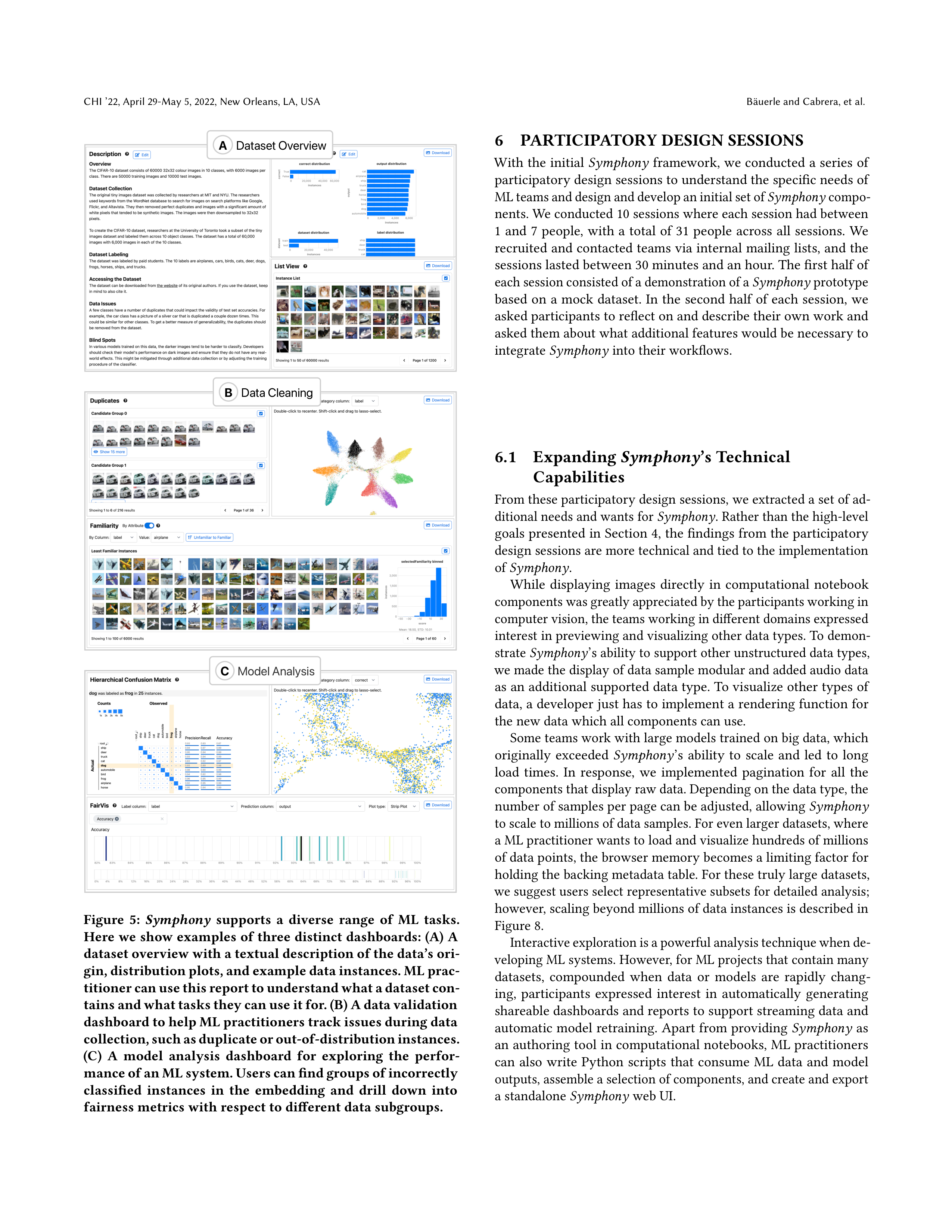
particular use cases, as shown in Figure 5. These dashboards can
be authored in programming environments and then exported as a
statically hosted websites. The wrapper for web-based UIs provides
an HTML file which imports components as independent JavaScript
(ES6) modules. Since
Symphony
components are compiled to pure
JavaScript files, the standalone dashboard does not need a dedicated
backend and can be hosted on a static file server.
Symphony
CHI ’22, April 29-May 5, 2022, New Orleans, LA, USA
A
B
C
D
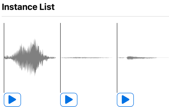
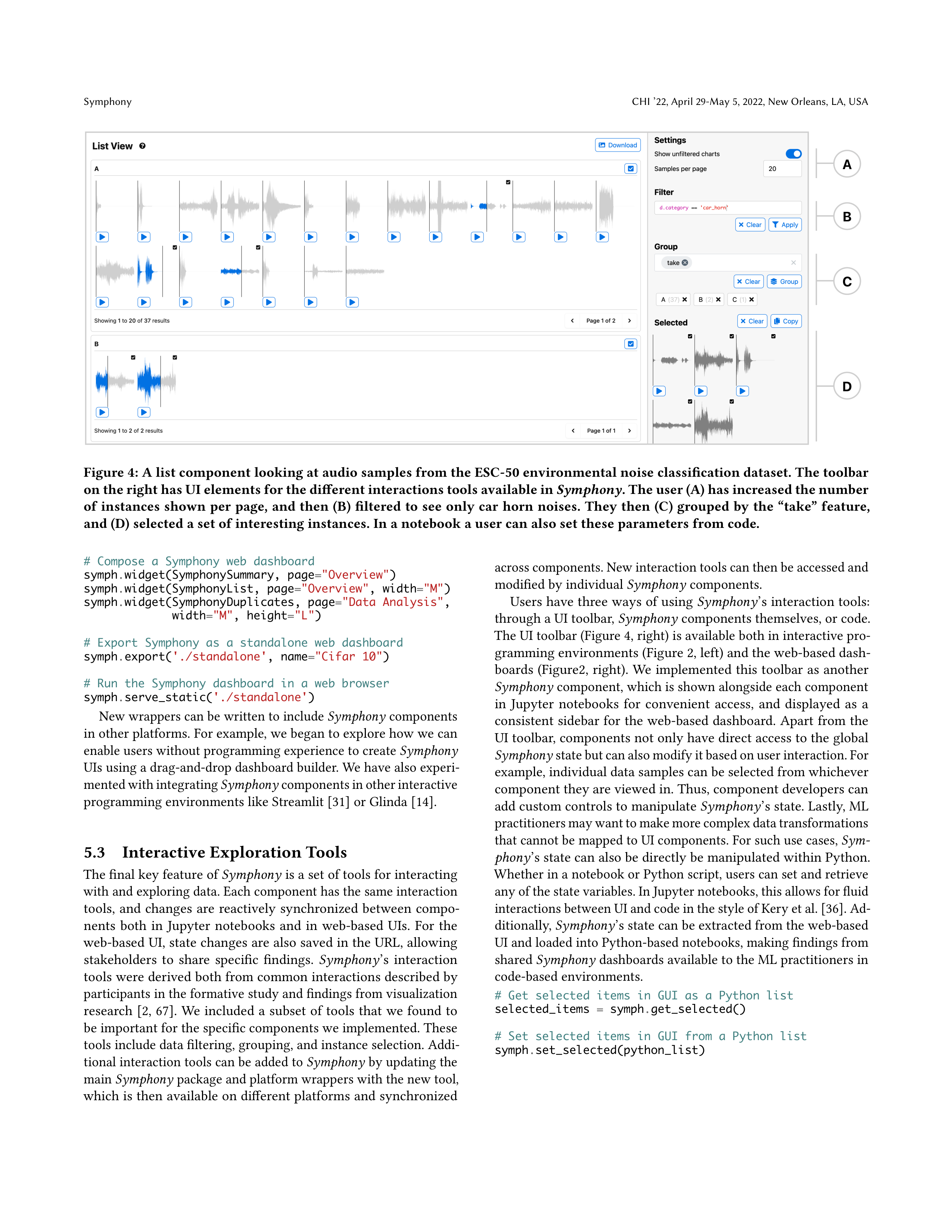
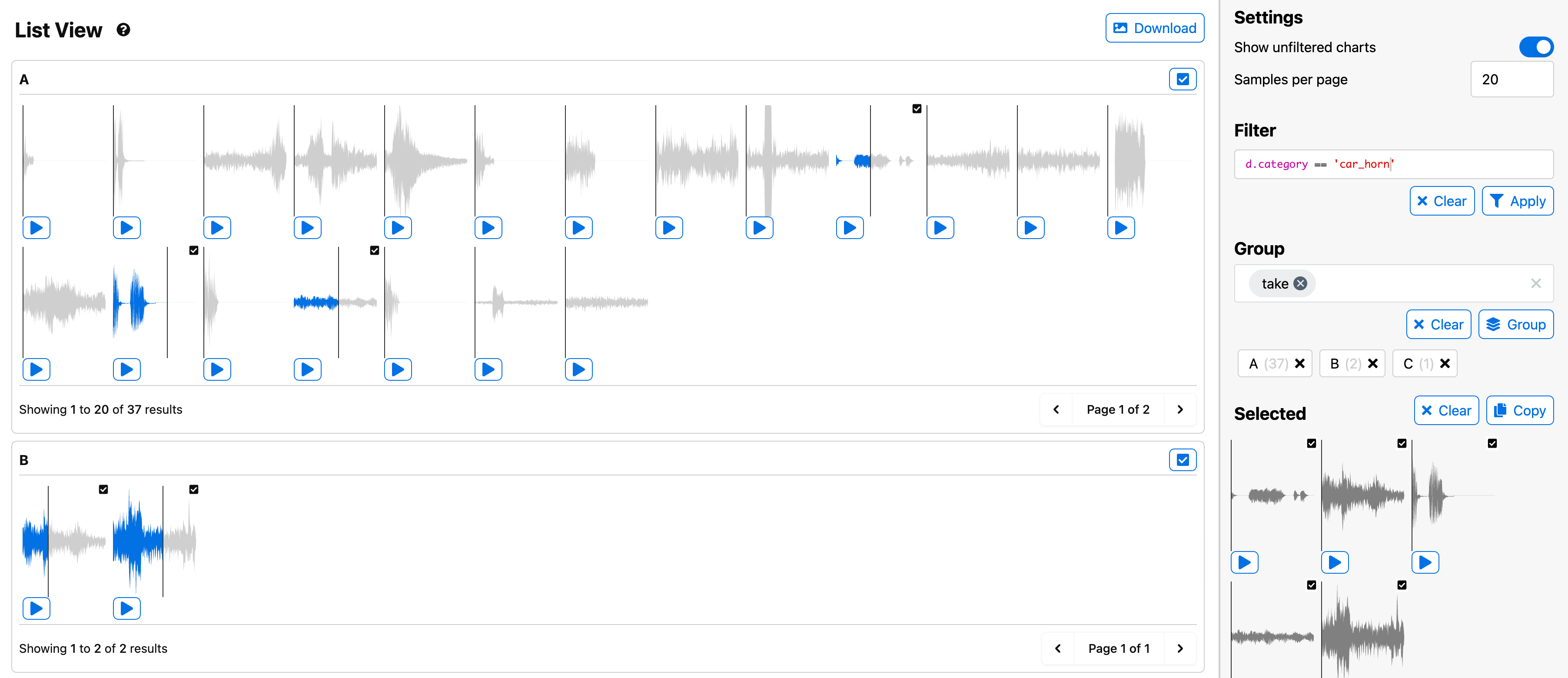
Figure 4: A list component looking at audio samples from the ESC-50 environmental noise classification dataset. The toolbar
on the right has UI elements for the different interactions tools available in
Symphony
. The user (A) has increased the number
of
instances
shown
per
page,
and
then
(B)
filtered
to
see
only
car
horn
noises.
They
then
(C)
grouped
by
the
“take”
feature,
and (D) selected a set of interesting instances. In a notebook a user can also set these parameters from code.
#
Compose
a
Symphony
web
dashboard
symph
.
widget(SymphonySummary,
page
=
"Overview"
)
symph
.
widget(SymphonyList,
page
=
"Overview"
,
width
=
"M"
)
symph
.
widget(SymphonyDuplicates,
page
=
"Data
Analysis"
,
width
=
"M"
,
height
=
"L"
)
#
Export
Symphony
as
a
standalone
web
dashboard
symph
.
export(
'./standalone'
,
name
=
"Cifar
10"
)
#
Run
the
Symphony
dashboard
in
a
web
browser
symph
.
serve_static(
'./standalone'
)
New wrappers can be written to include
Symphony
components
in other platforms. For example, we began to explore how we can
enable users without programming experience to create
Symphony
UIs using a drag-and-drop dashboard builder. We have also experi-
mented with integrating
Symphony
components in other interactive
programming environments like Streamlit [31] or Glinda [14].
5.3
Interactive Exploration Tools
The final key feature of
Symphony
is a set of tools for interacting
with and exploring data. Each component has the same interaction
tools,
and
changes
are
reactively
synchronized
between
compo-
nents
both
in
Jupyter
notebooks
and
in
web-based
UIs.
For
the
web-based UI, state changes are also saved in the URL, allowing
stakeholders
to
share
specific
findings.
Symphony
’s
interaction
tools were derived both from common interactions described by
participants in the formative study and findings from visualization
research
[
2
,
67
].
We
included
a
subset
of
tools
that
we
found
to
be important for the specific components we implemented. These
tools include data filtering, grouping, and instance selection. Addi-
tional interaction tools can be added to
Symphony
by updating the
main
Symphony
package and platform wrappers with the new tool,
which is then available on different platforms and synchronized
across components. New interaction tools can then be accessed and
modified by individual
Symphony
components.
Users have three ways of using
Symphony
’s interaction tools:
through a UI toolbar,
Symphony
components themselves, or code.
The UI toolbar (Figure 4, right) is available both in interactive pro-
gramming environments (Figure 2, left) and the web-based dash-
boards (Figure2, right). We implemented this toolbar as another
Symphony
component, which is shown alongside each component
in
Jupyter
notebooks
for
convenient
access,
and
displayed
as
a
consistent sidebar for the web-based dashboard. Apart from the
UI toolbar, components not only have direct access to the global
Symphony
state but can also modify it based on user interaction. For
example, individual data samples can be selected from whichever
component they are viewed in. Thus, component developers can
add custom controls to manipulate
Symphony
’s state. Lastly, ML
practitioners may want to make more complex data transformations
that cannot be mapped to UI components. For such use cases,
Sym-
phony
’s state can also be directly be manipulated within Python.
Whether in a notebook or Python script, users can set and retrieve
any of the state variables. In Jupyter notebooks, this allows for fluid
interactions between UI and code in the style of Kery et al
. [36]
. Ad-
ditionally,
Symphony
’s state can be extracted from the web-based
UI and loaded into Python-based notebooks, making findings from
shared
Symphony
dashboards available to the ML practitioners in
code-based environments.
#
Get
selected
items
in
GUI
as
a
Python
list
selected_items
=
symph
.
get_selected()
#
Set
selected
items
in
GUI
from
a
Python
list
symph
.
set_selected(python_list)

CHI ’22, April 29-May 5, 2022, New Orleans, LA, USA
Bäuerle and Cabrera, et al.
A
Dataset Overview
B
Data Cleaning
C
Model Analysis
Figure
5:
Symphony
supports
a
diverse
range
of
ML
tasks.
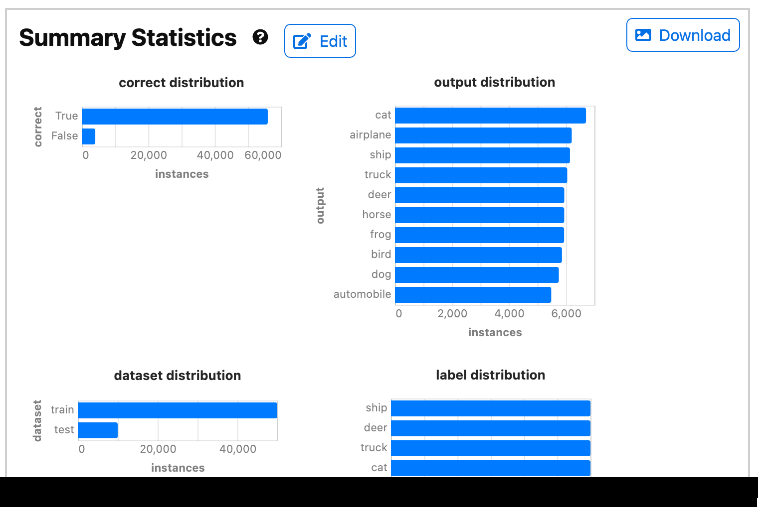
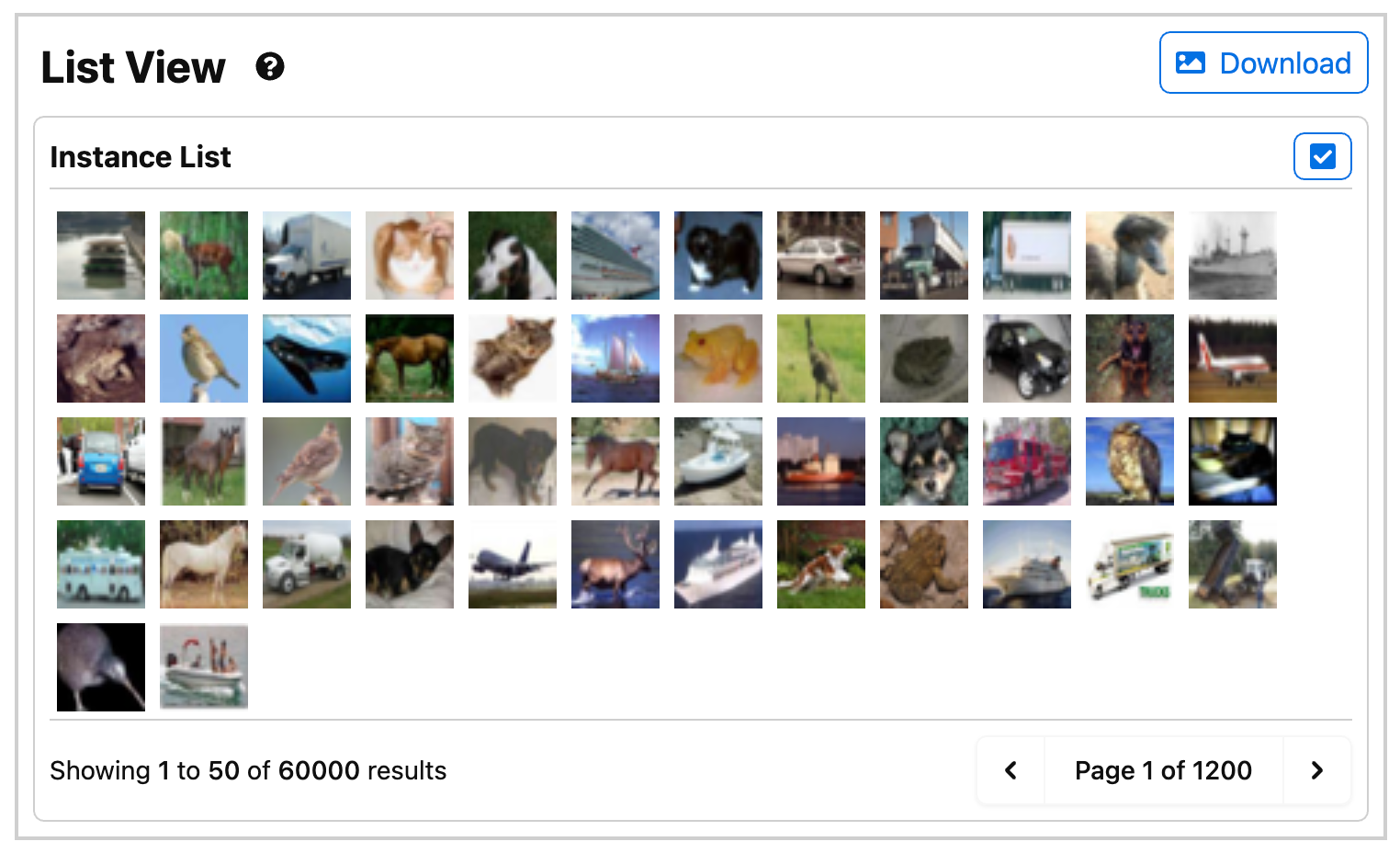
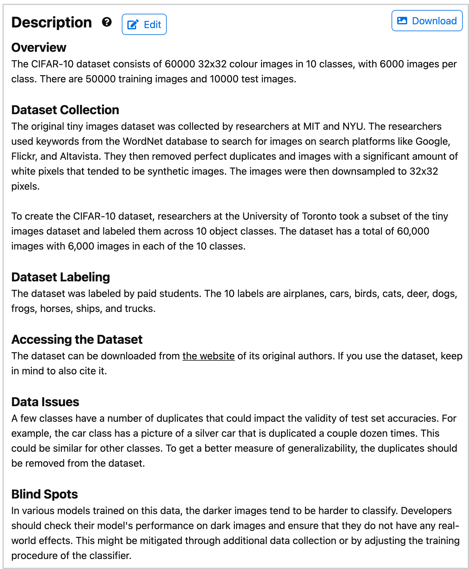
Here we show examples of three distinct dashboards: (A) A
dataset overview with a textual description of the data’s ori-
gin, distribution plots, and example data instances. ML prac-
titioner can use this report to understand what a dataset con-
tains and what tasks they can use it for. (B) A data validation
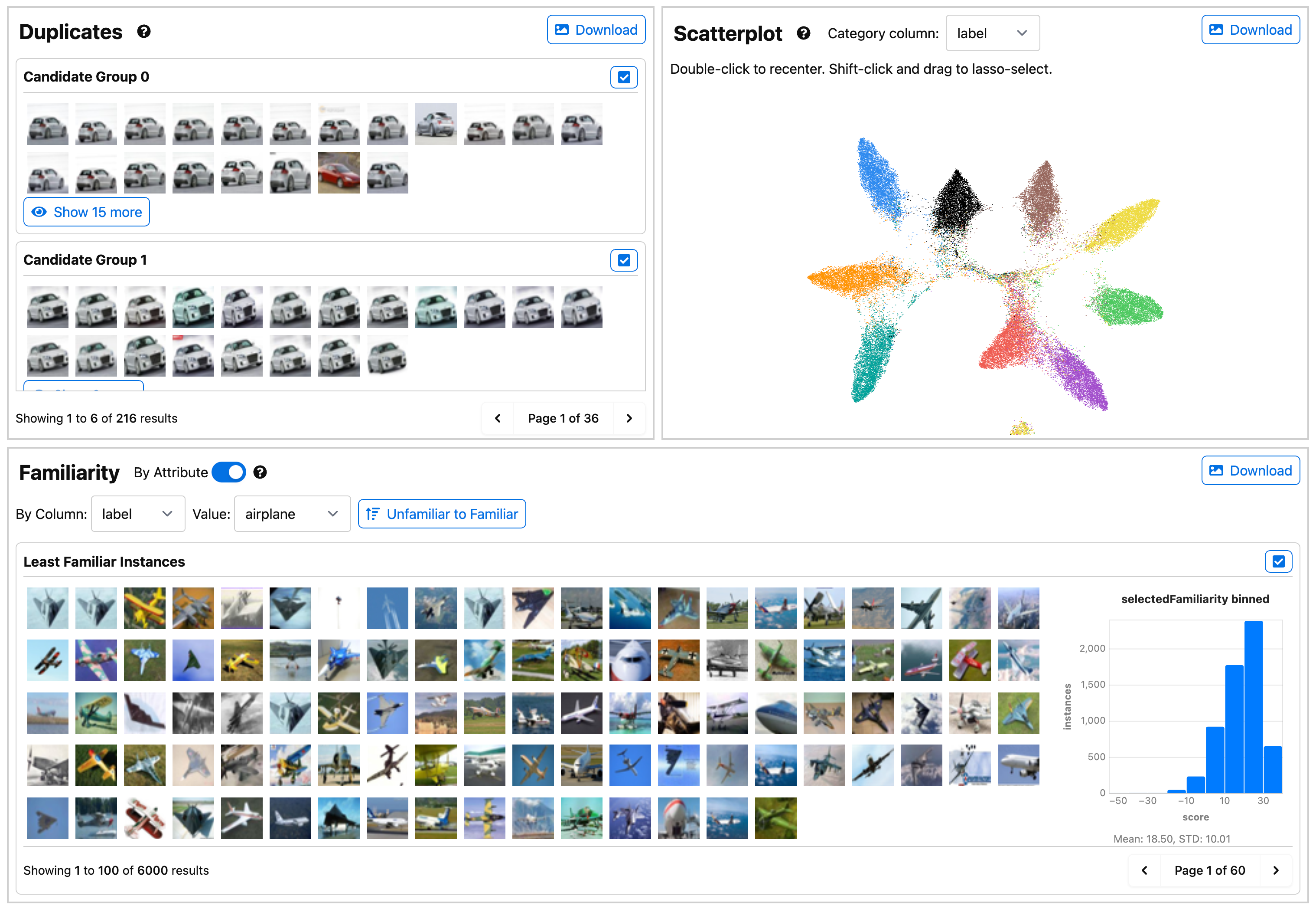
dashboard to help ML practitioners track issues during data
collection, such as duplicate or out-of-distribution instances.
(C)
A
model
analysis
dashboard
for
exploring
the
perfor-
mance of an ML system. Users can find groups of incorrectly
classified
instances
in
the
embedding
and
drill
down
into
fairness metrics with respect to different data subgroups.
6
PARTICIPATORY DESIGN SESSIONS
With the initial
Symphony
framework, we conducted a series of
participatory design sessions to understand the specific needs of
ML teams and design and develop an initial set of
Symphony
compo-
nents. We conducted 10 sessions where each session had between
1
and
7
people,
with
a
total
of
31
people
across
all
sessions.
We
recruited and contacted teams via internal mailing lists, and the
sessions lasted between 30 minutes and an hour. The first half of
each session consisted of a demonstration of a
Symphony
prototype
based on a mock dataset. In the second half of each session, we
asked participants to reflect on and describe their own work and
asked them about what additional features would be necessary to
integrate
Symphony
into their workflows.
6.1
Expanding
Symphony
’s Technical
Capabilities
From these participatory design sessions, we extracted a set of ad-
ditional needs and wants for
Symphony
. Rather than the high-level
goals presented in Section 4, the findings from the participatory
design sessions are more technical and tied to the implementation
of
Symphony
.
While
displaying
images
directly
in
computational
notebook
components was greatly appreciated by the participants working in
computer vision, the teams working in different domains expressed
interest in previewing and visualizing other data types. To demon-
strate
Symphony
’s ability to support other unstructured data types,
we made the display of data sample modular and added audio data
as an additional supported data type. To visualize other types of
data, a developer just has to implement a rendering function for
the new data which all components can use.
Some teams work with large models trained on big data, which
originally
exceeded
Symphony
’s
ability
to
scale
and
led
to
long
load
times.
In
response,
we
implemented
pagination
for
all
the
components that display raw data. Depending on the data type, the
number of samples per page can be adjusted, allowing
Symphony
to scale to millions of data samples. For even larger datasets, where
a ML practitioner wants to load and visualize hundreds of millions
of data points, the browser memory becomes a limiting factor for
holding the backing metadata table. For these truly large datasets,
we suggest users select representative subsets for detailed analysis;
however, scaling beyond millions of data instances is described in
Figure 8.
Interactive exploration is a powerful analysis technique when de-
veloping ML systems. However, for ML projects that contain many
datasets,
compounded
when
data
or
models
are
rapidly
chang-
ing,
participants
expressed
interest
in
automatically
generating
shareable dashboards and reports to support streaming data and
automatic model retraining. Apart from providing
Symphony
as
an authoring tool in computational notebooks, ML practitioners
can
also
write
Python
scripts
that
consume
ML
data
and
model
outputs, assemble a selection of components, and create and export
a standalone
Symphony
web UI.


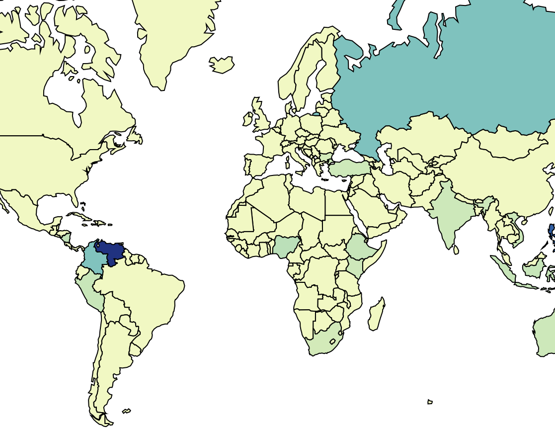
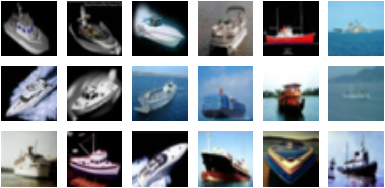
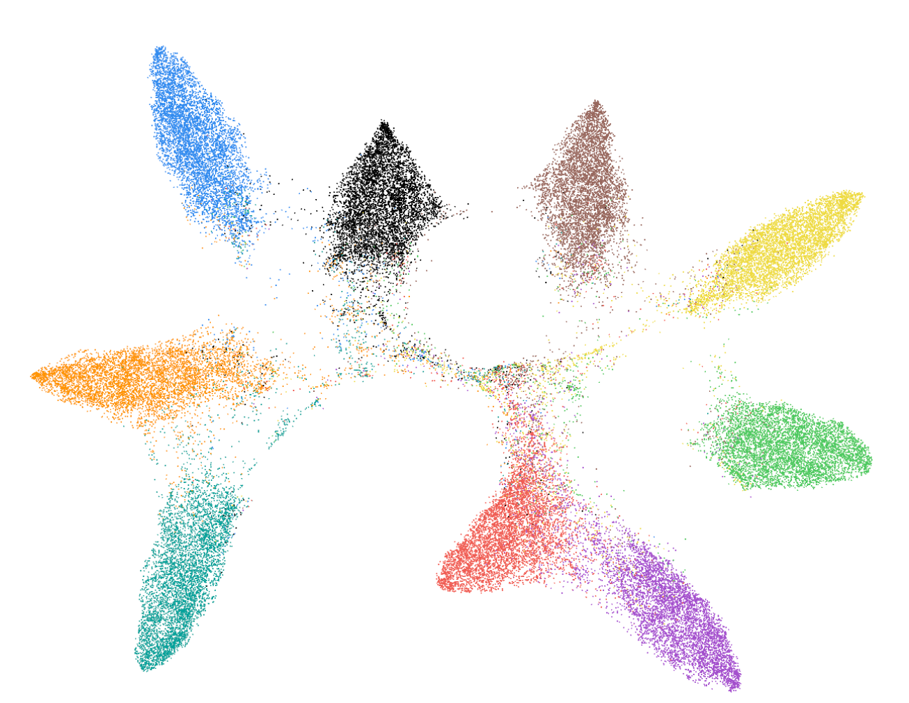
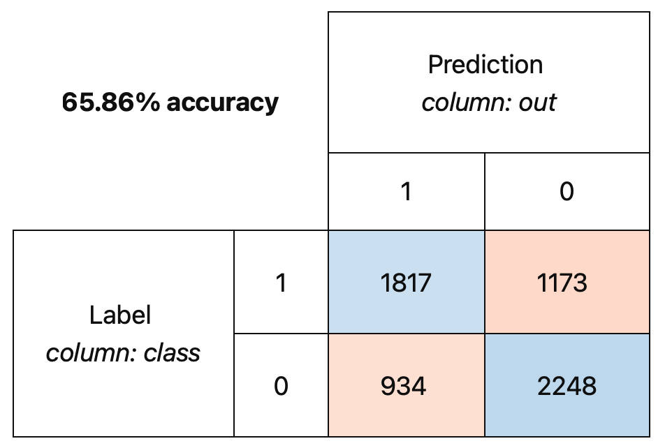

Symphony
CHI ’22, April 29-May 5, 2022, New Orleans, LA, USA
Candidate Group 1
Candidate Group 2
F
Duplicates
D
3D Path
E
Map
G
Familiarity
Least Familiar Instances
H
Projection
I
Confusion Matrix
J
Hierarchical Conf. Matrix
K
FairVis
False Positive Rate
B
List
C
Summary
A
Markdown
Data Collection
Labelling Process
Lorem ipsum dolor sit amet,
consectetur adipiscing elit, sed
do eiusmod tempor incididunt ut
labore et dolore magna aliqua.
Lorem ipsum dolor sit amet,
consectetur adipiscing elit, sed.
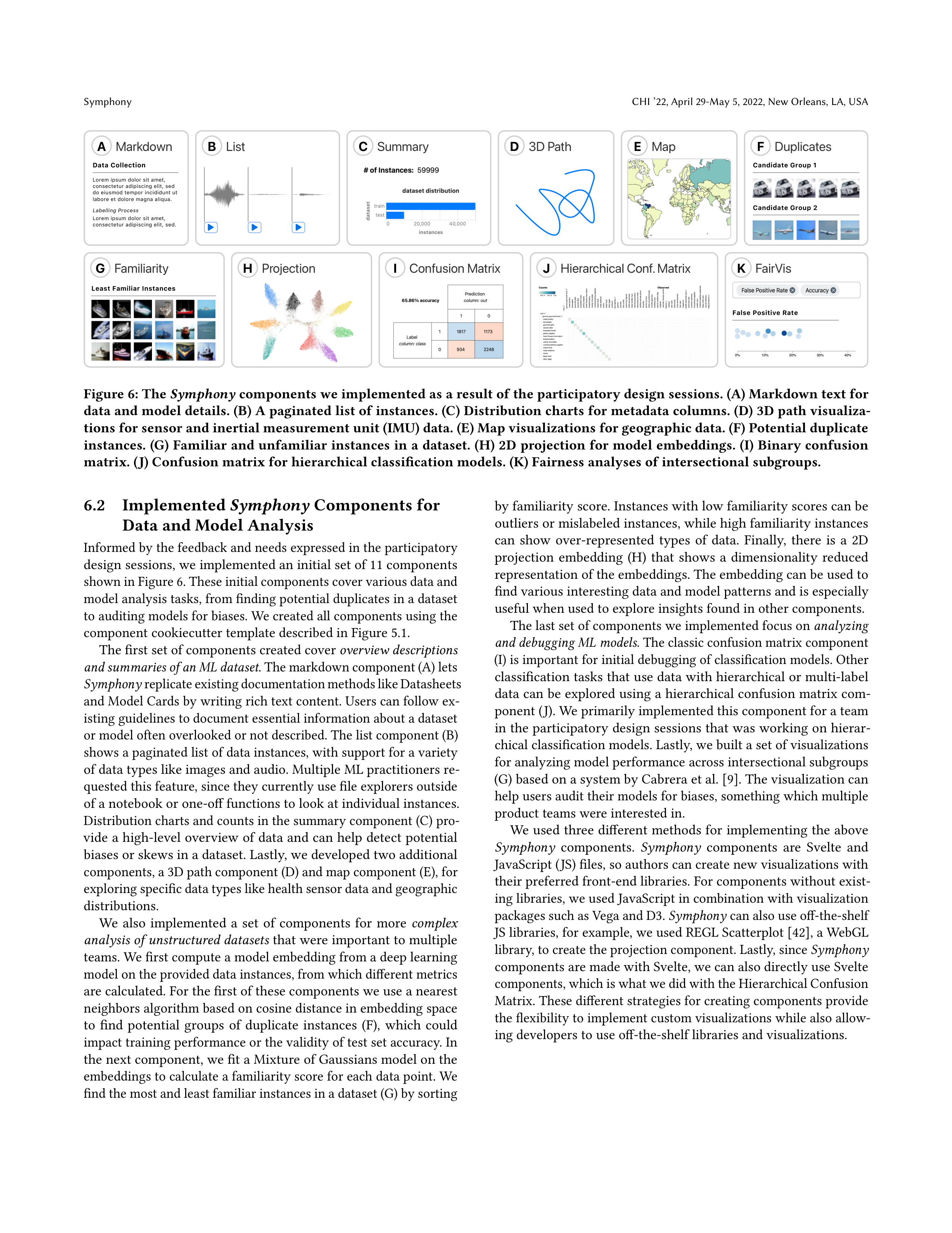
Figure 6: The
Symphony
components we implemented as a result of the participatory design sessions. (A) Markdown text for
data and model details. (B) A paginated list of instances. (C) Distribution charts for metadata columns. (D) 3D path visualiza-
tions for sensor and inertial measurement unit (IMU) data. (E) Map visualizations for geographic data. (F) Potential duplicate
instances. (G) Familiar and unfamiliar instances in a dataset. (H) 2D projection for model embeddings. (I) Binary confusion
matrix. (J) Confusion matrix for hierarchical classification models. (K) Fairness analyses of intersectional subgroups.
6.2
Implemented
Symphony
Components for
Data and Model Analysis
Informed by the feedback and needs expressed in the participatory
design sessions, we implemented an initial set of 11 components
shown in Figure 6. These initial components cover various data and
model analysis tasks, from finding potential duplicates in a dataset
to auditing models for biases. We created all components using the
component cookiecutter template described in Figure 5.1.
The first set of components created cover
overview descriptions
and summaries of an ML dataset
. The markdown component (A) lets
Symphony
replicate existing documentation methods like Datasheets
and Model Cards by writing rich text content. Users can follow ex-
isting guidelines to document essential information about a dataset
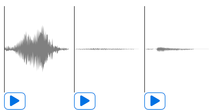
or model often overlooked or not described. The list component (B)
shows a paginated list of data instances, with support for a variety
of data types like images and audio. Multiple ML practitioners re-
quested this feature, since they currently use file explorers outside
of a notebook or one-off functions to look at individual instances.
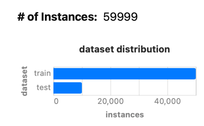
Distribution charts and counts in the summary component (C) pro-
vide a high-level overview of data and can help detect potential
biases or skews in a dataset. Lastly, we developed two additional
components, a 3D path component (D) and map component (E), for
exploring specific data types like health sensor data and geographic
distributions.
We
also
implemented
a
set
of
components
for
more
complex
analysis of unstructured datasets
that were important to multiple
teams. We first compute a model embedding from a deep learning
model on the provided data instances, from which different metrics
are calculated. For the first of these components we use a nearest
neighbors algorithm based on cosine distance in embedding space
to
find
potential
groups
of
duplicate
instances
(F),
which
could
impact training performance or the validity of test set accuracy. In
the next component, we fit a Mixture of Gaussians model on the
embeddings to calculate a familiarity score for each data point. We
find the most and least familiar instances in a dataset (G) by sorting
by familiarity score. Instances with low familiarity scores can be
outliers or mislabeled instances, while high familiarity instances
can
show
over-represented
types
of
data.
Finally,
there
is
a
2D
projection
embedding
(H)
that
shows
a
dimensionality
reduced
representation of the embeddings. The embedding can be used to
find various interesting data and model patterns and is especially
useful when used to explore insights found in other components.
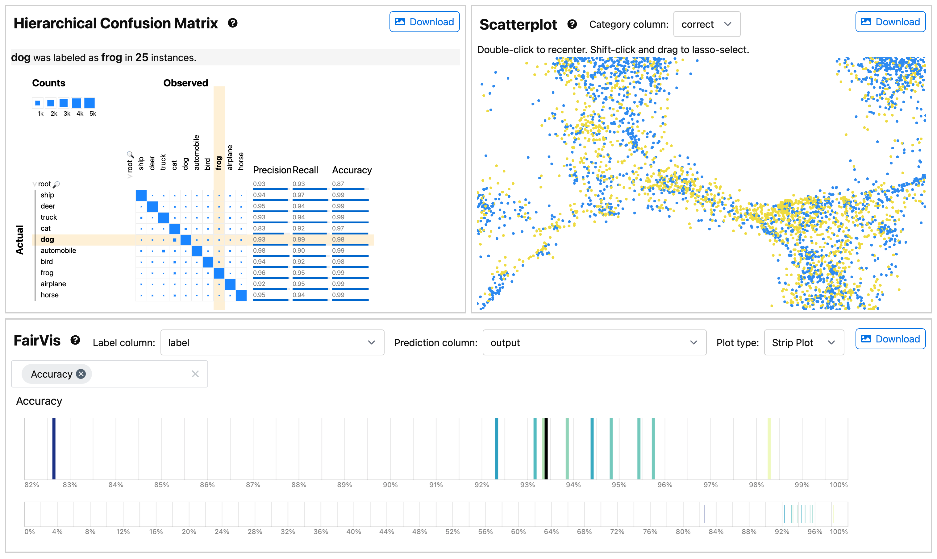
The last set of components we implemented focus on
analyzing
and debugging ML models
. The classic confusion matrix component
(I) is important for initial debugging of classification models. Other
classification tasks that use data with hierarchical or multi-label
data can be explored using a hierarchical confusion matrix com-
ponent (J). We primarily implemented this component for a team
in the participatory design sessions that was working on hierar-
chical classification models. Lastly, we built a set of visualizations
for analyzing model performance across intersectional subgroups
(G) based on a system by Cabrera et al
. [9]
. The visualization can
help users audit their models for biases, something which multiple
product teams were interested in.
We used three different methods for implementing the above
Symphony
components.
Symphony
components
are
Svelte
and
JavaScript (JS) files, so authors can create new visualizations with
their preferred front-end libraries. For components without exist-
ing libraries, we used JavaScript in combination with visualization
packages such as Vega and D3.
Symphony
can also use off-the-shelf
JS libraries, for example, we used REGL Scatterplot [
42
], a WebGL
library, to create the projection component. Lastly, since
Symphony
components are made with Svelte, we can also directly use Svelte
components, which is what we did with the Hierarchical Confusion
Matrix. These different strategies for creating components provide
the flexibility to implement custom visualizations while also allow-
ing developers to use off-the-shelf libraries and visualizations.
CHI ’22, April 29-May 5, 2022, New Orleans, LA, USA
Bäuerle and Cabrera, et al.
7
CASE STUDIES ON DEPLOYED ML SYSTEMS
Lastly, we evaluated
Symphony
with ML practitioners and stake-
holders working on real-world ML products. We worked with three
ML teams at Apple, drawn from the participatory design sessions,
to integrate
Symphony
with their data and ML pipelines. The teams
focus on different machine learning tasks, namely dataset creation
and labeling, accessibility research, and ML education. To under-
stand the affordances and limitations of
Symphony
, we conducted
think-aloud studies lasting 60 minutes where a member of each
team used
Symphony
to explore a Jupyter notebook and create a
web-based dashboard for their data and model. While field studies
like ours excel at capturing how participants actually work, this
data has to be collected opportunistically. We believe these case
studies capture the target audience of
Symphony
, cross-functional
teams working on modern ML models trained on unstructured data,
but may have some insights specific to organizational workflows.
Before the study, we sent a member of each team, the main par-
ticipant, a Jupyter notebook that imported their data and displayed
a set of
Symphony
components applicable to their domain and task.
The study was split into three main sections. For the first third of
the study, we asked the team to think aloud while the main partici-
pant used the notebook and
Symphony
components to explore the
data and model freely. In the second part of the study, we asked
the main participant to export the
Symphony
components (using a
command in the notebook) to a standalone dashboard and continue
exploring in the exported web UI. For the final part of the study,
we asked the team for feedback on
Symphony
and discussed what
types of use cases or limitations they found.
7.1
Case Study I: Validating and Sharing Data
Patterns on a Dataset Creation Team
For the first case study, we worked with a team that assembles and
labels large machine learning datasets. Their datasets are composed
of
labeled
images
and
videos
which
they
publish
to
an
internal
data repository. The team was interested in using
Symphony
in two
ways, first, using it during dataset creation to detect errors in the
data and labels, and second, as a reporting tool to give consumers
of the dataset details about the data. Given these requirements, we
loaded
Symphony
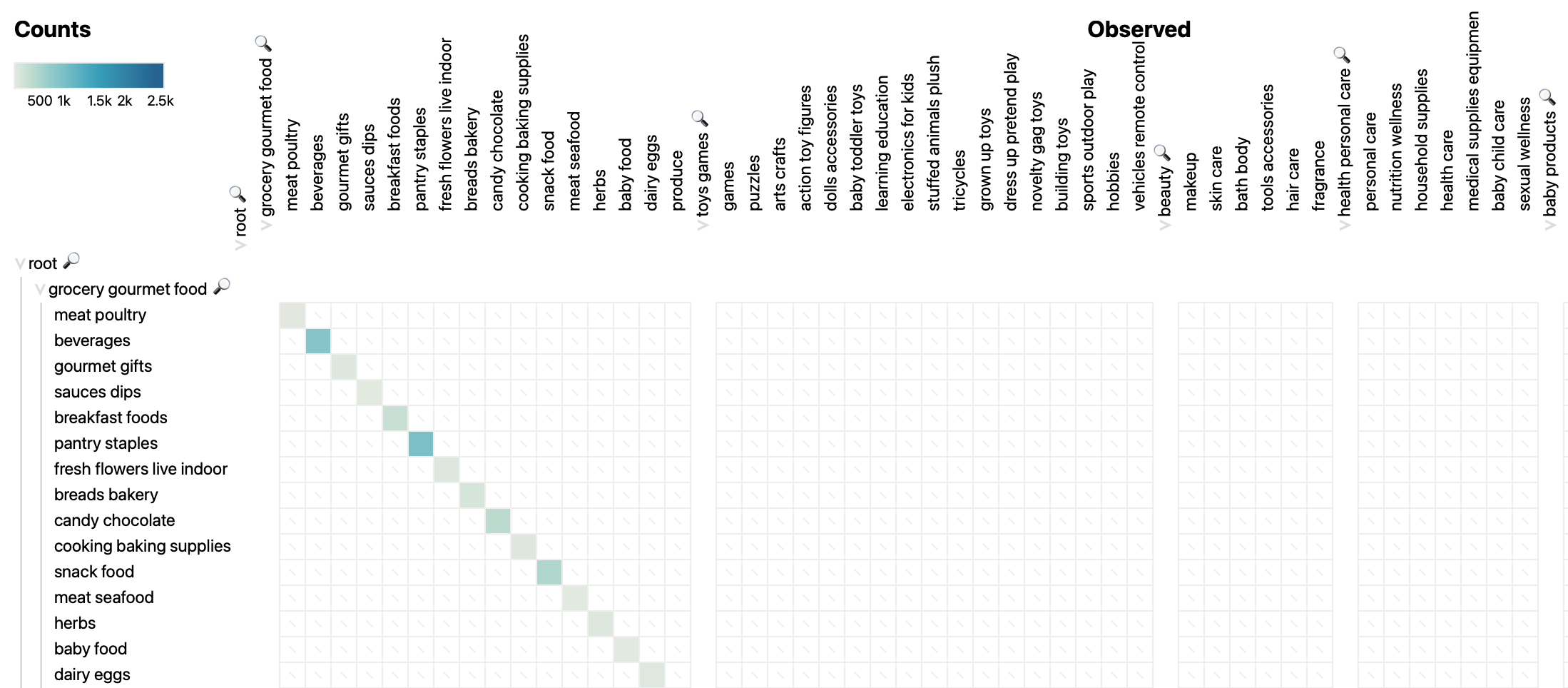
with the list (Figure 6 (B)), summary (Figure 6
(C)), duplicates (Figure 6 (F)), familiarity (Figure 6 (G)), projection
(Figure 6 (H)), and map (Figure 6 (E)) components.
The main participant started in the notebook and used multiple
components and interaction tools in concert to spot unexpected
patterns
in
their
data.
They
made
extensive
use
of
Symphony
’s
toolbar to combine filters and select subsets of data in which they
were interested. When using the notebook, they commented that
“there are a lot of neat things here, first, the filter carried over, and it
is so cool to see the data samples and metadata within the notebook.”
The synchronized, reactive state let them validate insights from the
filtered summary charts with the actual raw instance previews in
the list view. Next, the main participant moved on to the duplicates
and familiarity components, where they found a couple of labeling
errors that they suspected existed in their dataset but had not been
able to validate previously. After transitioning to the standalone
dashboard, the first component they looked at was the projection
visualization. They used the projection to find a closely clustered
group of instances where a few highlighted points that the model
had misclassified. In the standalone dashboard, they also dubbed the
map visualization
“very useful”
, especially when sharing reports
of their data collection efforts with managers or policymakers.
Overall, the team found
“a lot of value here”
when using
Sym-
phony
. They mentioned that the workflow they would most pre-
fer would be automatically generating shareable reports for every
dataset
they
published:
“programmatic
generation
and
live
visu-
alizations are awesome, being able to pop these charts into all our
READMEs would be amazing.”
They saw the standalone dashboard
that they created with
Symphony
as a
“great starting point”
for
analyzing
their
datasets,
and
that
they
could
see
people
use
the
notebooks for more detailed analysis:
“if people want to drill down
more, and get exact specific access, summon the notebook.”
Being
able to create different interfaces with subsets of visualization com-
ponents
was
important
for
them
as
well,
as
different
audiences
have different needs and they
“do not want customers to do the data
cleanup”
for them.
The team also identified usability issues and limitations in
Sym-
phony
. When initially using the projection component, the main
participant
was
not
sure
what
it
showed
and
thought
that
“this
component would need some introduction, as it has complex controls.”
They also requested additional components, such as heatmaps and
other 2D
graphs, to
do a
more detailed
analysis of
distributions.
Lastly, the main limitation for directly using
Symphony
was not
being able to attach the raw data files to a
Symphony
interface as
their data samples are often not hosted and too large to duplicate.
7.2
Case Study II: Debugging Training Data on
an Accessibility Team
In
the
second
case
study,
we
worked
with
a
team
that
uses
ML
to make software applications more accessible. They have a large
dataset of icon screenshots for which we assembled a similar set of
components to the dataset creation team. We included the summary
(Figure 6 (F)), duplicates (Figure 6 (A)), familiarity (Figure 6 (B), and
projection (Figure 6 (H)) components .
When
exploring
the
notebook,
the
participant
found
the
du-
plicates,
familiarity,
and
scatterplot
components
to
be
the
most
interesting. Since they use an automated approach to collect their
data, the participant assumed that there were likely duplicates in
the dataset but had protocols to ensure they would not be across
the training and testing set. Using the duplicates component, they
confirmed that a significant number of icons were duplicates, but
when they used the grouping interaction to split the data by test-
ing and training they found that a significant number of instances
were duplicated across the two datasets. The combination of the
duplicates visualization and grouping interaction tool helped them
discover that they
“were cheating learning on samples we test for.”
The participant identified the problematic duplicates and selected
them in the notebook to remove from the test set with a Python
command later. Next, the participant explored the familiarity com-
ponent and found a large number of similar grey icons, based on
which they wondered if
“the model might overfit on these samples.”
Finally, using the projection visualization, they found a dispersed
cluster of instances with different labels. When they selected the
group, they found that the instances were all PNG images in the
Symphony
CHI ’22, April 29-May 5, 2022, New Orleans, LA, USA
test set, while the training set only contained JPEG images. The par-
ticipant then mentioned they
“want to test their model specifically
on PNG images to assess how the model generalized.”
Overall,
the
participant
mentioned
that
they
would
“want
to
try
and
use
this
to
share
insights
within
the
team.”
Additionally,
they
found
the
notebook-based
visualizations
personally
useful
to
“look into the data,”
which they had previously done manually
using a file explorer outside of the notebook. They mentioned that
they would likely use a computational notebook to explore data,
and only use the standalone dashboards to share insights or when
they wanted more visualization space. The main feature the team
wanted was to combine data and model findings to understand the
impact of data changes:
“it would be super helpful to also add models
and combine model analysis with existing components.”
While this
analysis is possible with existing model analysis components, future
components could specifically combine data and model information.
7.3
Case Study III: Promoting Data Exploration
for ML Novices on an Education Team
For the final case study, we collaborated with a team focused on ML
education. They teach courses about ML principles and techniques
to engineers, and also teach their audience about data and model
analysis tools. They sent us a list of datasets they commonly explore
with students from which we selected two representative datasets,
one audio dataset for data analysis and one image dataset for model
analysis. For the audio dataset we used the same components as in
the previous evaluation. To support model analysis for the image
dataset, we used the summary (Figure 6 (F)), hierarchical confusion
matrix (Figure 6 (D)), FairVis (Figure 6 (K)), and projection (Figure 6
(H)) components.
The team was interested in how they could use separate com-
ponents
in
concert.
They
used
the
cross-filtering
and
grouping
heavily to combine, for example, the projection visualization with
the summary component to spot misclassified samples. They also
used the confusion matrix visualization in combination with our
filtering tool. For example, they filtered out the correctly classified
data
samples
from
the
metadata
table
to
highlight
misclassifica-
tions and described the resulting confusion matrix as
“a fantastic
graphic.”
They were also intrigued by being able to display a list
of data samples in notebooks or a standalone dashboard, as they
“constantly tell [their] students to look at a lot of examples”
but are
currently limited to seeing one or two instance at a time and
“just
graph things using matplotlib or pillow.”
Overall, the team found
Symphony
to be a valuable tool for ML
tasks and thought it could play a part in one of their lessons, as
“promoting looking at data is extremely important.”
They remarked
that
“in Python, its very easy to ignore the data, anything you can
do to bring the data to the forefront is great.”
Thus, they wanted
to use
Symphony
during their courses in multiple ways, namely
using the
“notebook for generating interfaces, then exporting them
to teach a group such that they can open the website and everyone
can explore on their own or follow my instructions.”
This way, they
hoped that
“[students] can play with it and experiment talk about
how to communicate results for ML models.”
They also particularly
liked the option to assemble visualizations, for example when their
students learn how to
“communicate findings to executives”
and
“graphing the relevant, and hiding the irrelevant.”
As
for
limitations,
they
wanted
to
be
able
to
unlink
the
state
of different components to experiment with them independently.
They also mentioned that they would like to load more data types
than just the currently implemented audio, images, and tabular data,
namely text data. While this is not possible right now,
Symphony
could
be
extended
to
more
data
types
by
augmenting
the
data
sample adapter we provide.
8
LIMITATIONS AND FUTURE WORK
In both the pilot studies and case studies, we found ways in which
Symphony
could be further improved.
Authoring components.
Symphony
components are written using
JavaScript code and web-based visualization libraries. Programming
these
visualizations
requires
expertise
in
web
development
and
visualization, which limits who can create new components. Future
work
could
explore
ways
to
lower
the
barrier
to
authoring
new
visualization components. Potential strategies to make component
creation more accessible include using grammars for interactive
graphics, such as Vega [
52
], or UI-based visualization builders like
Tableau [
43
]. Additional research would be needed to make these
tools more expressive for unstructured data and ML models.
Scaling past millions of data points.
Symphony
currently loads
the backing metadata table used for
Symphony
into web browser
memory. This scales to tens of millions of data points, which, while
sufficient for many modern ML tasks, does not cover all domains. In
our design sessions, we spoke to teams with terabyte-scale metadata
tables that do not fit in browser memory. Future work could explore
ways to support this scale while still providing direct interactivity
with
the
underlying
data
and
models.
Using
an
external
API
or
backend
for
data
processing
combined
with
more
efficient
data
queries could support massive data but would limit where the web-
based UI could be used.
Beyond conventional data science platforms.
In this work, we im-
plemented
Symphony
wrappers for computational notebooks, pro-
gramming environments, and web-based dashboards. While these
platforms cover a significant portion of where ML work happens,
future work could explore how
Symphony
could be incorporated
into other platforms, especially those which are currently isolated
from data science work. For example,
Symphony
interfaces could
be included in messaging services, documents, presentations, or
issue trackers to further bring the benefits of
Symphony
to more
people. New design studies could be conducted to understand how
users in common communication platforms like instant messaging
would benefit from and use
Symphony
components.
Guided usage of Symphony.
ML practitioners can use
Symphony
for a wide array of ML analyses, from dataset debugging to auditing
models
for
bias.
This
gamut
of
uses
stands
in
contrast
to
more
prescriptive
approaches like Datsheets [
17
], Model Cards [
46
], and
checklists [
44
] which define an ordered list of what an ML interface
should show. While ML practitioners can use
Symphony
for more
types of analyses, it does not provide any guidance to users about
which components might be the most adequate or useful for a given
CHI ’22, April 29-May 5, 2022, New Orleans, LA, USA
Bäuerle and Cabrera, et al.
task. Future work could look at combining
Symphony
s open-ended,
exploratory approach with more prescriptive guidance.
Scope of case study findings.
Lastly, our case studies were con-
ducted
with
ML
practitioners
at
a
single
institution
that
works
on
large
ML
models
trained
on
unstructured
data,
often
using
notebooks and visualization dashboards. While we believe these
tools and ML development practices exist widely in industry and
academia, we recognize some of our findings may not generalize
to other organizations or types of users such as machine learning
enthusiasts, hobbyists, or small teams. Further studies could explore
Symphony
’s affordances and drawbacks in these distinct settings.
9
DISCUSSION
Symphony
provides
a
common
substrate
for
ML
interfaces
that
enables both exploratory analysis and sharable ML interfaces. By
meeting
different
users
where
they
work,
Symphony
empowers
each member of an ML team to have direct access and knowledge
of the data and models powering an AI product.
While the case studies described scenarios where ML practition-
ers
work
in
programming
environments
and
then
transition
to
web-based UIs, we also observed in our studies that ML practition-
ers can benefit from going the opposite direction: transitioning from
a web-based UI back to a programming environment. When a user
finds an interesting insight in a standalone
Symphony
dashboard,
they
can
copy
their
findings
to
the
programming
environments
along with state variables like filters and groups. Existing analysis
tooling often suffers from an “expressiveness cliff”, where only a
fixed set of visualizations and data manipulations is available.
Sym-
phony
allows users to return to programming environments where
they have more flexible analysis tools.
ML practitioners’ desire to use
Symphony
for exploration could
also
encourage
them
to
share
their
insights
more
frequently.
If
ML practitioners are using a set of
Symphony
components for ex-
ploratory
analysis
in
a
notebook,
no
additional
work
is
needed
for
them
to
export
it
as
a
standalone,
shareable
UI.
Participants
mentioned the ability to programmatically combine components
as a major benefit, allowing them to go from exploration to an in-
teractive, web-based UI without using a different tool. Additionally,
Symphony
interfaces can be redeployed continuously whenever the
data and model are updated, supporting ML tasks with streaming
data or automatic model retraining.
By integrating with existing data science platforms,
Symphony
could also encourage broader use of task-specific ML visualizations.
ML visualization systems are often implemented as one-off web
dashboards [
1
,
9
,
10
,
22
,
39
,
64
] that require users to wrangle and
export
their
data
into
systems
separate
from
where
they
do
ML
development.
Symphony
includes task-specific visualization com-
ponents
directly
in
data
since
platforms
like
Jupyter
notebooks,
and the components can consume data from standard data APIs
like Pandas Data Frames. In turn, implementing ML visualizations
as independent components in a framework like
Symphony
could
increase their use and longevity.
Beyond helping individuals understand ML systems,
Symphony
is intended to foster a shared organizational understanding [
69
]
between
stakeholders
on
an
ML
team.
Symphony
interfaces
act
as
boundary objects
for large, cross-functional ML teams. Bound-
ary objects are artifacts that are
“both plastic enough to adapt to
local needs and the constraints of the several parties employing them,
yet robust enough to maintain a common identity across sites”
[
56
].
Symphony
can serve as a boundary object for ML teams, providing
interfaces that adapt to the different needs of stakeholders. At the
same time,
“The creation and management of boundary objects is
a
key
process
in
developing
and
maintaining
coherence
across
in-
tersecting social worlds”
[
56
].
Symphony
aids in this creation and
management process, bridging the gap between the intersecting
worlds of different ML stakeholders such as engineers, designers,
and product managers.
10
CONCLUSION
In this work, we designed and implemented
Symphony
, a frame-
work
for
composing
interactive
ML
interfaces
with
data-driven,
task-specific visualization components.
Symphony
’s visualizations
helped ML teams find important issues such as data duplicates and
model blind spots. Additionally, We found that by providing ML
interfaces
in
the
data
science
platforms
where
ML
practitioners
work,
Symphony
can encourage ML practitioners to
want
to use
and share insights. With data-driven components that diverse stake-
holders across an ML team can use,
Symphony
fosters a culture of
shared ML understanding and encourages the creation of accurate,
responsible, and robust AI products.
ACKNOWLEDGMENTS
We thank our colleagues at Apple for their time and effort integrat-
ing our research with their work. We especially thank Kayur Patel
for his guidance and Mary Beth Kery for her generosity reviewing
early drafts of this work.
REFERENCES
[1]
Yongsu
Ahn
and
Yu-Ru
Lin.
2019.
Fairsight:
Visual
analytics
for
fairness
in
decision making.
IEEE Transactions on Visualization and Computer Graphics
26, 1
(2019), 1086–1095.
[2]
Robert Amar, James Eagan, and John Stasko. 2005.
Low-level components of
analytic activity in information visualization. In
IEEE Symposium on Information
Visualization, INFO VIS
. IEEE, 111–117.
[3]
Saleema Amershi, Max Chickering, Steven M Drucker, Bongshin Lee, Patrice
Simard, and Jina Suh. 2015.
Modeltracker: Redesigning performance analysis
tools for machine learning. In
Proceedings of the 33rd Annual ACM Conference on
Human Factors in Computing Systems
. 337–346.
[4]
Matthew Arnold, Rachel KE Bellamy, Michael Hind, Stephanie Houde, Sameep
Mehta, Aleksandra Mojsilović, Ravi Nair, K Natesan Ramamurthy, Alexandra
Olteanu, David Piorkowski, et al
.
2019.
FactSheets: Increasing trust in AI services
through
supplier’s
declarations
of
conformity.
IBM
Journal
of
Research
and
Development
63, 4/5 (2019), 6–1.
[5]
Andrea Batch, Niklas Elmqvist, and Senior Member. 2018.
The interactive visual-
ization gap in initial exploratory data analysis.
IEEE Transactions on Visualization
and Computer Graphics
24 (2018), 278–287.
[6]
Alex Bäuerle, Heiko Neumann, and Timo Ropinski. 2020.
Classifier-guided visual
correction of noisy labels for image classification tasks. In
Computer Graphics
Forum
, Vol. 39. Wiley Online Library, 195–205.
[7]
Emily
M
Bender
and
Batya
Friedman.
2018.
Data
statements
for
natural
lan-
guage processing: Toward mitigating system bias and enabling better science.
Transactions of the Association for Computational Linguistics
6 (2018), 587–604.
[8]
Joy Buolamwini and Timnit Gebru. 2018.
Gender shades: Intersectional accu-
racy disparities in commercial gender classification. In
Conference on Fairness,
Accountability and Transparency
. PMLR, 77–91.
[9]
Ángel Alexander Cabrera, Will Epperson, Fred Hohman, Minsuk Kahng, Jamie
Morgenstern, and Duen Horng Chau. 2019.
FairVis: Visual analytics for discov-
ering intersectional bias in machine learning. In
2019 IEEE Conference on Visual
Analytics Science and Technology
. IEEE, 46–56.
Symphony
CHI ’22, April 29-May 5, 2022, New Orleans, LA, USA
[10]
Dylan Cashman, Adam Perer, Remco Chang, and Hendrik Strobelt. 2019.
Ablate,
variate, and contemplate: Visual analytics for discovering neural architectures.
IEEE Transactions on Visualization and Computer Graphics
26, 1 (2019), 863–873.
[11]
Changjian Chen, Jun Yuan, Yafeng Lu, Yang Liu, Hang Su, Songtao Yuan, and
Shixia Liu. 2020.
Oodanalyzer: Interactive analysis of out-of-distribution samples.
IEEE Transactions on Visualization and Computer Graphics
27, 7 (2020), 3335–3349.
[12]
Nan-Chen Chen, Jina Suh, Johan Verwey, Gonzalo Ramos, Steven Drucker, and
Patrice Simard. 2018. AnchorViz: Facilitating classifier error discovery through in-
teractive semantic data exploration. In
23rd International Conference on Intelligent
User Interfaces
. 269–280.
[13]
European Commission. 2019.
Ethics guidelines for trustworthy AI
.
https://digital-
strategy.ec.europa.eu/en/library/ethics-guidelines-trustworthy-ai
[14]
Robert A DeLine. 2021.
Glinda: Supporting data science with live programming,
GUIs and a Domain-specific Language. In
Proceedings of the 2021 CHI Conference
on Human Factors in Computing Systems
. 1–11.
[15]
Luciano Floridi. 2019.
Establishing the rules for building trustworthy AI.
Nature
Machine Intelligence
1, 6 (2019), 261–262.
[16]
Jules Françoise, Baptiste Caramiaux, and Téo Sanchez. 2021. Marcelle: Composing
interactive machine learning workflows and interfaces. In
The 34th Annual ACM
Symposium on User Interface Software and Technology
. 39–53.
[17]
Timnit Gebru, Jamie Morgenstern, Briana Vecchione, Jennifer Wortman Vaughan,
Hanna Wallach, Hal Daumé Iii, and Kate Crawford. 2021.
Datasheets for datasets.
Commun. ACM
64, 12 (2021), 86–92.
[18]
Andrew Head, Fred Hohman, Titus Barik, Steven M Drucker, and Robert DeLine.
2019.
Managing messes in computational notebooks. In
Proceedings of the 2019
CHI Conference on Human Factors in Computing Systems
. 1–12.
[19]
Lisa
Anne
Hendricks,
Kaylee
Burns,
Kate
Saenko,
Trevor
Darrell,
and
Anna
Rohrbach. 2018.
Women also snowboard: Overcoming bias in captioning models.
In
Proceedings of the European Conference on Computer Vision
. 771–787.
[20]
Andreas
Hinterreiter,
Peter
Ruch,
Holger
Stitz,
Martin
Ennemoser,
Jurgen
Bernard,
Hendrik
Strobelt,
and
Marc
Streit.
2020.
Confusionflow:
A
model-
agnostic visualization for temporal analysis of classifier confusion.
IEEE Transac-
tions on Visualization and Computer Graphics
(2020).
[21]
Fred Hohman, Minsuk Kahng, Robert Pienta, and Duen Horng Chau. 2018. Visual
analytics in deep learning: An interrogative survey for the next frontiers.
IEEE
Transactions on Visualization and Computer Graphics
(2018).
https://doi.org/10.
1109/TVCG.2018.2843369
[22]
Fred Hohman, Haekyu Park, Caleb Robinson, and Duen Horng Polo Chau. 2019.
Summit:
Scaling
deep
learning
interpretability
by
visualizing
activation
and
attribution summarizations.
IEEE Transactions on Visualization and Computer
Graphics
26, 1 (2019), 1096–1106.
[23]
Sarah Holland, Ahmed Hosny, Sarah Newman, Joshua Joseph, and Kasia Chmielin-
ski. 2018.
The dataset nutrition label: A framework to drive higher data quality
standards.
arXiv preprint arXiv:1805.03677
(2018).
[24]
Holoviz. 2021.
Panel
.
https://panel.holoviz.org/
[25]
J. D. Hunter. 2007.
Matplotlib: A 2D graphics environment.
Computing in Science
& Engineering
9, 3 (2007), 90–95.
https://doi.org/10.1109/MCSE.2007.55
[26]
DataBricks Inc. 2021.
DataBricks
.
https://databricks.com/
[27]
Google Inc. 2021.
Facets
.
https://pair-code.github.io/facets/
[28]
Google Inc. 2021.
Know Your Data
.
https://knowyourdata.withgoogle.com/
[29]
Observable Inc. 2021.
Observable
.
https://observablehq.com/
[30]
Plotly Technologies Inc. 2015.
Collaborative data science
.
Montreal, QC.
https:
//plot.ly
[31]
Streamlit Inc. 2021.
Streamlit
.
https://streamlit.io/
[32]
Jupyter. 2021.
IPyWidgets
.
https://ipywidgets.readthedocs.io/en/stable/
[33]
Minsuk Kahng, Pierre Y. Andrews, Aditya Kalro, and Duen Horng Polo Chau.
2018.
ActiVis: Visual exploration of industry-scale deep neural network models.
IEEE Transactions on Visualization and Computer Graphics
24 (2018), 88–97.
Issue
1.
https://doi.org/10.1109/TVCG.2017.2744718
[34]
Minsuk Kahng, Dezhi Fang, and Duen Horng Chau. 2016.
Visual exploration of
machine learning results using data cube analysis.
HILDA 2016 - Proceedings of
the Workshop on Human-In-the-Loop Data Analytics
(2016).
https://doi.org/10.
1145/2939502.2939503
[35]
Mary Beth Kery, Marissa Radensky, Mahima Arya, Bonnie E John, and Brad A
Myers. 2018.
The story in the notebook: Exploratory data science using a literate
programming tool. In
Proceedings of the 2018 CHI Conference on Human Factors
in Computing Systems
. 1–11.
[36]
Mary Beth Kery, Donghao Ren, Fred Hohman, Dominik Moritz, Kanit Wong-
suphasawat, and Kayur Patel. 2020.
mage: Fluid moves between code and graph-
ical work in computational notebooks. In
Proceedings of the 33rd Annual ACM
Symposium on User Interface Software and Technology
. 140–151.
[37]
Thomas
Kluyver,
Benjamin
Ragan-Kelley,
Fernando
Pérez,
Brian
Granger,
Matthias
Bussonnier,
Jonathan
Frederic,
Kyle
Kelley,
Jessica
Hamrick,
Jason
Grout,
Sylvain
Corlay,
Paul
Ivanov,
Damián
Avila,
Safia
Abdalla,
and
Carol
Willing. 2016.
Jupyter Notebooks – a publishing format for reproducible com-
putational workflows. In
Positioning and Power in Academic Publishing: Players,
Agents and Agendas
, F. Loizides and B. Schmidt (Eds.). IOS Press, 87 – 90.
[38]
Laura Koesten, Emilia Kacprzak, Jeni Tennison, and Elena Simperl. 2019.
Col-
laborative practices with structured data: Do tools support what users need?. In
Proceedings of the 2019 CHI Conference on Human Factors in Computing Systems
.
1–14.
[39]
Josua Krause, Adam Perer, and Kenney Ng. 2016.
Interacting with predictions:
Visual inspection of black-box machine learning models. In
Proceedings of the
2016 CHI Conference on Human Factors in Computing Systems
. 5686–5697.
[40]
Alex Krizhevsky, Geoffrey Hinton, et al
.
2009. Learning multiple layers of features
from tiny images.
(2009).
[41]
Doris Jung-Lin Lee, Dixin Tang, Kunal Agarwal, Thyne Boonmark, Caitlyn Chen,
Jake Kang, Ujjaini Mukhopadhyay, Jerry Song, Micah Yong, Marti A. Hearst, and
Aditya G. Parameswaran. 2022.
Lux: Always-on visualization recommendations
for exploratory data science.
Proceedings of the VLDB Endowment
15, 3 (2022),
727–738.
[42]
Fritz
Lekschas.
2021.
Regl
Scatterplot
.
https://github.com/flekschas/regl-
scatterplot
[43]
Tableau Software LLC. 2021.
Tableau
.
https://www.tableau.com/
[44]
Michael A Madaio, Luke Stark, Jennifer Wortman Vaughan, and Hanna Wallach.
2020.
Co-designing
checklists
to
understand
organizational
challenges
and
opportunities around fairness in ai. In
Proceedings of the 2020 CHI Conference on
Human Factors in Computing Systems
. 1–14.
[45]
Wes McKinney et al
.
2010.
Data structures for statistical computing in python. In
Proceedings of the 9th Python in Science Conference
, Vol. 445. Austin, TX, 51–56.
[46]
Margaret Mitchell, Simone Wu, Andrew Zaldivar, Parker Barnes, Lucy Vasserman,
Ben Hutchinson, Elena Spitzer, Inioluwa Deborah Raji, and Timnit Gebru. 2019.
Model cards for model reporting. In
Proceedings of the Conference on Fairness,
Accountability, and Transparency
. 220–229.
[47]
Luke Oakden-Rayner, Jared Dunnmon, Gustavo Carneiro, and Christopher Ré.
2020.
Hidden
stratification
causes
clinically
meaningful
failures
in
machine
learning for medical imaging. In
Proceedings of the ACM Conference on Health,
Inference, and Learning
. 151–159.
[48]
Kayur Patel, Naomi Bancroft, Steven M Drucker, James Fogarty, Andrew J Ko,
and James Landay. 2010.
Gestalt: Integrated support for implementation and
analysis in machine learning. In
Proceedings of the 23nd annual ACM Symposium
on User Interface Software and Technology
. 37–46.
[49]
Plotly. 2021.
Dash
.
https://plotly.com/dash/
[50]
Donghao Ren, Saleema Amershi, Bongshin Lee, Jina Suh, and Jason D. Williams.
2017.
Squares: Supporting interactive performance analysis for multiclass classi-
fiers.
IEEE Transactions on Visualization and Computer Graphics
23 (2017), 61–70.
Issue 1.
https://doi.org/10.1109/TVCG.2016.2598828
[51]
Dominik Sacha, Michael Sedlmair, Leishi Zhang, John A Lee, Jaakko Peltonen,
Daniel Weiskopf, Stephen C North, and Daniel A Keim. 2017. What you see is what
you can change: Human-centered machine learning by interactive visualization.
Neurocomputing
268 (2017), 164–175.
[52]
Arvind Satyanarayan, Ryan Russell, Jane Hoffswell, and Jeffrey Heer. 2015.
Reac-
tive vega: A streaming dataflow architecture for declarative interactive visual-
ization.
IEEE Transactions on Visualization and Computer Graphics
22, 1 (2015),
659–668.
[53]
Ben Shneiderman. 2020. Bridging the gap between ethics and practice: Guidelines
for reliable, safe, and trustworthy Human-Centered AI systems.
ACM Transactions
on Interactive Intelligent Systems
10, 4 (2020), 1–31.
[54]
Jake Silberg and James Manyika. 2019.
Notes from the AI frontier: Tackling bias
in AI (and in humans).
McKinsey Global Institute (June 2019)
(2019).
[55]
Jacob Snow. 2018.
Amazon’s face recognition falsely matched 28 members of
congress with mugshots.
American Civil Liberties Union
28 (2018).
[56]
Susan Leigh Star and James R Griesemer. 1989.
Institutional ecology,translations’
and
boundary
objects:
Amateurs
and
professionals
in
Berkeley’s
Museum
of
Vertebrate Zoology, 1907-39.
Social Studies of Science
19, 3 (1989), 387–420.
[57]
Hendrik Strobelt, Sebastian Gehrmann, Michael Behrisch, Adam Perer, Hanspeter
Pfister, and Alexander M. Rush. 2019.
Seq2seq-Vis: A visual debugging tool for
sequence-to-sequence models. In
IEEE Transactions on Visualization and Computer
Graphics
, Vol. 25. 353–363.
https://doi.org/10.1109/TVCG.2018.2865044
[58]
Jacob VanderPlas, Brian Granger, Jeffrey Heer, Dominik Moritz, Kanit Wong-
suphasawat, Arvind Satyanarayan, Eitan Lees, Ilia Timofeev, Ben Welsh, and Scott
Sievert. 2018.
Altair: Interactive statistical visualizations for python.
Journal of
Open Source Software
3 (2018), 1057.
Issue 32.
https://doi.org/10.21105/joss.01057
[59]
Alfredo Vellido. 2020.
The importance of interpretability and visualization in
machine learning for applications in medicine and health care.
Neural Computing
and Applications
32, 24 (2020), 18069–18083.
[60]
Voila. 2021.
Voila
.
https://github.com/voila-dashboards/voila
[61]
Angelina Wang, Arvind Narayanan, and Olga Russakovsky. 2020.
REVISE: A
tool for measuring and mitigating bias in visual datasets. In
European Conference
on Computer Vision
. Springer, 733–751.
[62]
James Wexler, Mahima Pushkarna, Tolga Bolukbasi, Martin Wattenberg, Fernanda
Viegas, and Jimbo Wilson. 2020.
The what-if tool: Interactive probing of machine
learning models.
IEEE Transactions on Visualization and Computer Graphics
26
(2020), 56–65.
Issue 1.
https://doi.org/10.1109/TVCG.2019.2934619

CHI ’22, April 29-May 5, 2022, New Orleans, LA, USA
Bäuerle and Cabrera, et al.
[63]
Benjamin Wilson, Judy Hoffman, and Jamie Morgenstern. 2019.
Predictive in-
equity in object detection.
arXiv preprint arXiv:1902.11097
(2019).
[64]
Tongshuang Wu, Marco Tulio Ribeiro, Jeffrey Heer, and Daniel S Weld. 2019.
Errudite: Scalable, reproducible, and testable error analysis. In
Proceedings of the
57th Annual Meeting of the Association for Computational Linguistics
. 747–763.
[65]
Yifan Wu, Joseph M Hellerstein, and Arvind Satyanarayan. 2020.
B2: Bridging
code and interactive visualization in computational notebooks. In
Proceedings
of the 33rd Annual ACM Symposium on User Interface Software and Technology
.
152–165.
[66]
Shouxing
Xiang,
Xi
Ye,
Jiazhi
Xia,
Jing
Wu,
Yang
Chen,
and
Shixia
Liu.
2019.
Interactive correction of mislabeled training data. In
2019 IEEE Conference on
Visual Analytics Science and Technology
. IEEE, 57–68.
[67]
Ji Soo Yi, Youn ah Kang, John Stasko, and Julie A Jacko. 2007.
Toward a deeper
understanding
of
the
role
of
interaction
in
information
visualization.
IEEE
Transactions on Visualization and Computer Graphics
13, 6 (2007), 1224–1231.
[68]
J M Zhang, M Harman, L Ma, and Y Liu. 2020.
Machine learning testing: Survey,
landscapes and horizons.
IEEE Transactions on Software Engineering
(2020), 1.
https://doi.org/10.1109/TSE.2019.2962027
[69]
Ángel Cabrera and Elizabeth F. Cabrera. 2002.
Knowledge-sharing dilemmas.
Or-
ganization Studies
23, 687–710. Issue 5.
https://doi.org/10.1177/0170840602235001