

Journal of Physics: Conference Series
PAPER •
OPEN ACCESS
Data Visualization in Splunk and Tableau: A Case Study Demonstration
To cite this article: N Balaji
et al
2021
J. Phys.: Conf. Ser.
1767
012008
View the
article online
for updates and enhancements.
This content was downloaded from IP address 1.39.167.109 on 21/02/2021 at 04:39
Content from this work may be used under the terms of the
Creative Commons Attribution 3.0 licence
.
Any further distribution
of this work must maintain attribution to the author(s) and the title of the work, journal citation and DOI.
Published under licence by IOP Publishing Ltd
ICDIIS 2020
Journal of Physics: Conference Series
1767
(2021) 012008
IOP Publishing
doi:10.1088/1742-6596/1767/1/012008
1
Data Visualization in Splunk and Tableau: A Case Study
Demonstration
Balaji N
1
, Karthik Pai B H
2
, Bhaskar Bhat
3
, Barmavatu Praveen
4
1,2,3
Department of Information Science and Engineering, NMAM Institute of Technology, Nitte
4
Department of Mechanical Engineering, Anurag University, Venkatapur
balaji.hiriyur@gmail.com
,
karthikpai@nitte.edu.in
,
bhaskarbhatkr07@gmail.com
,
praveen205.bps@gmail.com
,
Abstract
. This article mainly deals with data analytics and visualization techniques. Data
visualization techniques helps user to understand the data in a faster and easier way. Any data
which is in the form of text is difficult to analyse in a short period of time, so using some
colours or visualization techniques like bar chart, scattered plots will give a better
understanding of any data in a glance. Using this technique we can analyse the data in a faster
way and also represent a data in a batter way. Apart from data visualization, this internship
focused on handling machine generated log data. Most of the time machines will generate
some kind of log data in response to our actions, which is very difficult to understand. A study
says that in the present world, machines will generate large amount of data, which are difficult
to understand and analysing this data can be used for the betterment of the business or to invent
new things. So to understand this machine generated data there is requirement of some
experience with the process and also using of the tools, we can make the machine generated
data divide into events and represent it in an easy and understandable manner.
1. Introduction
In this paper we have worked in the field of data analytics and visualization. Data visualization is
nothing but, representing data in a visual form. This visual form can be a chart, graphs, lists or a map
etc. Data analytics is the method of examining data sets (structured or unstructured) in order to get
useful insights to draw conclusions about the data-sets. Following are the tools used for analyzing and
visualizing the data-sets.
2. Tableau
Tableau
is a data visualization and Business intelligence software helps organization make better
decisions, by providing good visualization dashboards. It is in a great demand in the field of data
science and visualization. Some study says that
Tableau
is the eighth most commonly listed
technology skill in data scientist job listings.
Tableau
is a powerful and fastest growing data
visualization tool used in the Business Intelligence Industry. It helps in simplifying raw data into the
very easily understandable format. Data analysis is very fast with
Tableau
and the visualizations
created are in the form of dashboards and worksheets. Few significant usage of $Tableau$ are listed as
follows.
-
Tableau
software is used to translate queries into visualization.
-
It is used for managing metadata.
-
Tableau software imports data of all sizes and ranges.
-
For a non-technical user, Tableau is a life saver as it offers the facility to create ‘no-code’ data
queries.
3. Splunk
Splunk
is a searching and reporting application and this software is basically used for searching,
monitoring and analysing the machine generated by big data. This
Splunk
captures, indexes, and
ICDIIS 2020
Journal of Physics: Conference Series
1767
(2021) 012008
IOP Publishing
doi:10.1088/1742-6596/1767/1/012008
2
correlates real time data in a searchable repository from where it can generate graphs, reports, alerts,
dashboards and visualization. This is further used to identify data patterns, providing metrics,
diagnosing problems and providing intelligence for business operations. In this we have used
Splunk
enterprise application.
3.1 Features of Splunk
-
Indexing -
Splunk
Enterprise indexes the data that makes up the IT infrastructure. We can
source data from websites, applications, servers, databases, operating systems, and more.
-
Searching - search is the primary way users navigate their data in
Splunk
Enterprise. We can
save a search as a report and use it to power dashboard panels. Searches provide insight from
your data, such as, retrieving events from the index, calculating metrics, searching for specific
conditions within a rolling time window, identifying patterns in your data, predicting future
trends.
-
Dashboard - Dashboards contain panels of modules like search boxes, fields, charts, and so on.
Dashboard panels are usually connected to saved searches or pivots. They display the results
of completed searches and data from real-time searches that run in the background.
-
Reports -
Splunk
Enterprise allows you to save searches and pivots as reports, and then add
reports to dashboards as dashboard panels. Run reports on an adhoc basis, schedule them to
run on a regular interval, or set a scheduled report to generate alerts when the result meets
particular conditions.
3.2 Development of Splunk Enterprise Application
Splunk
enterprise can collect the data from anywhere whether the data is local, remote or in the cloud.
This performs three main functions while processing the data.
-
Intakes data from files.
-
Parses and index the data collected.
-
Run searches on the indexed data.
Splunk
Enterprise application can be deployed in two different ways.
1.
Single Instance Deployment - Single instance deployment - in small deployments, one
instance of
Splunk
Enterprise handles all aspects of processing data, from input through
indexing to search. A single-instance deployment can be useful for testing and evaluation
purposes and might serve the needs of department-sized environments.
2.
Distributed deployment - to support larger environments where data originates on many
machines, where you need to process large volumes of data, or where many users need to
search the data, you can scale the deployment by distributing
Splunk
Enterprise instances
across multiple machines. In a typical distributed deployment, each
Splunk
Enterprise instance
performs a specialized task and resides on one of three processing tiers corresponding to the
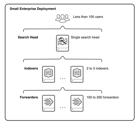
main processing functions like Data input tier, indexer tier, and search management tier.
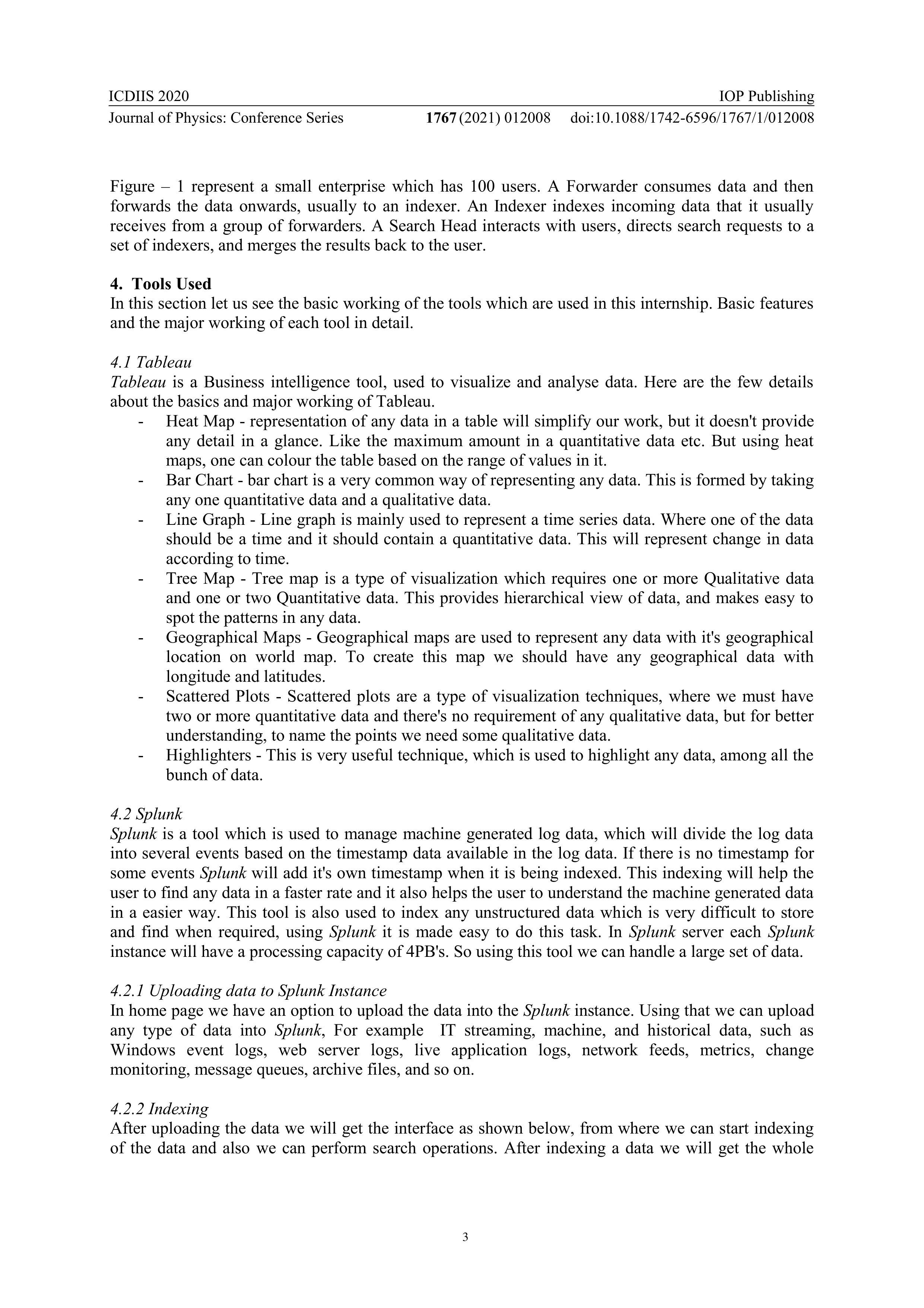
Figure 1
. Small Enterprise Application
ICDIIS 2020
Journal of Physics: Conference Series
1767
(2021) 012008
IOP Publishing
doi:10.1088/1742-6596/1767/1/012008
3
Figure – 1 represent a small enterprise which has 100 users. A Forwarder consumes data and then
forwards the data onwards, usually to an indexer. An Indexer indexes incoming data that it usually
receives from a group of forwarders. A Search Head interacts with users, directs search requests to a
set of indexers, and merges the results back to the user.
4. Tools Used
In this section let us see the basic working of the tools which are used in this internship. Basic features
and the major working of each tool in detail.
4.1 Tableau
Tableau
is a Business intelligence tool, used to visualize and analyse data. Here are the few details
about the basics and major working of Tableau.
-
Heat Map - representation of any data in a table will simplify our work, but it doesn't provide
any detail in a glance. Like the maximum amount in a quantitative data etc. But using heat
maps, one can colour the table based on the range of values in it.
-
Bar Chart - bar chart is a very common way of representing any data. This is formed by taking
any one quantitative data and a qualitative data.
-
Line Graph - Line graph is mainly used to represent a time series data. Where one of the data
should be a time and it should contain a quantitative data. This will represent change in data
according to time.
-
Tree Map - Tree map is a type of visualization which requires one or more Qualitative data
and one or two Quantitative data. This provides hierarchical view of data, and makes easy to
spot the patterns in any data.
-
Geographical Maps - Geographical maps are used to represent any data with it's geographical
location on world map. To create this map we should have any geographical data with
longitude and latitudes.
-
Scattered Plots - Scattered plots are a type of visualization techniques, where we must have
two or more quantitative data and there's no requirement of any qualitative data, but for better
understanding, to name the points we need some qualitative data.
-
Highlighters - This is very useful technique, which is used to highlight any data, among all the
bunch of data.
4.2 Splunk
Splunk
is a tool which is used to manage machine generated log data, which will divide the log data
into several events based on the timestamp data available in the log data. If there is no timestamp for
some events
Splunk
will add it's own timestamp when it is being indexed. This indexing will help the
user to find any data in a faster rate and it also helps the user to understand the machine generated data
in a easier way. This tool is also used to index any unstructured data which is very difficult to store
and find when required, using
Splunk
it is made easy to do this task. In
Splunk
server each
Splunk
instance will have a processing capacity of 4PB's. So using this tool we can handle a large set of data.
4.2.1 Uploading data to Splunk Instance
In home page we have an option to upload the data into the
Splunk
instance. Using that we can upload
any type of data into
Splunk
, For example IT streaming, machine, and historical data, such as
Windows event logs, web server logs, live application logs, network feeds, metrics, change
monitoring, message queues, archive files, and so on.
4.2.2 Indexing
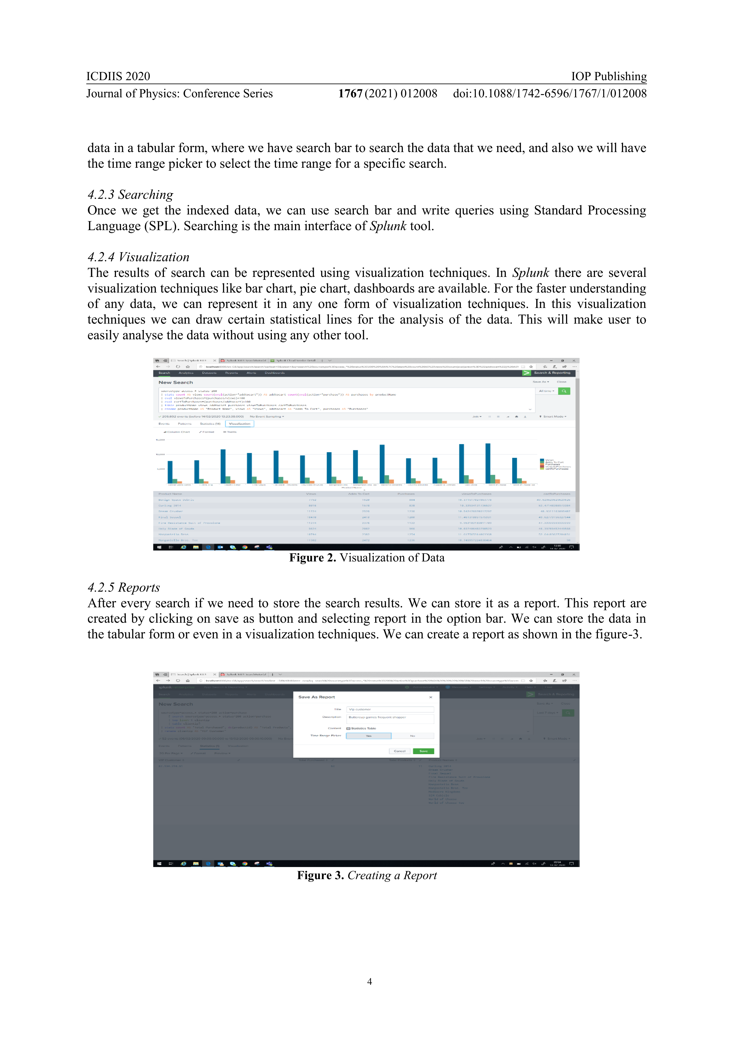
After uploading the data we will get the interface as shown below, from where we can start indexing
of the data and also we can perform search operations. After indexing a data we will get the whole
ICDIIS 2020
Journal of Physics: Conference Series
1767
(2021) 012008
IOP Publishing
doi:10.1088/1742-6596/1767/1/012008
4
data in a tabular form, where we have search bar to search the data that we need, and also we will have
the time range picker to select the time range for a specific search.
4.2.3 Searching
Once we get the indexed data, we can use search bar and write queries using Standard Processing
Language (SPL). Searching is the main interface of
Splunk
tool.
4.2.4 Visualization
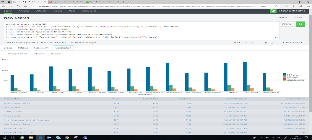
The results of search can be represented using visualization techniques. In
Splunk
there are several
visualization techniques like bar chart, pie chart, dashboards are available. For the faster understanding
of any data, we can represent it in any one form of visualization techniques. In this visualization
techniques we can draw certain statistical lines for the analysis of the data. This will make user to
easily analyse the data without using any other tool.
Figure 2.
Visualization of Data
4.2.5 Reports
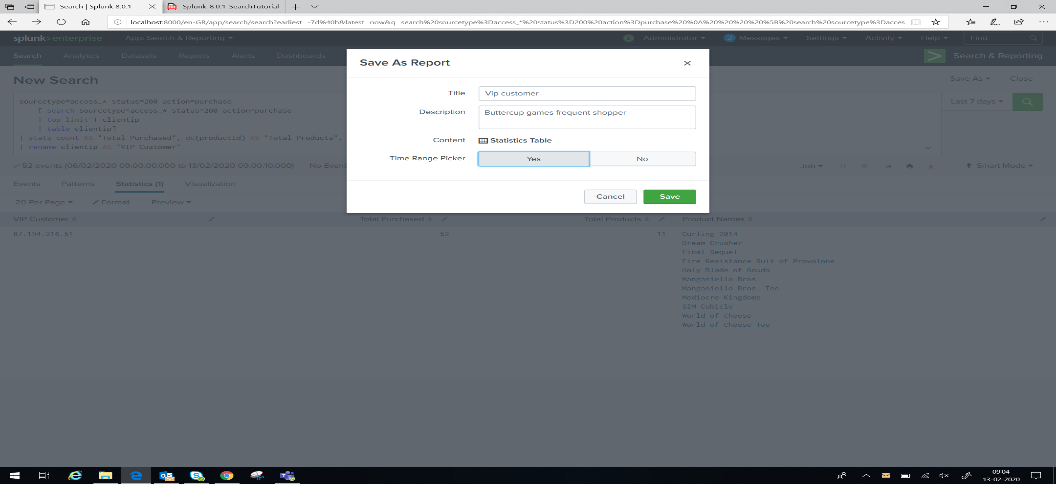
After every search if we need to store the search results. We can store it as a report. This report are
created by clicking on save as button and selecting report in the option bar. We can store the data in
the tabular form or even in a visualization techniques. We can create a report as shown in the figure-3.
Figure 3.
Creating a Report
ICDIIS 2020
Journal of Physics: Conference Series
1767
(2021) 012008
IOP Publishing
doi:10.1088/1742-6596/1767/1/012008
5
4.2.6 Final Report
After creating a report, we can use search bar to search any data within the report. This will make easy
for user to find the data in a short period of time. Here even we get time range picker for selecting the
time range for the search results, where we need a specific information.
4.2.7 Creating Dashboards
We can even create dashboards using
Splunk
. Where we select the already saved reports which we
need to show in the dashboard and we can create a dashboard. Even this is achieved by clicking on
save as button, and selecting dashboard in the option bar. This will be very good way to represent a
data, where we can get multiple view of a data in a single worksheet.
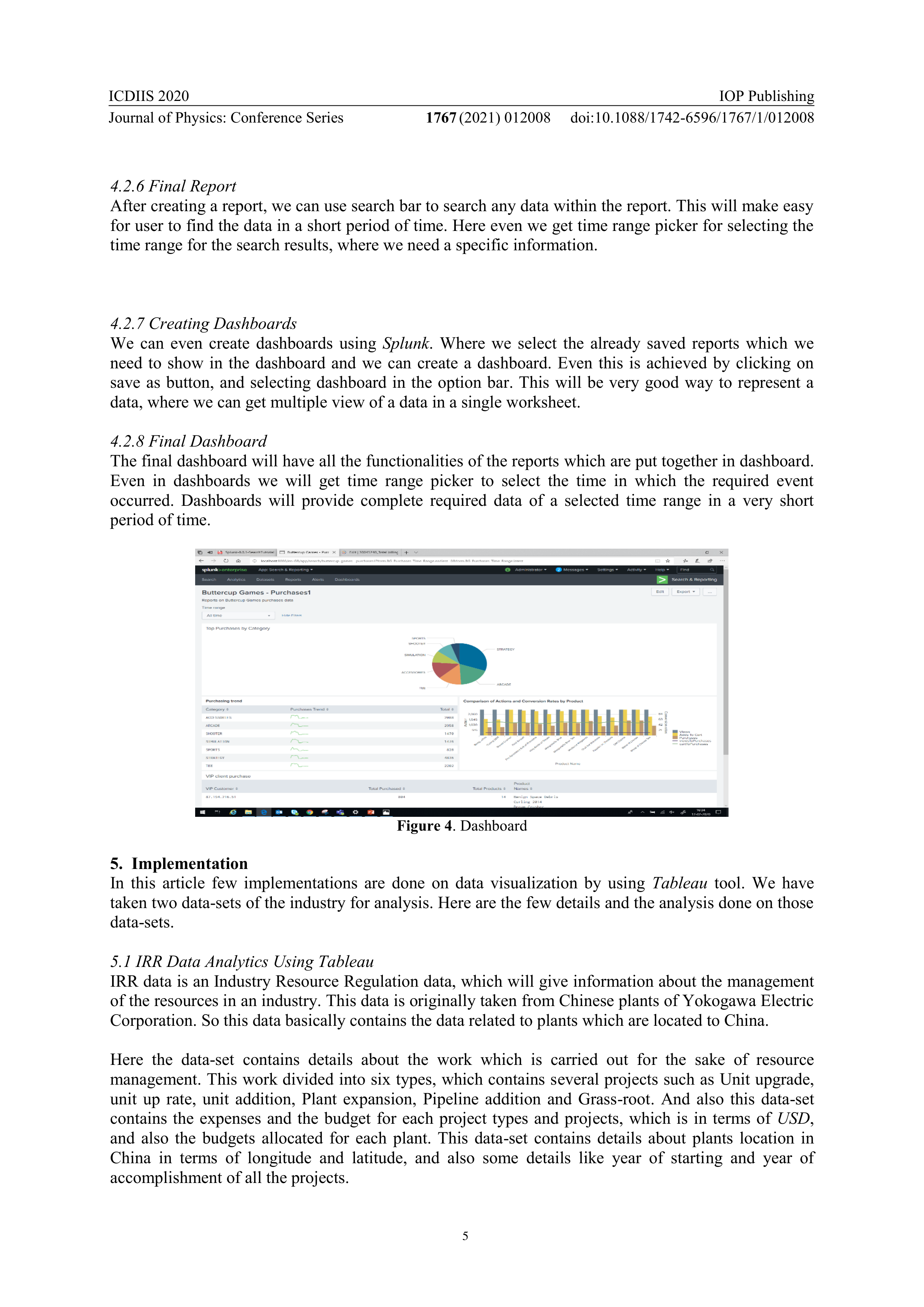
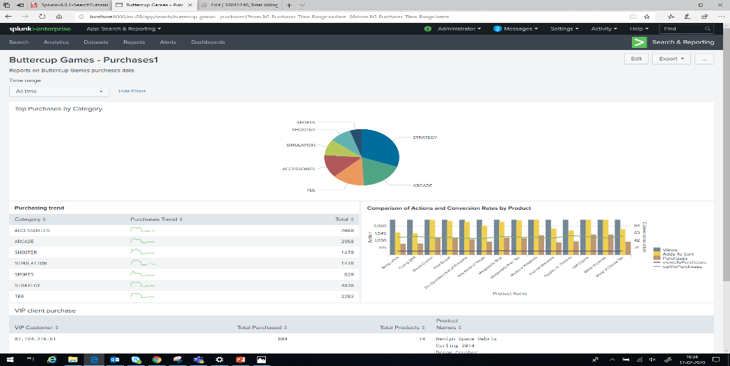
4.2.8 Final Dashboard
The final dashboard will have all the functionalities of the reports which are put together in dashboard.
Even in dashboards we will get time range picker to select the time in which the required event
occurred. Dashboards will provide complete required data of a selected time range in a very short
period of time.
Figure 4
. Dashboard
5. Implementation
In this article few implementations are done on data visualization by using
Tableau
tool. We have
taken two data-sets of the industry for analysis. Here are the few details and the analysis done on those
data-sets.
5.1 IRR Data Analytics Using Tableau
IRR data is an Industry Resource Regulation data, which will give information about the management
of the resources in an industry. This data is originally taken from Chinese plants of Yokogawa Electric
Corporation. So this data basically contains the data related to plants which are located to China.
Here the data-set contains details about the work which is carried out for the sake of resource
management. This work divided into six types, which contains several projects such as Unit upgrade,
unit up rate, unit addition, Plant expansion, Pipeline addition and Grass-root. And also this data-set
contains the expenses and the budget for each project types and projects, which is in terms of
USD
,
and also the budgets allocated for each plant. This data-set contains details about plants location in
China in terms of longitude and latitude, and also some details like year of starting and year of
accomplishment of all the projects.
ICDIIS 2020
Journal of Physics: Conference Series
1767
(2021) 012008
IOP Publishing
doi:10.1088/1742-6596/1767/1/012008
6
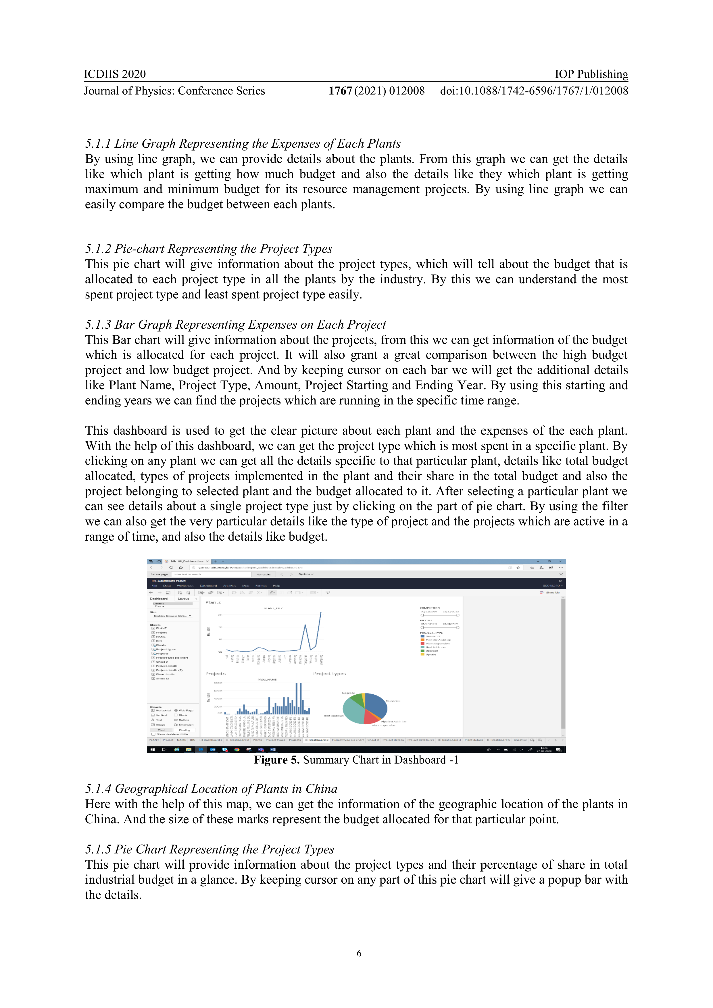
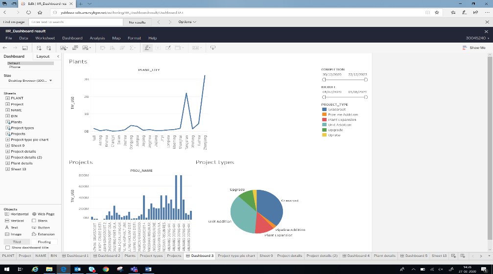
5.1.1 Line Graph Representing the Expenses of Each Plants
By using line graph, we can provide details about the plants. From this graph we can get the details
like which plant is getting how much budget and also the details like they which plant is getting
maximum and minimum budget for its resource management projects. By using line graph we can
easily compare the budget between each plants.
5.1.2 Pie-chart Representing the Project Types
This pie chart will give information about the project types, which will tell about the budget that is
allocated to each project type in all the plants by the industry. By this we can understand the most
spent project type and least spent project type easily.
5.1.3 Bar Graph Representing Expenses on Each Project
This Bar chart will give information about the projects, from this we can get information of the budget
which is allocated for each project. It will also grant a great comparison between the high budget
project and low budget project. And by keeping cursor on each bar we will get the additional details
like Plant Name, Project Type, Amount, Project Starting and Ending Year. By using this starting and
ending years we can find the projects which are running in the specific time range.
This dashboard is used to get the clear picture about each plant and the expenses of the each plant.
With the help of this dashboard, we can get the project type which is most spent in a specific plant. By
clicking on any plant we can get all the details specific to that particular plant, details like total budget
allocated, types of projects implemented in the plant and their share in the total budget and also the
project belonging to selected plant and the budget allocated to it. After selecting a particular plant we
can see details about a single project type just by clicking on the part of pie chart. By using the filter
we can also get the very particular details like the type of project and the projects which are active in a
range of time, and also the details like budget.
Figure 5.
Summary Chart in Dashboard -1
5.1.4 Geographical Location of Plants in China
Here with the help of this map, we can get the information of the geographic location of the plants in
China. And the size of these marks represent the budget allocated for that particular point.
5.1.5 Pie Chart Representing the Project Types
This pie chart will provide information about the project types and their percentage of share in total
industrial budget in a glance. By keeping cursor on any part of this pie chart will give a popup bar with
the details.
ICDIIS 2020
Journal of Physics: Conference Series
1767
(2021) 012008
IOP Publishing
doi:10.1088/1742-6596/1767/1/012008
7
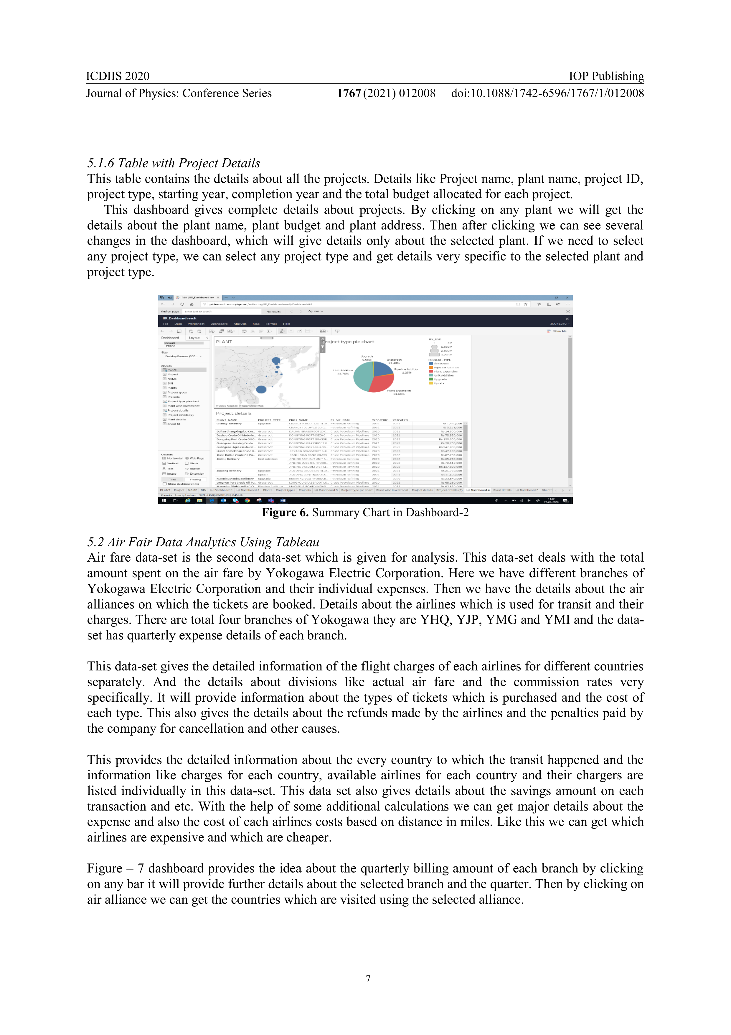
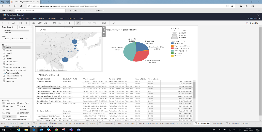
5.1.6 Table with Project Details
This table contains the details about all the projects. Details like Project name, plant name, project ID,
project type, starting year, completion year and the total budget allocated for each project.
This dashboard gives complete details about projects. By clicking on any plant we will get the
details about the plant name, plant budget and plant address. Then after clicking we can see several
changes in the dashboard, which will give details only about the selected plant. If we need to select
any project type, we can select any project type and get details very specific to the selected plant and
project type.
Figure 6.
Summary Chart in Dashboard-2
5.2 Air Fair Data Analytics Using Tableau
Air fare data-set is the second data-set which is given for analysis. This data-set deals with the total
amount spent on the air fare by Yokogawa Electric Corporation. Here we have different branches of
Yokogawa Electric Corporation and their individual expenses. Then we have the details about the air
alliances on which the tickets are booked. Details about the airlines which is used for transit and their
charges. There are total four branches of Yokogawa they are YHQ, YJP, YMG and YMI and the data-
set has quarterly expense details of each branch.
This data-set gives the detailed information of the flight charges of each airlines for different countries
separately. And the details about divisions like actual air fare and the commission rates very
specifically. It will provide information about the types of tickets which is purchased and the cost of
each type. This also gives the details about the refunds made by the airlines and the penalties paid by
the company for cancellation and other causes.
This provides the detailed information about the every country to which the transit happened and the
information like charges for each country, available airlines for each country and their chargers are
listed individually in this data-set. This data set also gives details about the savings amount on each
transaction and etc. With the help of some additional calculations we can get major details about the
expense and also the cost of each airlines costs based on distance in miles. Like this we can get which
airlines are expensive and which are cheaper.
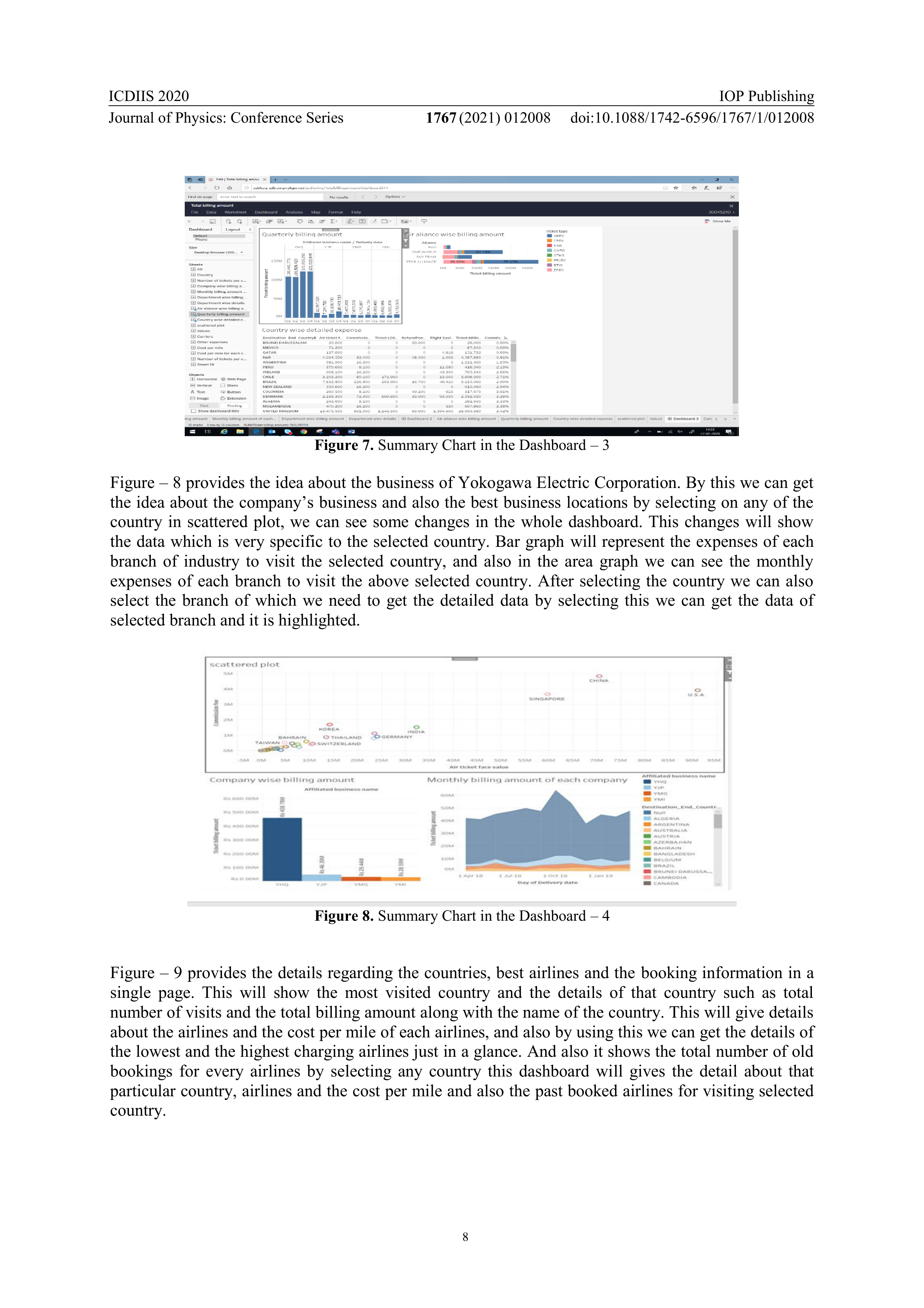
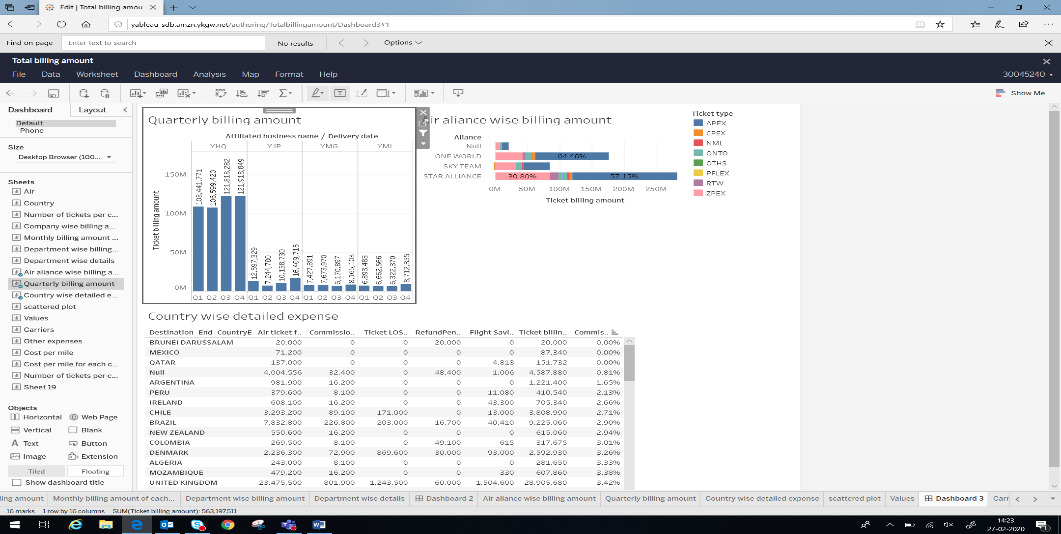
Figure – 7 dashboard provides the idea about the quarterly billing amount of each branch by clicking
on any bar it will provide further details about the selected branch and the quarter. Then by clicking on
air alliance we can get the countries which are visited using the selected alliance.
ICDIIS 2020
Journal of Physics: Conference Series
1767
(2021) 012008
IOP Publishing
doi:10.1088/1742-6596/1767/1/012008
8
Figure 7.
Summary Chart in the Dashboard – 3
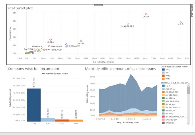
Figure – 8 provides the idea about the business of Yokogawa Electric Corporation. By this we can get
the idea about the company’s business and also the best business locations by selecting on any of the
country in scattered plot, we can see some changes in the whole dashboard. This changes will show
the data which is very specific to the selected country. Bar graph will represent the expenses of each
branch of industry to visit the selected country, and also in the area graph we can see the monthly
expenses of each branch to visit the above selected country. After selecting the country we can also
select the branch of which we need to get the detailed data by selecting this we can get the data of
selected branch and it is highlighted.
Figure 8.
Summary Chart in the Dashboard – 4
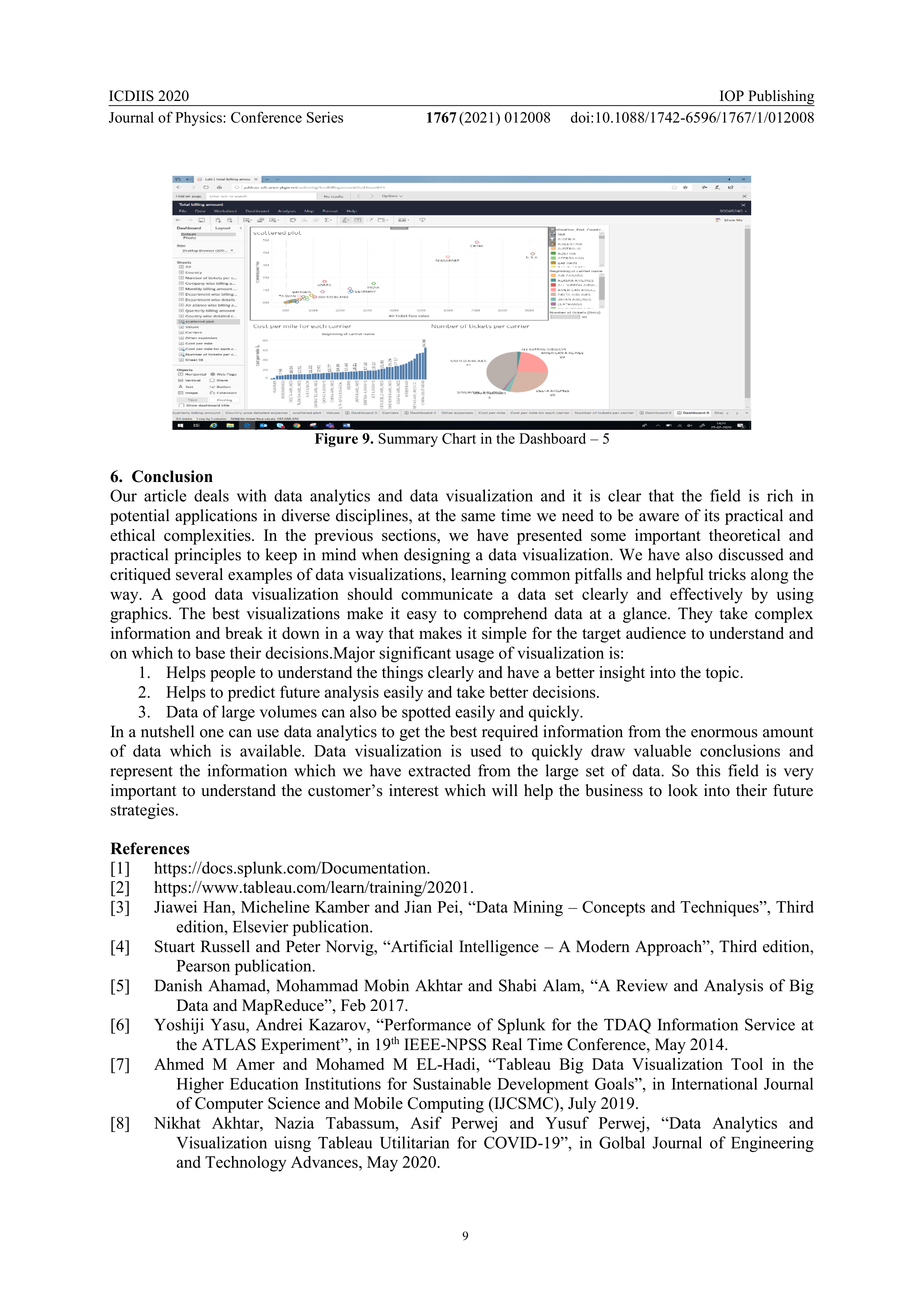
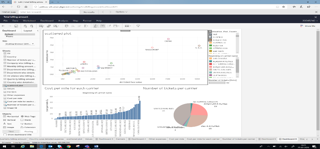
Figure – 9 provides the details regarding the countries, best airlines and the booking information in a
single page. This will show the most visited country and the details of that country such as total
number of visits and the total billing amount along with the name of the country. This will give details
about the airlines and the cost per mile of each airlines, and also by using this we can get the details of
the lowest and the highest charging airlines just in a glance. And also it shows the total number of old
bookings for every airlines by selecting any country this dashboard will gives the detail about that
particular country, airlines and the cost per mile and also the past booked airlines for visiting selected
country.
ICDIIS 2020
Journal of Physics: Conference Series
1767
(2021) 012008
IOP Publishing
doi:10.1088/1742-6596/1767/1/012008
9
Figure 9.
Summary Chart in the Dashboard – 5
6. Conclusion
Our article deals with data analytics and data visualization and it is clear that the field is rich in
potential applications in diverse disciplines, at the same time we need to be aware of its practical and
ethical complexities. In the previous sections, we have presented some important theoretical and
practical principles to keep in mind when designing a data visualization. We have also discussed and
critiqued several examples of data visualizations, learning common pitfalls and helpful tricks along the
way. A good data visualization should communicate a data set clearly and effectively by using
graphics. The best visualizations make it easy to comprehend data at a glance. They take complex
information and break it down in a way that makes it simple for the target audience to understand and
on which to base their decisions.Major significant usage of visualization is:
1.
Helps people to understand the things clearly and have a better insight into the topic.
2.
Helps to predict future analysis easily and take better decisions.
3.
Data of large volumes can also be spotted easily and quickly.
In a nutshell one can use data analytics to get the best required information from the enormous amount
of data which is available. Data visualization is used to quickly draw valuable conclusions and
represent the information which we have extracted from the large set of data. So this field is very
important to understand the customer’s interest which will help the business to look into their future
strategies.
References
[1]
https://docs.splunk.com/Documentation.
[2]
https://www.tableau.com/learn/training/20201.
[3]
Jiawei Han, Micheline Kamber and Jian Pei, “Data Mining – Concepts and Techniques”, Third
edition, Elsevier publication.
[4]
Stuart Russell and Peter Norvig, “Artificial Intelligence – A Modern Approach”, Third edition,
Pearson publication.
[5]
Danish Ahamad, Mohammad Mobin Akhtar and Shabi Alam, “A Review and Analysis of Big
Data and MapReduce”, Feb 2017.
[6]
Yoshiji Yasu, Andrei Kazarov, “Performance of Splunk for the TDAQ Information Service at
the ATLAS Experiment”, in 19
th
IEEE-NPSS Real Time Conference, May 2014.
[7]
Ahmed M Amer and Mohamed M EL-Hadi, “Tableau Big Data Visualization Tool in the
Higher Education Institutions for Sustainable Development Goals”, in International Journal
of Computer Science and Mobile Computing (IJCSMC), July 2019.
[8]
Nikhat Akhtar, Nazia Tabassum, Asif Perwej and Yusuf Perwej, “Data Analytics and
Visualization uisng Tableau Utilitarian for COVID-19”, in Golbal Journal of Engineering
and Technology Advances, May 2020.