PageVis: Facebook Data Visualization Tool
Heng Somnang
#1
, Kor Sokchea
#2
#
Department of Information Technology Engineering, FE, Royal University of Phnom Penh
Phnom Penh, Cambodia
1
heng.somnang.2018@rupp.edu.kh
2
kor.sokchea@rupp.edu.kh
Abstract
— Facebook has become a major social media platform
that is growing exponentially because it is best for the connection
between
particular
people,
institutions,
businesses,
and
organizations as well as government and non-government. With
its popularity, many business owners ranging from small to big
businesses start to shift their promotion campaign from
traditional advertisement to Facebook advertising platform. In
order to create a successful advertising campaign or provide
personalized services, business owners need to understand their
target customer by analysing user’s data. Looking at raw data
directly, it is not convenient. It needs tools and techniques that can
turn data into graphic form. In this paper, we present a data
visualization tool called PageVis that convert data fetching from
Facebook through Facebook Graph API into wide variety of
graphical representations. With this representation, it can help
advertisers or business owners to understand their customer.
Keywords
—
Facebook, Data Visualization, Facebook Graph API,
PageVis, Visualization Tool
I.
I
NTRODUCTION
Facebook is a social media platform that is very popular in
the world and also in Cambodia. It has around 2.934 billion
monthly active users in July 2022 making it the most famous
social media in the world [10]. With a large number of active
users, various business owners has started to use social media
platforms like Facebook for the promotions campaign instead
of using traditional advertisement. The potential way to
produce a successful advertising campaign and personalized
service requirement, advertisers need to understand the user
preference by analysing the data of users through provided data
from Facebook Graph APIs. Facebook provides the graph API
that allows analysers to fetch those data for analysing their
target user. However, the data returning from Facebook Graph
API is the raw data which is inconvenient for human to
understand. Numeric representation is convenient for computer
to read but not for human. Therefore, numeric representation
needs to transform into graph representations by using
visualization techniques in order to allow advertisers to gain
insight into their target user.
In this paper, we will present a data visualization tool
called
PageVis
that enable users to visualize various data from
the Facebook page which aggregates structured and
unstructured data sources including the data of the Facebook
page insight, user data, and demographic data and converts
them to virtual viewing through a dashboard of the software.
With this tool, it gives a convenient way for a business owner
to understand their audience and prepare strategies for the next
advertising campaign in return for success.
II.
L
ITERATURE
R
EVIEW
The growth of data has been hailed as one of the greatest
challenges of the 21st century due to the volume of data [1].
Data growth is defined as large, complex, high-velocity data
sets [2]. However, big data brings new opportunities for
research and new insights across a wide variety of fields [3] and
by visually exploring and analysing the data. To capitalize on
the data insight of social media platforms, visualization allows
faster interpretation of the data, much of which is generated in
real-time. Moreover, the goal of many businesses regarding
data analysis is to recognize such patterns, emphasizing the
need for data visualization to achieve strategic objectives.
Visualizations can be likened to the front end of big data [4]
and can be used to access and interpret the data, making the
insights and trends more apparent. The Twitter analyser also
uses the streamgraph to represent the behaviour of user interests’
change over time [5]. Moreover, data from the tweet and
retweets were plotted as a timeline with a line graph illustrating
[6]. Twitter is one of the social media providing an API that
could retrieve data geo-location coordinates and uses
visualization techniques to plot data on the map by using
OpenStreetMaps to compare the data for a period between
different locations [7].
Common data visualization techniques to represent data are line
charts, bar charts, area charts, graphs, and maps.
Line Charts are one of the most basic visualization
techniques. They make the data more appealing and visualized.
It shows the relationship between two patterns and compares
several values at the same time interval. It is the most effective
approach when changes in a variable or variables need to be
displayed [7].
Pie Chart is used to represent data in the form of a pie slice.
The slice shows the amount of data. It is used to show the
component’s percentage of the whole. Moreover, Donut chat is
one of the variations of pie charts [8].
Bar charts are referred to as column charts which make use
of both horizontal and vertical bars. It could be used to compare
items of a different group, but it is not very effective when the
amount of data is very huge [8].
The map is used to plot the spatial data that is usually
represented by Latitude, and Longitude. Individual locations
are usually visualized as dots, and placed on a map according
to a graphic coordination system [8].
Stream graph is used to show data values differing in
median timeline. It represents the change of data over time.
Thes method is helpful to visualize deeply in fast changing data
sets. It would be the major feature of big data interpretation to
make analyzers convenient to understand a mass of data to the
graphic [9].
Additionally, there are many professional and commercial
software which enable user to perform data visualization
including Tableau, Microsoft Power BI, Qlik Sense, Looker
and so on. Tableau is a tool that could visualize the interaction
data visualization. It provides the potential range of
visualization options. It is a very helpful tool since it is fast and
flexible in using and also provides a wide variety of charts [9].
Microsoft Power BI would be the great cloud-based business
analytics service. This tool is also flexible and persuasive [9].
And Plotly is built using python and Django framework. It is
proficiency to perform analyzing and visualizing data. It allows
users to create charts or dashboards for many purposes such as
statistical charts, scientific charts, and multiple axes. Automatic
grabs the data from the static images which known as “Web
Plot Digitizer (WPD)” has been used by Plotly [9].
III.
M
ETHODOLOGY
1.
F
ACEBOOK GRAPH API
.
Facebook Graph API is a primary way that Facebook
provides to app developer to read and write to the Facebook
social graph [11]. Graph API is a low-level HTTP-based API
that could be utilized to query data, and fetch information
related to posts and media upload [3]. Every content in the page
including posts are restricted to the privacy setting of
individuals. The secure access to the API is via access token.
Access token is an open-source token generated for every
Facebook user at the time of request. The token allows the app
to interact with Graph API only until it is valid. Almost all
Graph API endpoints require an access token of some kind, so
each time you access an endpoint, your request may require
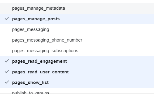
one. Specific permissions have to be set to generate the access
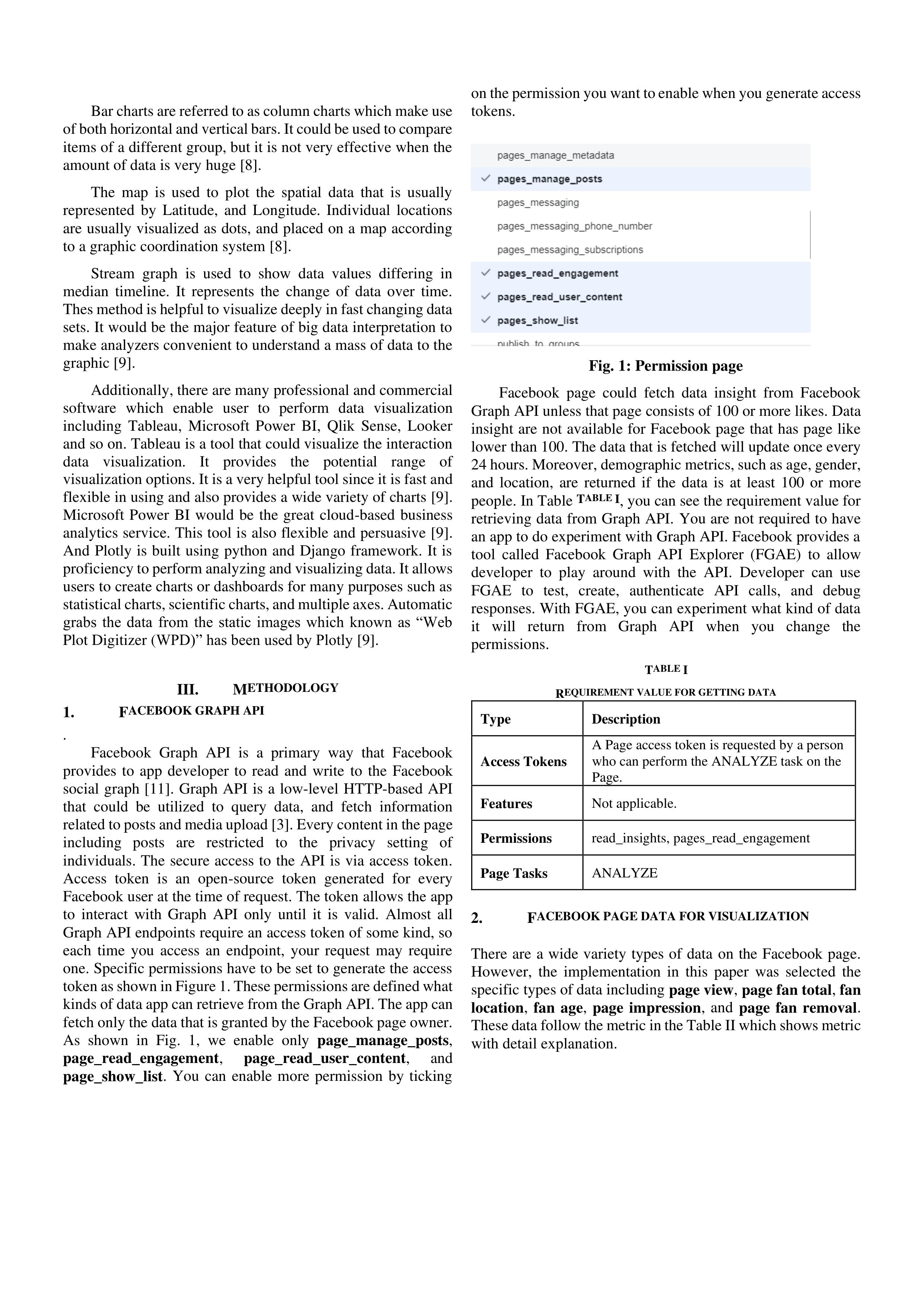
token as shown in Figure 1. These permissions are defined what
kinds of data app can retrieve from the Graph API. The app can
fetch only the data that is granted by the Facebook page owner.
As shown in Fig. 1, we enable only
page_manage_posts
,
page_read_engagement
,
page_read_user_content
,
and
page_show_list
. You can enable more permission by ticking
on the permission you want to enable when you generate access
tokens.
Fig. 1: Permission page
Facebook page could fetch data insight from Facebook
Graph API unless that page consists of 100 or more likes. Data
insight are not available for Facebook page that has page like
lower than 100. The data that is fetched will update once every
24 hours. Moreover, demographic metrics, such as age, gender,
and location, are returned if the data is at least 100 or more
people. In Table
T
ABLE
I
, you can see the requirement value for
retrieving data from Graph API. You are not required to have
an app to do experiment with Graph API. Facebook provides a
tool called Facebook Graph API Explorer (FGAE) to allow
developer to play around with the API. Developer can use
FGAE to test, create, authenticate API calls, and debug
responses. With FGAE, you can experiment what kind of data
it will return from Graph API when you change the
permissions.
T
ABLE
I
R
EQUIREMENT VALUE FOR GETTING DATA
Type
Description
Access Tokens
A Page access token is requested by a person
who can perform the ANALYZE task on the
Page.
Features
Not applicable.
Permissions
read_insights, pages_read_engagement
Page Tasks
ANALYZE
2.
F
ACEBOOK PAGE DATA FOR VISUALIZATION
There are a wide variety types of data on the Facebook page.
However, the implementation in this paper was selected the
specific types of data including
page view
,
page fan total
,
fan
location
,
fan age
,
page impression
, and
page fan removal
.
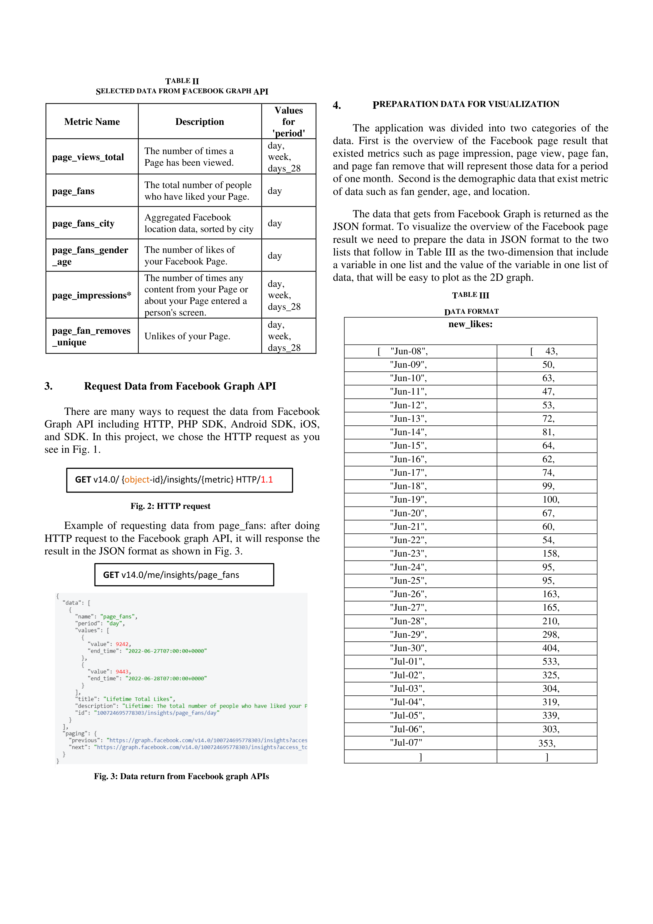
These data follow the metric in the Table II which shows metric
with detail explanation.

T
ABLE
II
S
ELECTED DATA FROM
F
ACEBOOK GRAPH
API
Metric Name
Description
Values
for
'period'
page_views_total
The number of times a
Page has been viewed.
day,
week,
days_28
page_fans
The total number of people
who have liked your Page.
day
page_fans_city
Aggregated Facebook
location data, sorted by city
day
page_fans_gender
_age
The number of likes of
your Facebook Page.
day
page_impressions*
The number of times any
content from your Page or
about your Page entered a
person's screen.
day,
week,
days_28
page_fan_removes
_unique
Unlikes of your Page.
day,
week,
days_28
3.
Request Data from Facebook Graph API
There are many ways to request the data from Facebook
Graph API including HTTP, PHP SDK, Android SDK, iOS,
and SDK. In this project, we chose the HTTP request as you
see in Fig. 1.
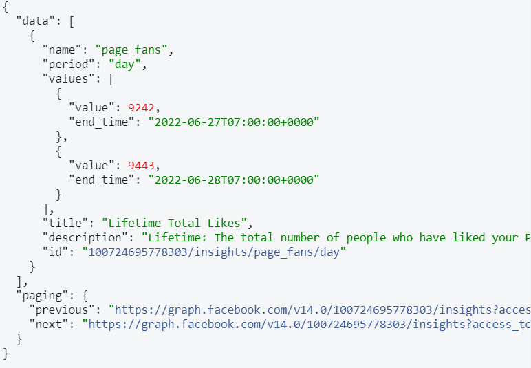
Example of requesting data from page_fans: after doing
HTTP request to the Facebook graph API, it will response the
result in the JSON format as shown in Fig. 3.
4.
P
REPARATION DATA FOR VISUALIZATION
The application was divided into two categories of the
data. First is the overview of the Facebook page result that
existed metrics such as page impression, page view, page fan,
and page fan remove that will represent those data for a period
of one month. Second is the demographic data that exist metric
of data such as fan gender, age, and location.
The data that gets from Facebook Graph is returned as the
JSON format. To visualize the overview of the Facebook page
result we need to prepare the data in JSON format to the two
lists that follow in Table III as the two-dimension that include
a variable in one list and the value of the variable in one list of
data, that will be easy to plot as the 2D graph.
T
ABLE
III
D
ATA FORMAT
new_likes:
[ "Jun-08",
[ 43,
"Jun-09",
50,
"Jun-10",
63,
"Jun-11",
47,
"Jun-12",
53,
"Jun-13",
72,
"Jun-14",
81,
"Jun-15",
64,
"Jun-16",
62,
"Jun-17",
74,
"Jun-18",
99,
"Jun-19",
100,
"Jun-20",
67,
"Jun-21",
60,
"Jun-22",
54,
"Jun-23",
158,
"Jun-24",
95,
"Jun-25",
95,
"Jun-26",
163,
"Jun-27",
165,
"Jun-28",
210,
"Jun-29",
298,
"Jun-30",
404,
"Jul-01",
533,
"Jul-02",
325,
"Jul-03",
304,
"Jul-04",
319,
"Jul-05",
339,
"Jul-06",
303,
"Jul-07"
353,
]
]
GET
v14.0/ {
object
-id}/insights/{metric} HTTP/
1.1
GET
v14.0/me/insights/page_fans
Fig. 2: HTTP request
Fig. 3: Data return from Facebook graph APIs
parameters = {
"key": "api key"
"location": "Preksandek, Cambodia"
}
respon=requests.get("http://www.mapquestapi.com/g
eocoding/v1/address", params=parameters)
However, the structure of the data demographic is very
similar to the data overview Facebook result that also converts
those data in the format like shown in Table 3. It is an easy way
to plot demographic data as the different 2D charts.
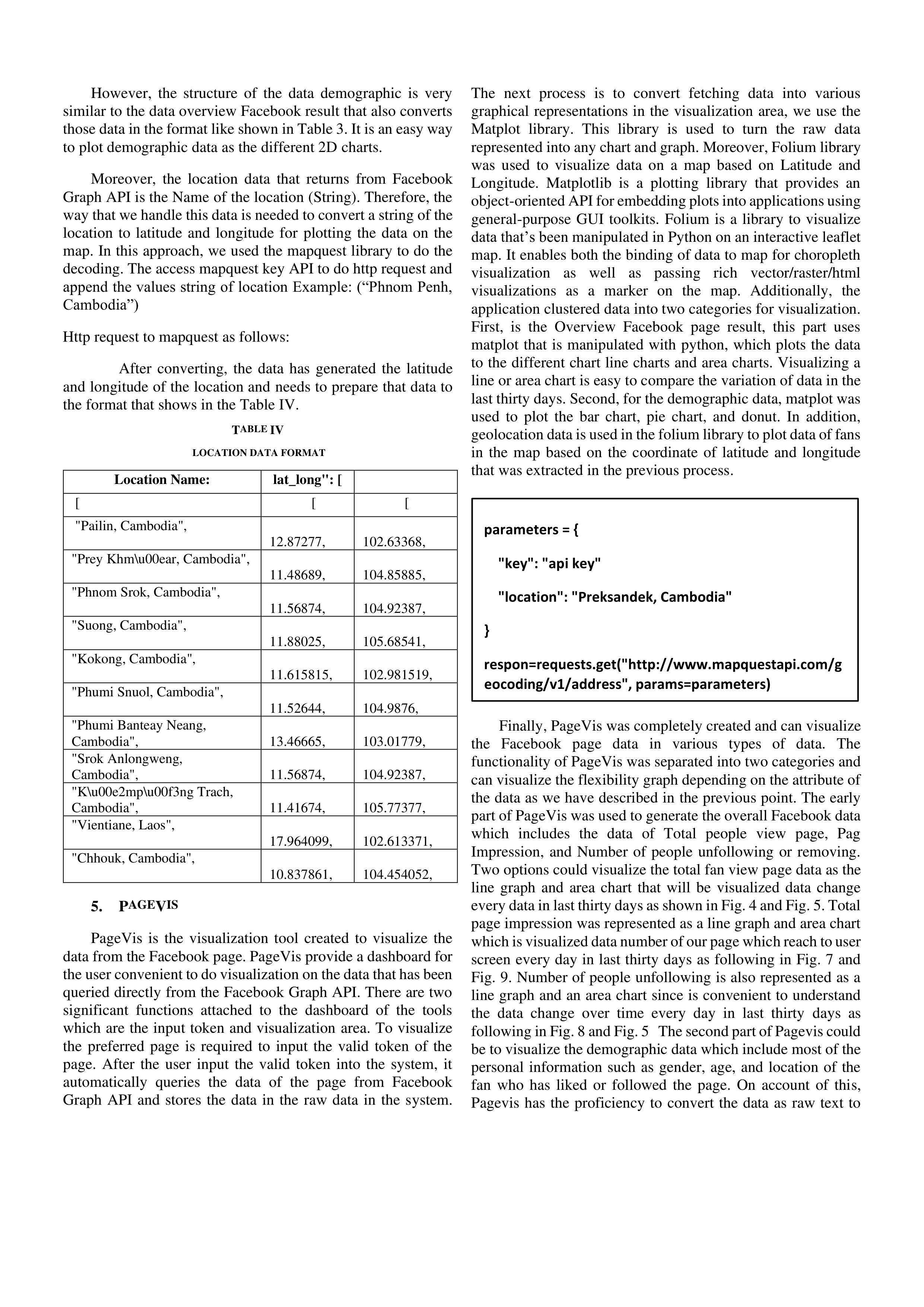
Moreover, the location data that returns from Facebook
Graph API is the Name of the location (String). Therefore, the
way that we handle this data is needed to convert a string of the
location to latitude and longitude for plotting the data on the
map. In this approach, we used the mapquest library to do the
decoding. The access mapquest key API to do http request and
append the values string of location Example: (“Phnom Penh,
Cambodia”)
Http request to mapquest
as follows:
After converting, the data has generated the latitude
and longitude of the location and needs to prepare that data to
the format that shows in the Table IV.
T
ABLE
IV
LOCATION DATA FORMAT
Location Name:
lat_long": [
[
[
[
"Pailin, Cambodia",
12.87277,
102.63368,
"Prey Khm\u00ear, Cambodia",
11.48689,
104.85885,
"Phnom Srok, Cambodia",
11.56874,
104.92387,
"Suong, Cambodia",
11.88025,
105.68541,
"Kokong, Cambodia",
11.615815,
102.981519,
"Phumi Snuol, Cambodia",
11.52644,
104.9876,
"Phumi Banteay Neang,
Cambodia",
13.46665,
103.01779,
"Srok Anlongweng,
Cambodia",
11.56874,
104.92387,
"K\u00e2mp\u00f3ng Trach,
Cambodia",
11.41674,
105.77377,
"Vientiane, Laos",
17.964099,
102.613371,
"Chhouk, Cambodia",
10.837861,
104.454052,
5.
P
AGE
V
IS
PageVis is the visualization tool created to visualize the
data from the Facebook page. PageVis provide a dashboard for
the user convenient to do visualization on the data that has been
queried directly from the Facebook Graph API. There are two
significant functions attached to the dashboard of the tools
which are the input token and visualization area. To visualize
the preferred page is required to input the valid token of the
page. After the user input the valid token into the system, it
automatically queries the data of the page from Facebook
Graph API and stores the data in the raw data in the system.
The next process is to convert fetching data into various
graphical representations in the visualization area, we use the
Matplot library. This library is used to turn the raw data
represented into any chart and graph. Moreover, Folium library
was used to visualize data on a map based on Latitude and
Longitude. Matplotlib is a plotting library that provides an
object-oriented API for embedding plots into applications using
general-purpose GUI toolkits. Folium is a library to visualize
data that’s been manipulated in Python on an interactive leaflet
map. It enables both the binding of data to map for choropleth
visualization as well as passing rich vector/raster/html
visualizations as a marker on the map. Additionally, the
application clustered data into two categories for visualization.
First, is the Overview Facebook page result, this part uses
matplot that is manipulated with python, which plots the data
to the different chart line charts and area charts. Visualizing a
line or area chart is easy to compare the variation of data in the
last thirty days. Second, for the demographic data, matplot was
used to plot the bar chart, pie chart, and donut. In addition,
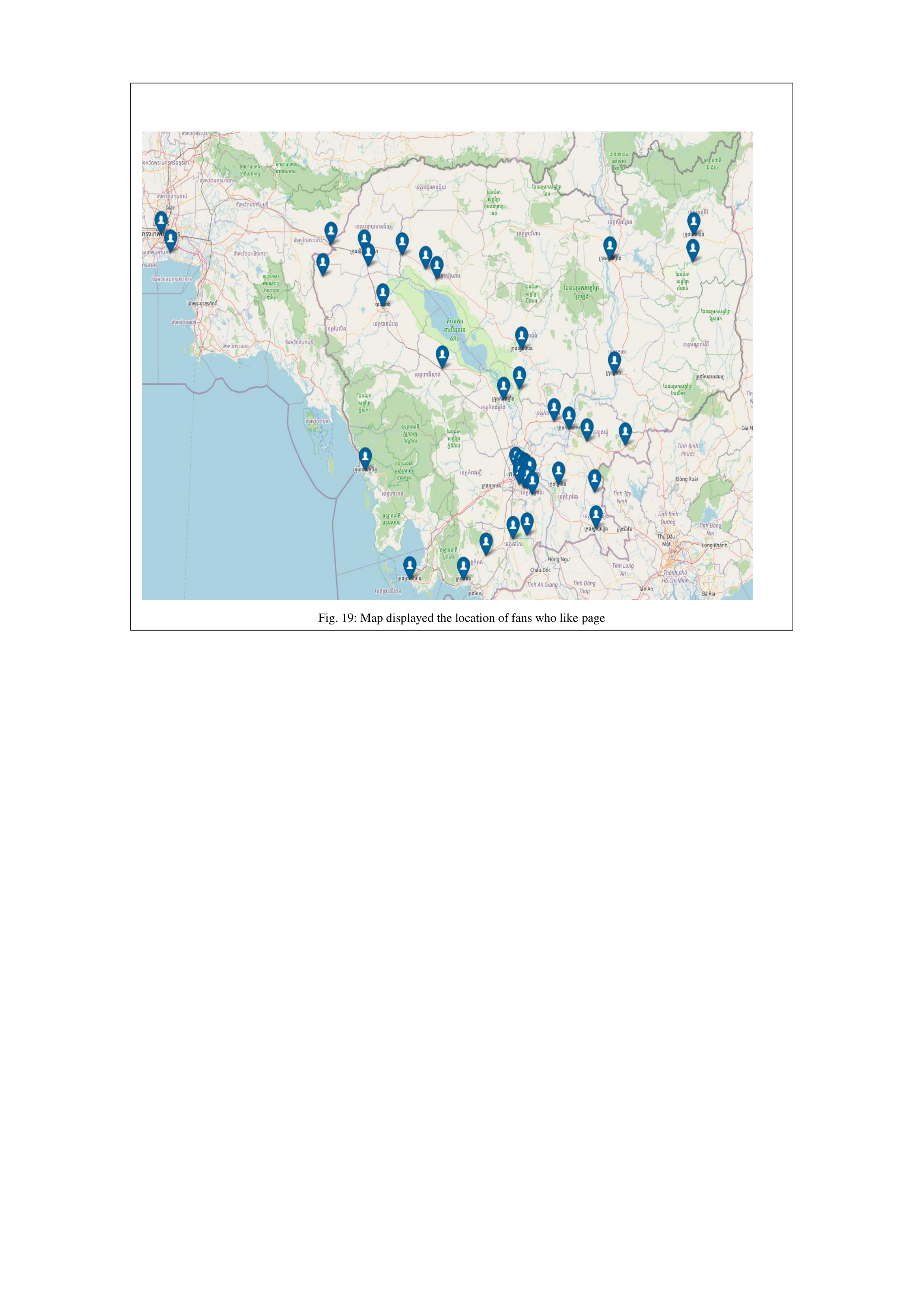
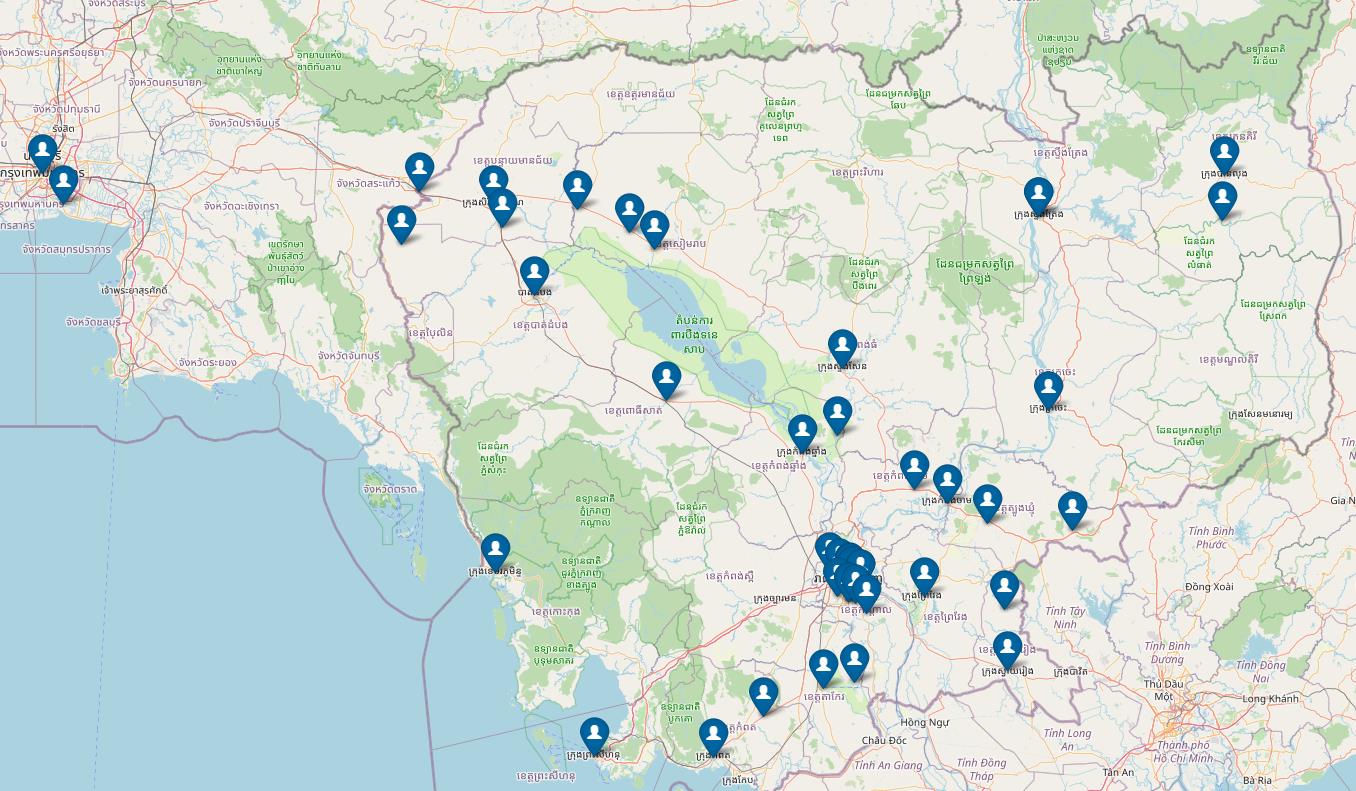
geolocation data is used in the folium library to plot data of fans
in the map based on the coordinate of latitude and longitude
that was extracted in the previous process.
Finally, PageVis was completely created and can visualize
the Facebook page data in various types of data. The
functionality of PageVis was separated into two categories and
can visualize the flexibility graph depending on the attribute of
the data as we have described in the previous point. The early
part of PageVis was used to generate the overall Facebook data
which includes the data of Total people view page, Pag
Impression, and Number of people unfollowing or removing.
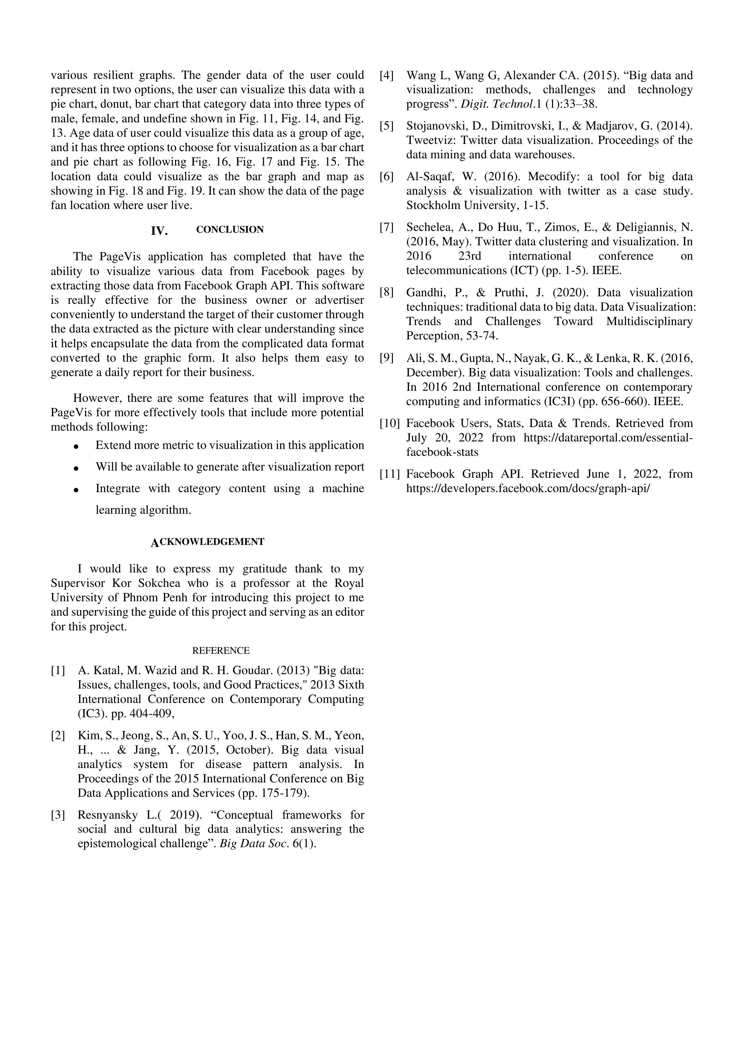
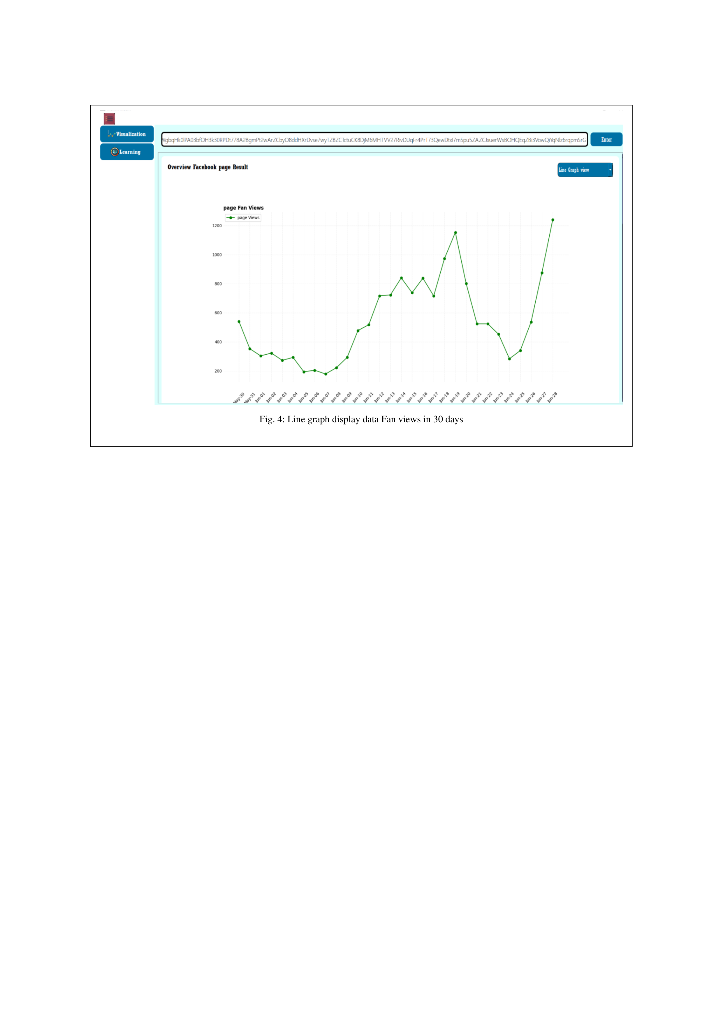
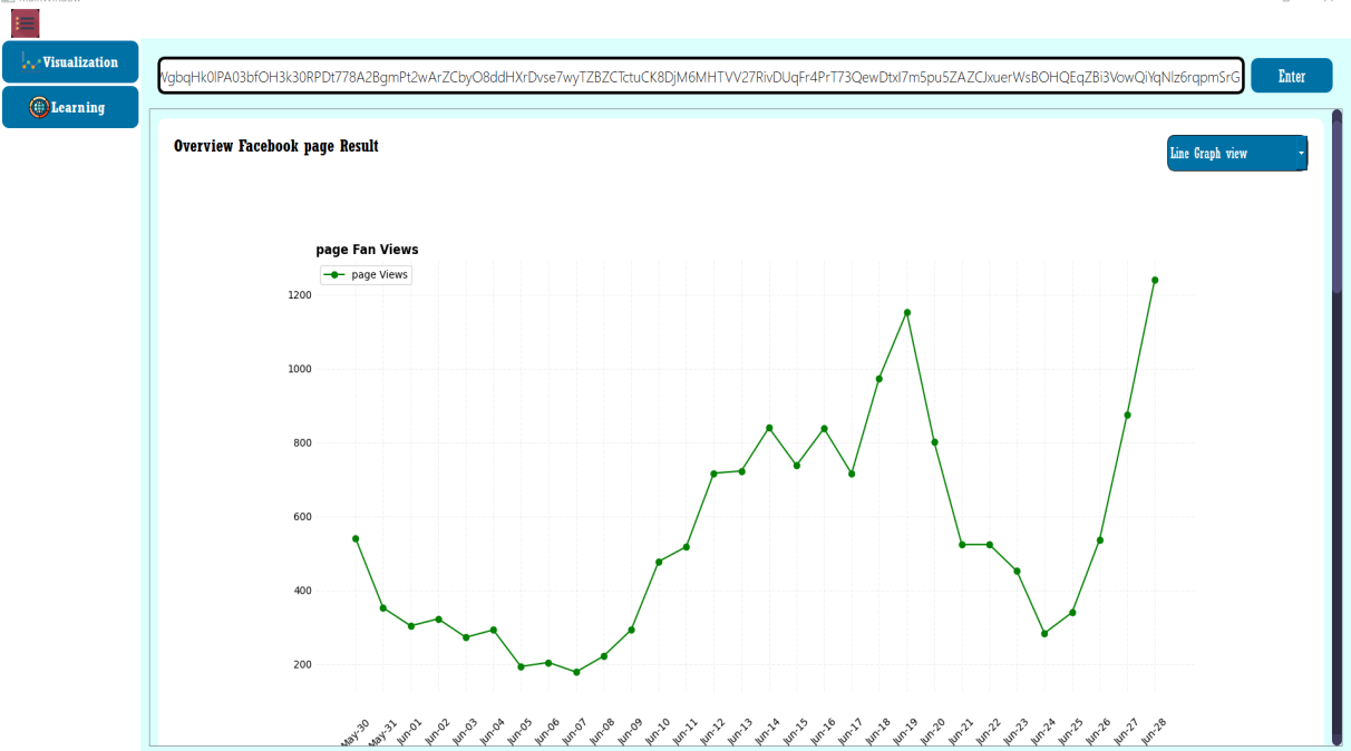
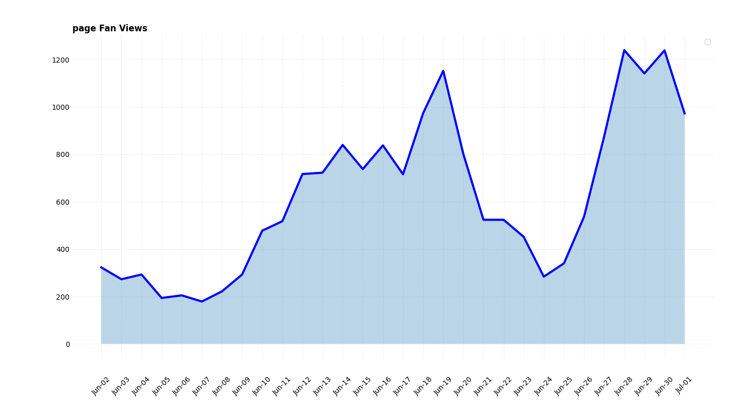
Two options could visualize the total fan view page data as the
line graph and area chart that will be visualized data change
every data in last thirty days as shown in Fig. 4 and Fig. 5. Total
page impression was represented as a line graph and area chart
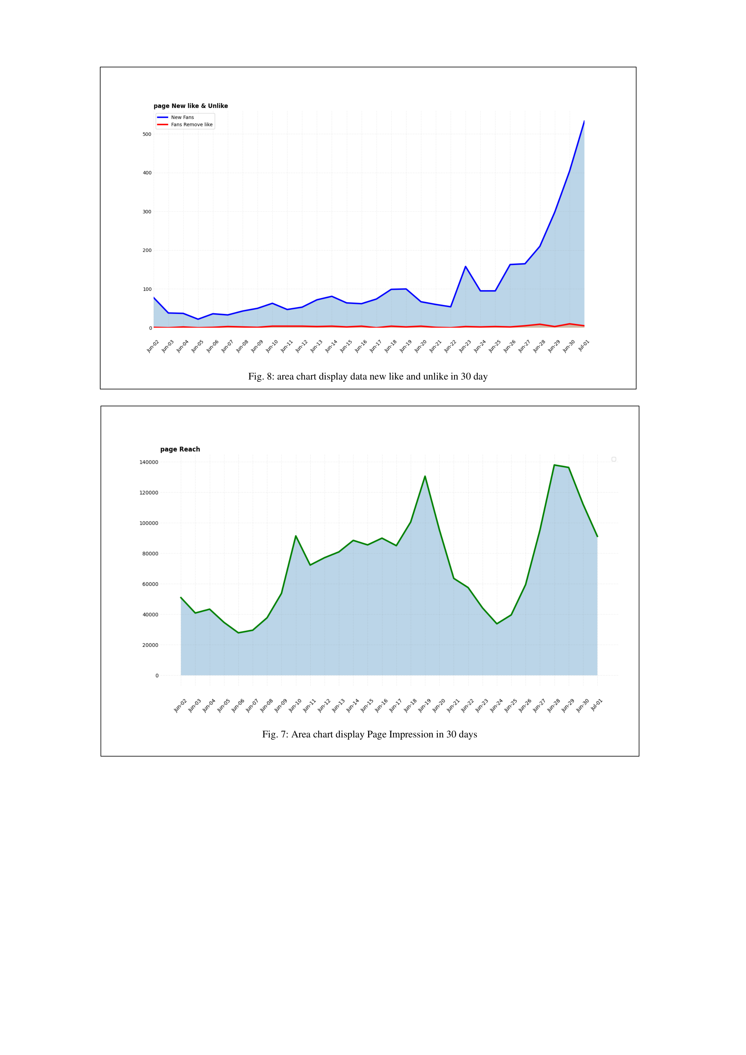
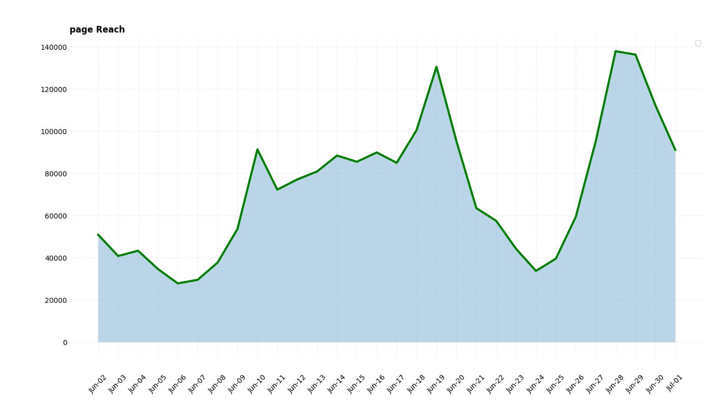
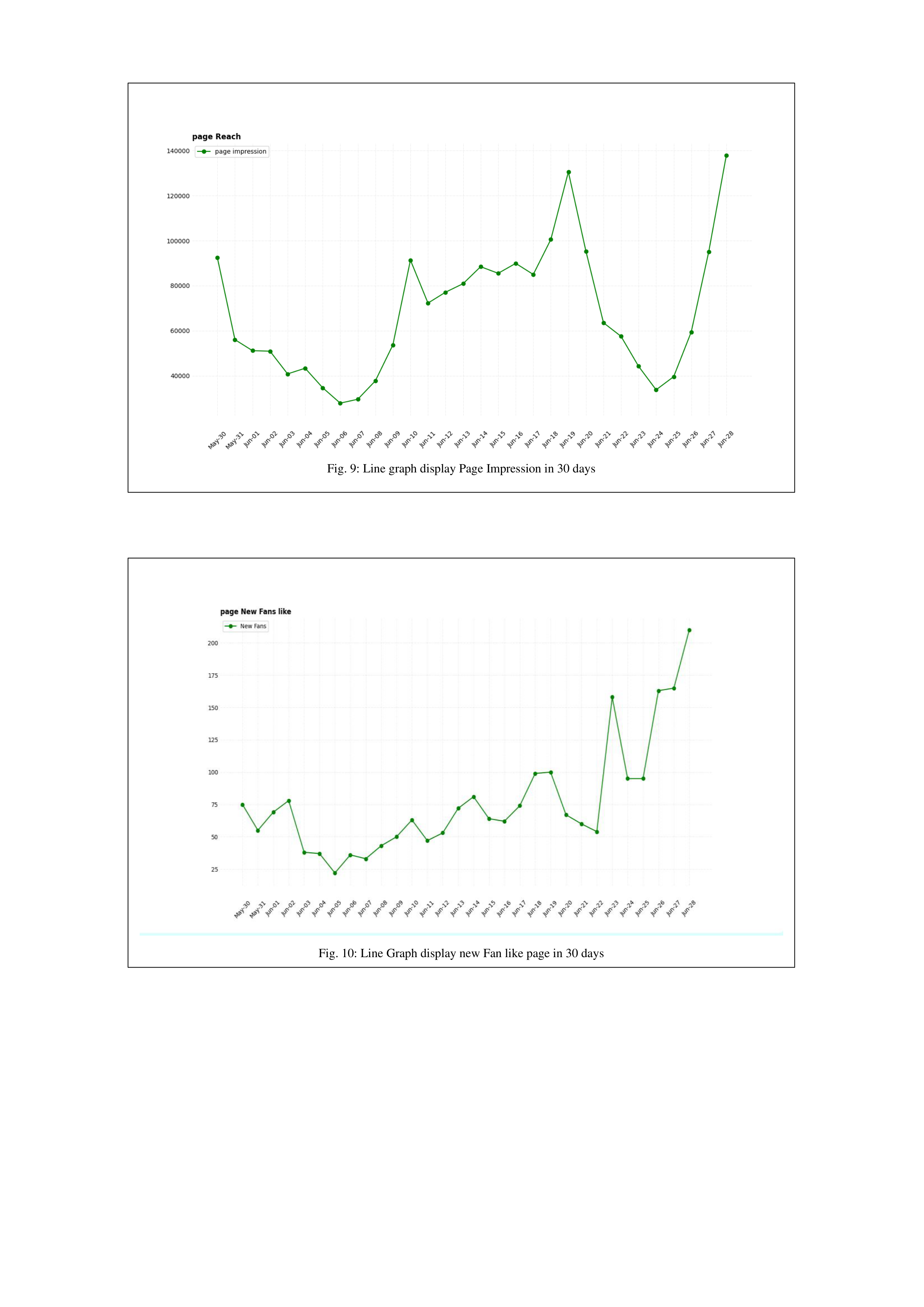
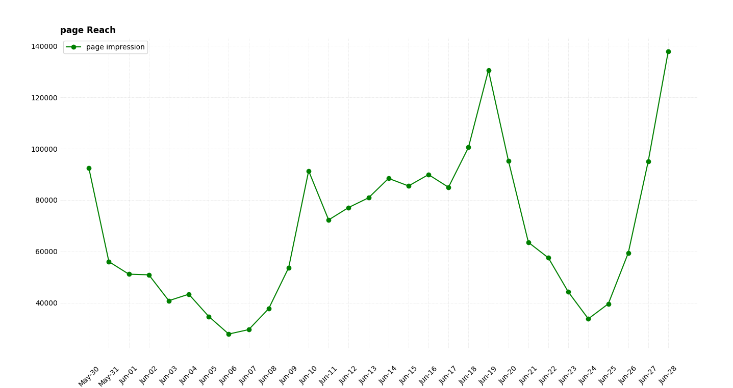
which is visualized data number of our page which reach to user
screen every day in last thirty days as following in Fig. 7 and
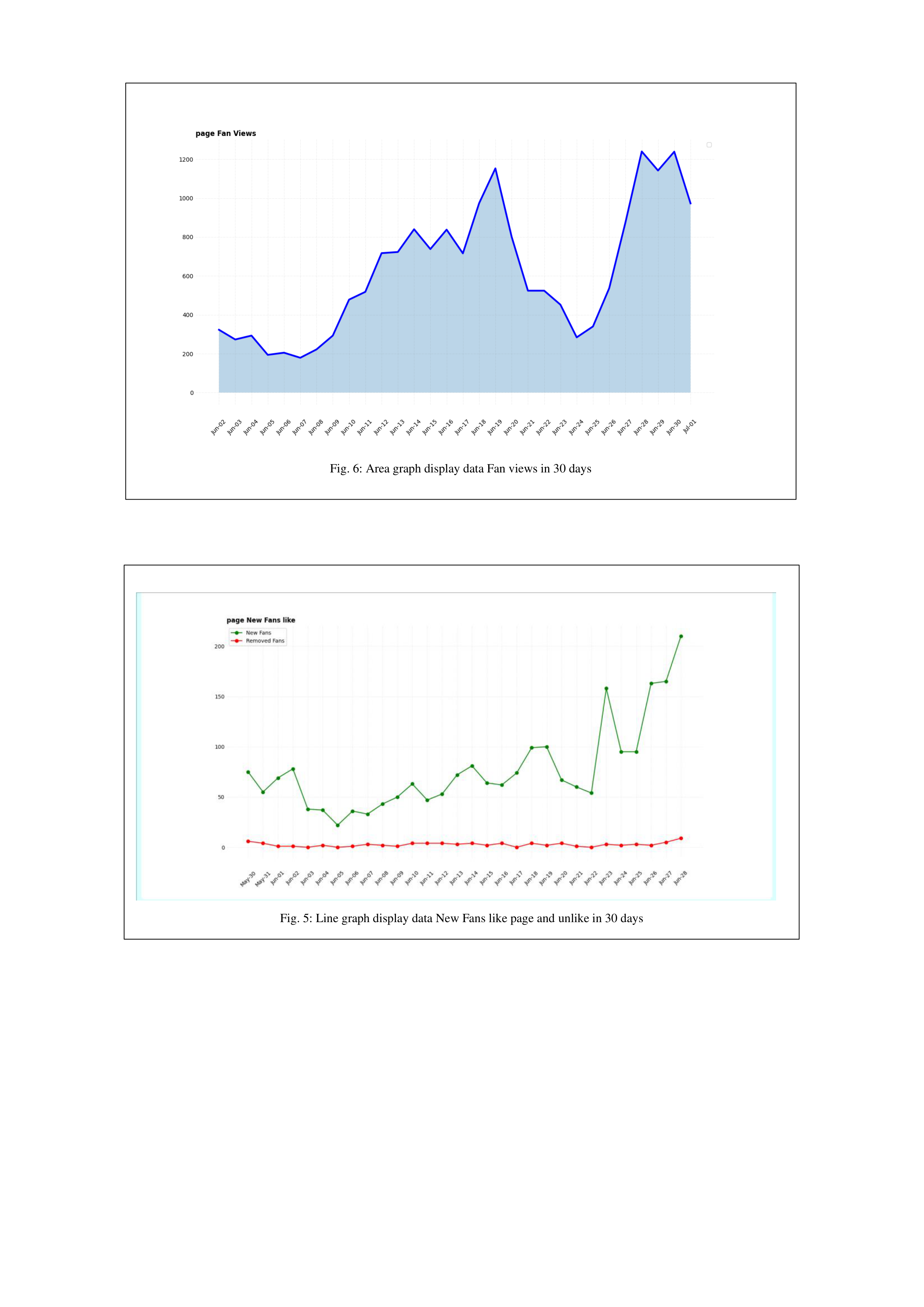
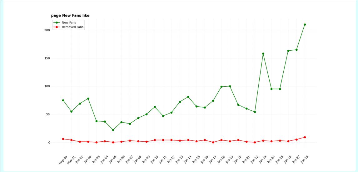
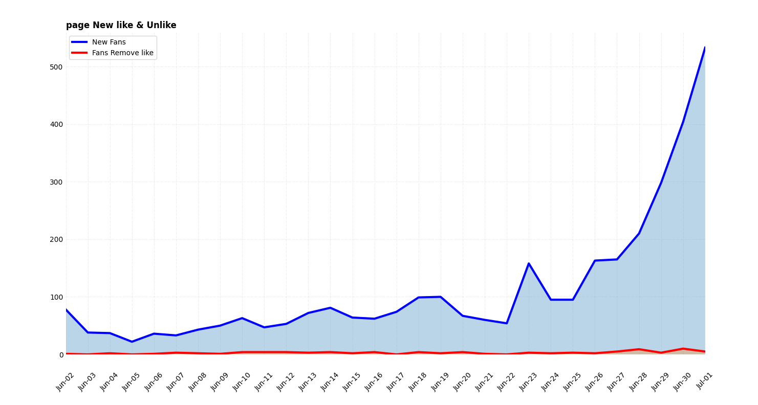
Fig. 9. Number of people unfollowing is also represented as a
line graph and an area chart since is convenient to understand
the data change over time every day in last thirty days as
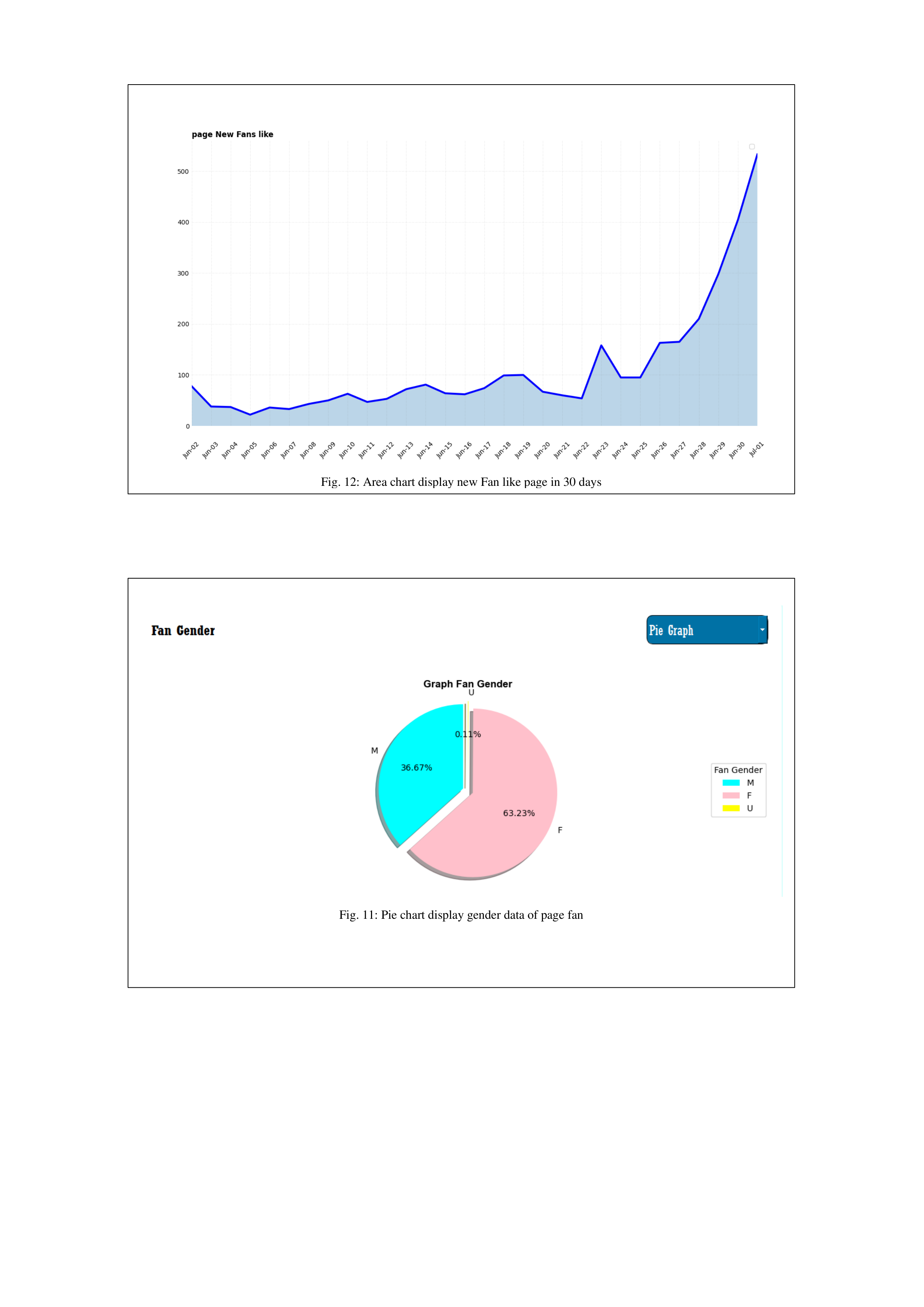
following in Fig. 8 and Fig. 5 The second part of Pagevis could
be to visualize the demographic data which include most of the
personal information such as gender, age, and location of the
fan who has liked or followed the page. On account of this,
Pagevis has the proficiency to convert the data as raw text to
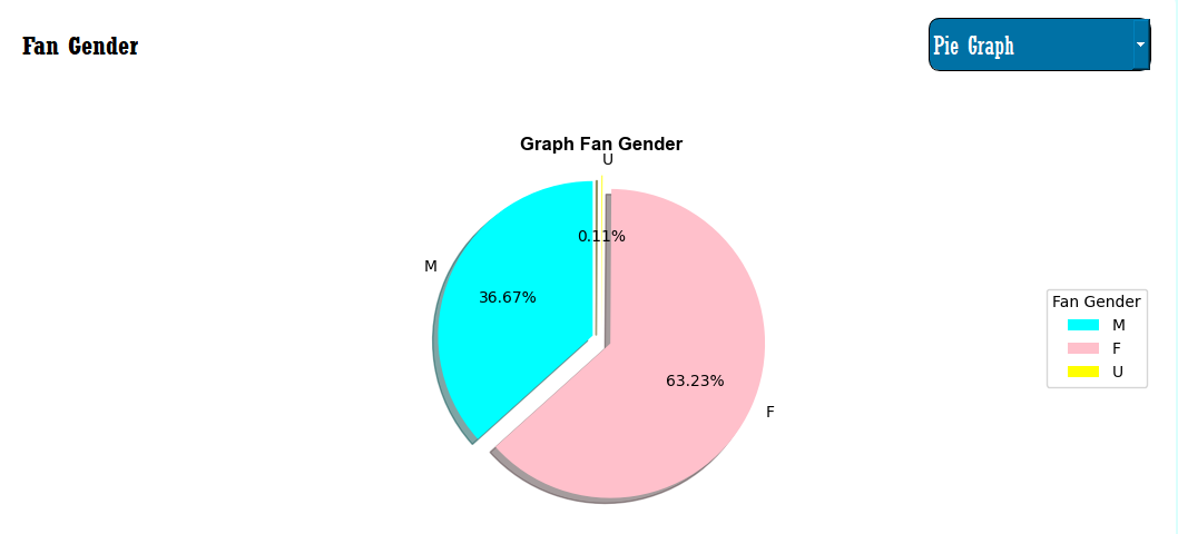
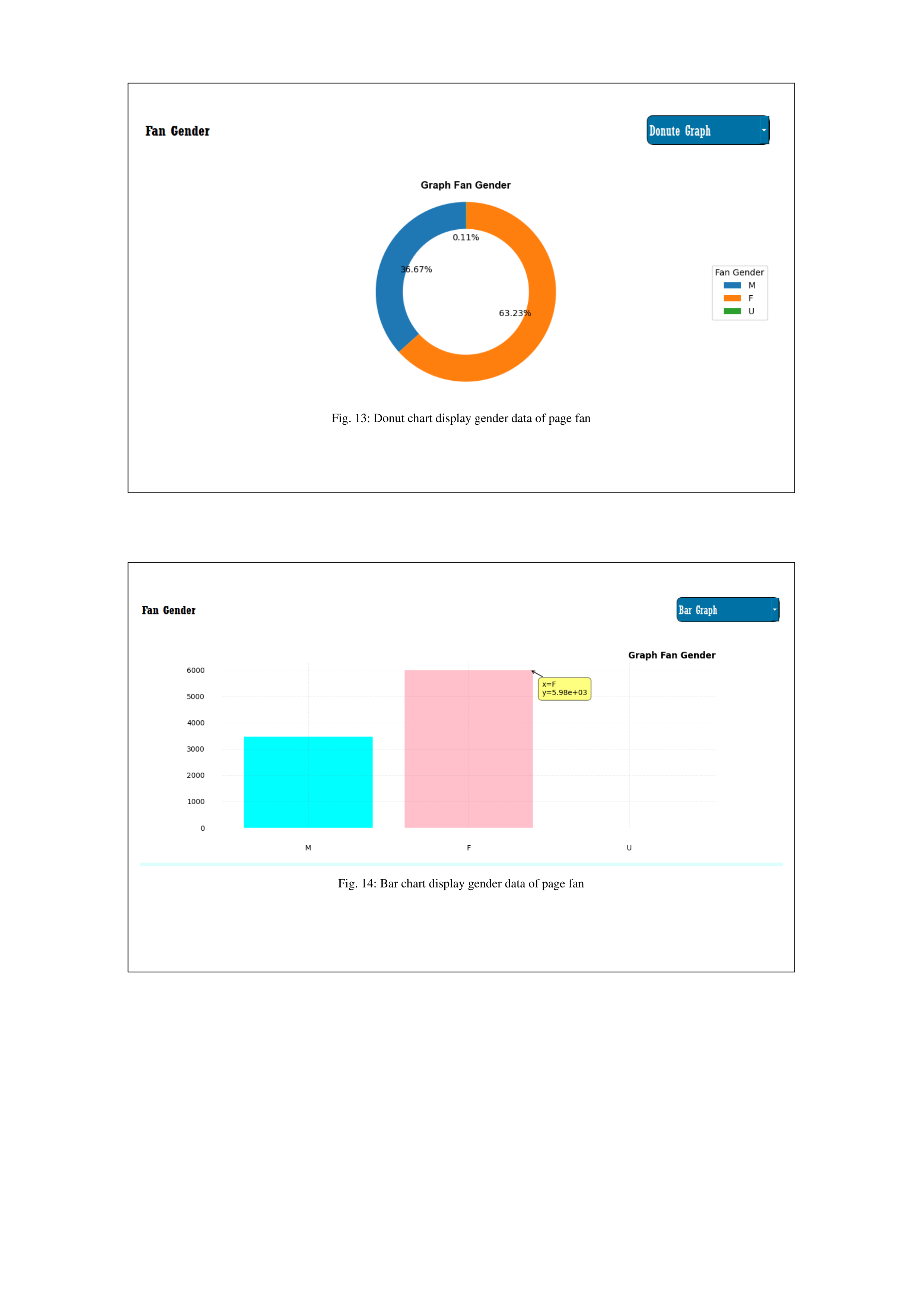
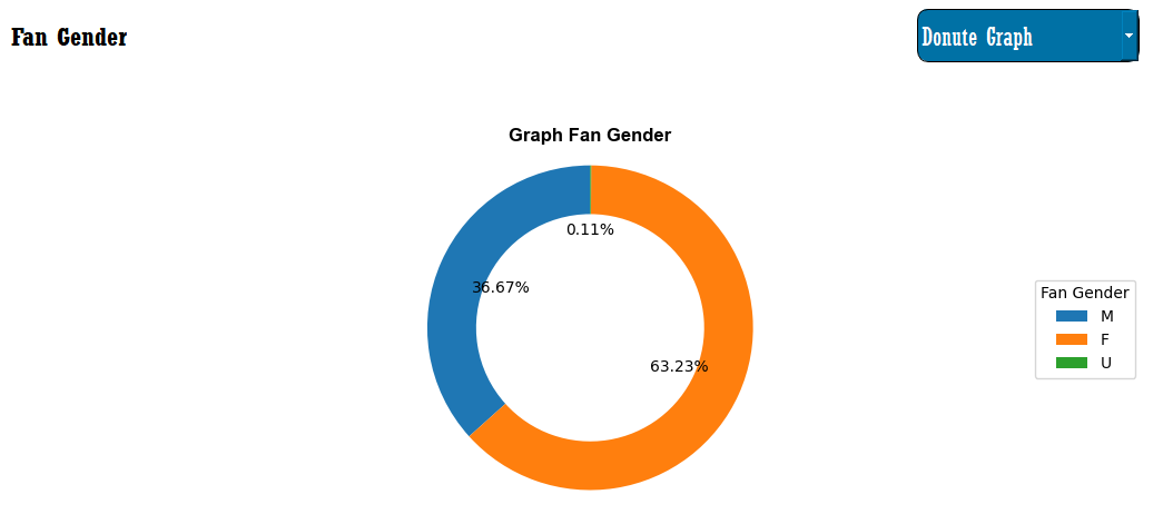
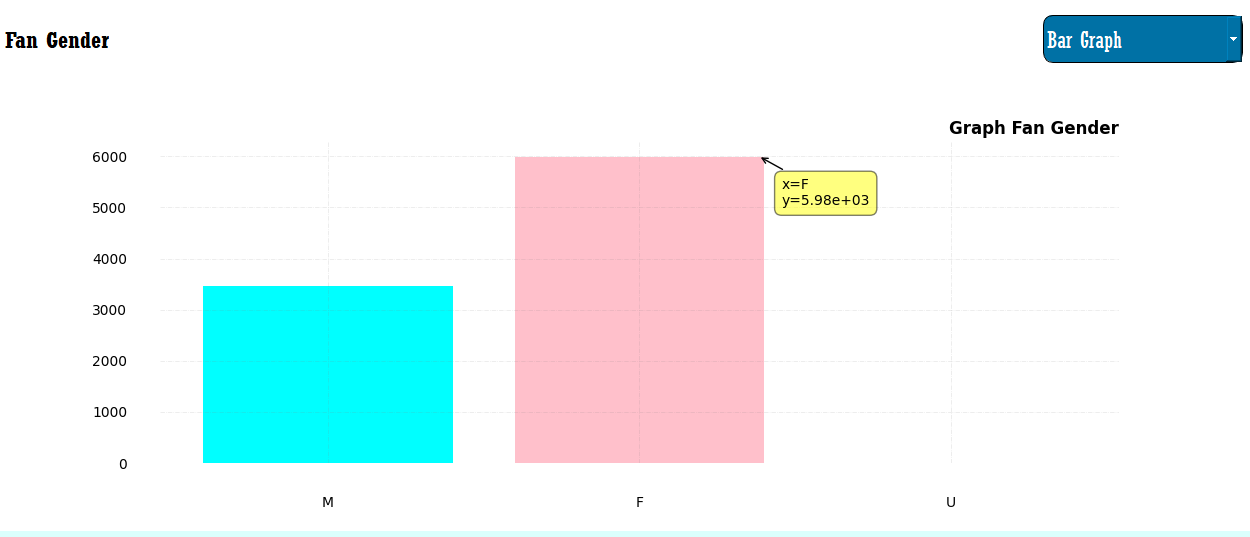
various resilient graphs. The gender data of the user could
represent in two options, the user can visualize this data with a
pie chart, donut, bar chart that category data into three types of
male, female, and undefine shown in Fig. 11, Fig. 14, and Fig.
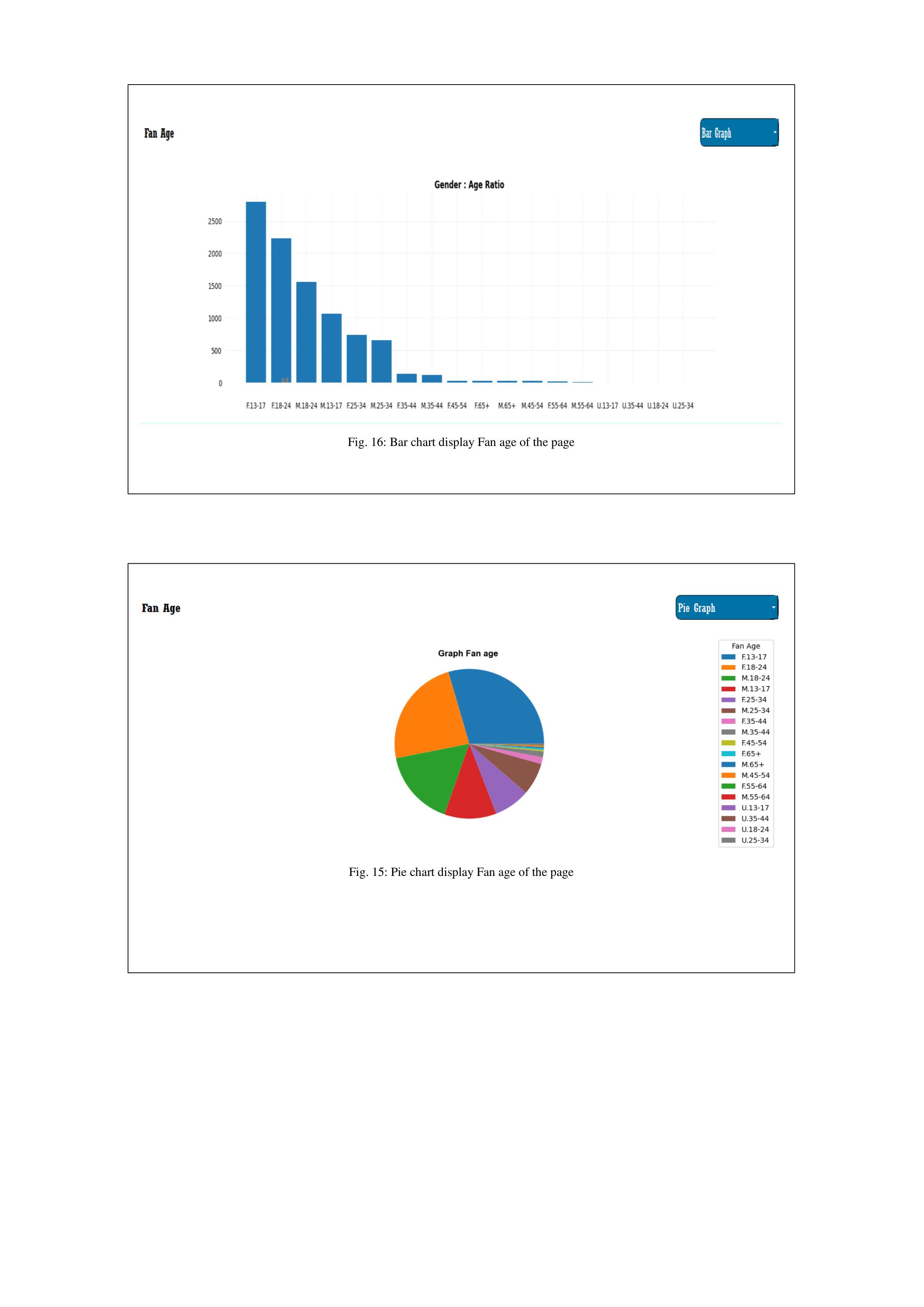
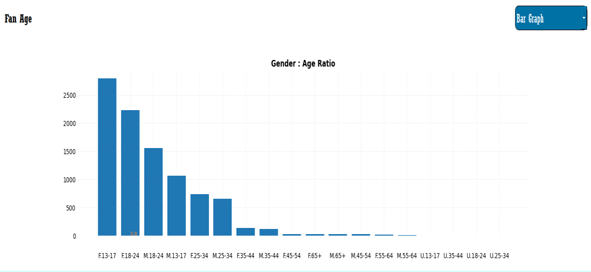
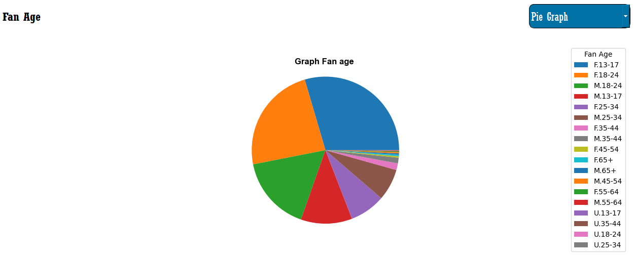
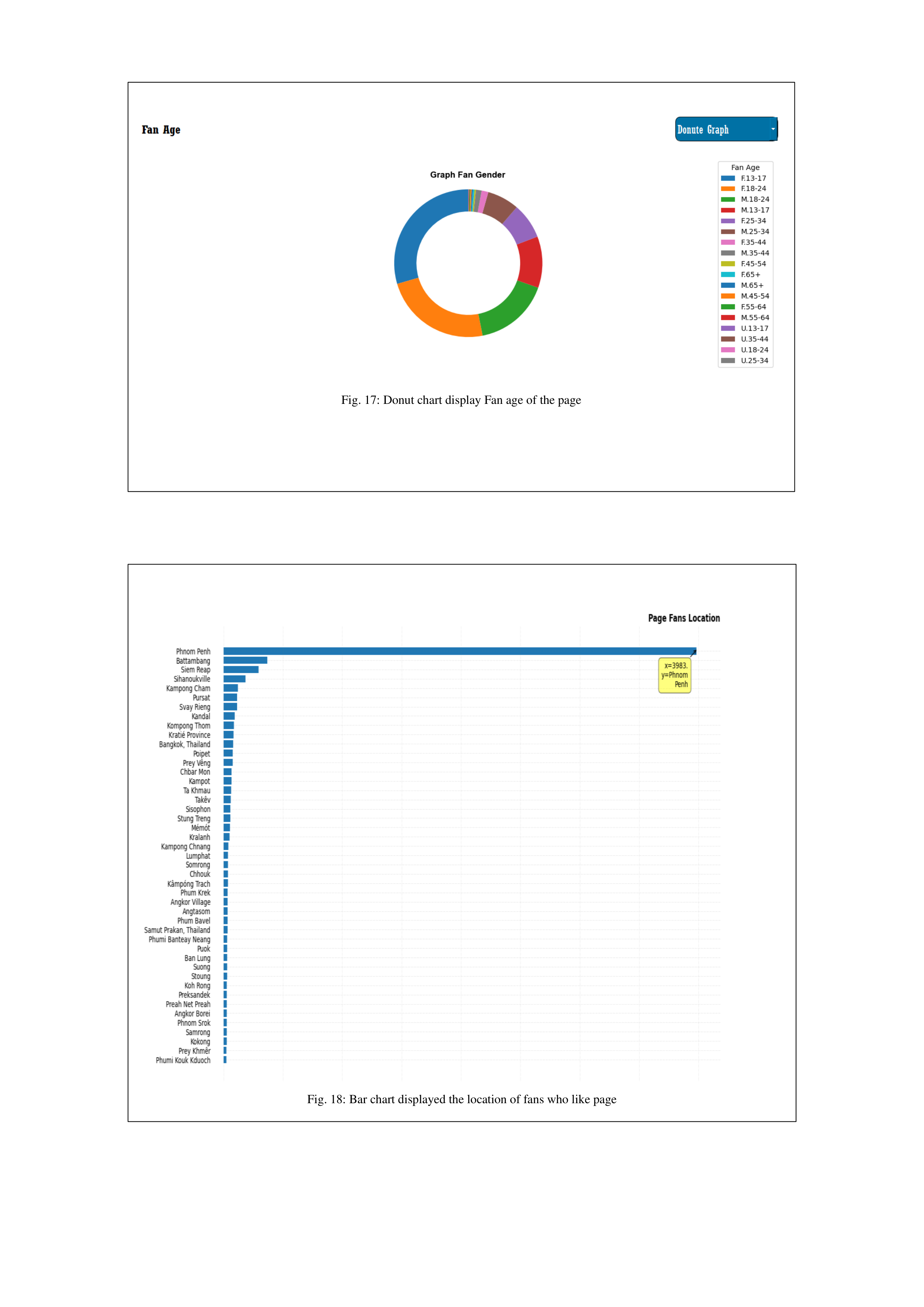
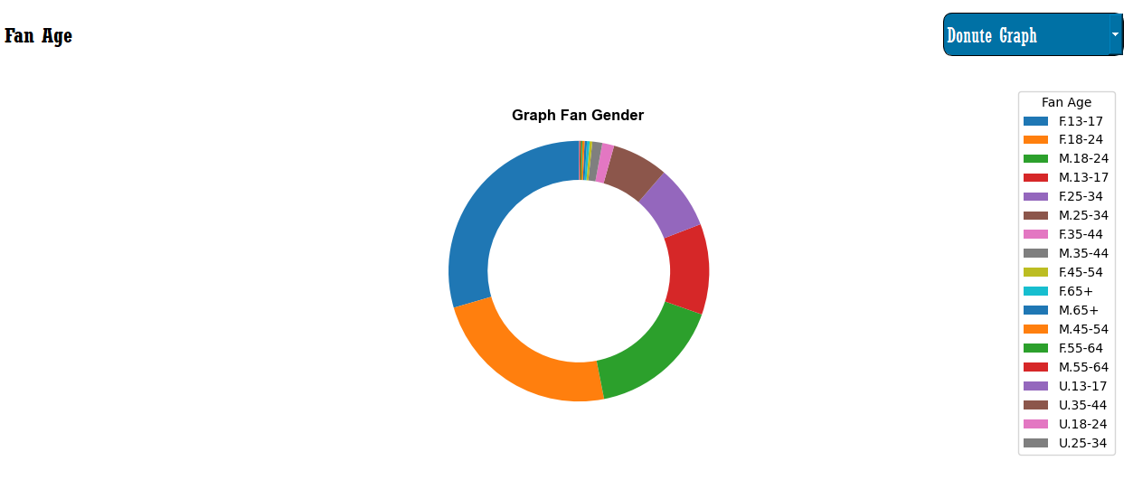
13. Age data of user could visualize this data as a group of age,
and it has three options to choose for visualization as a bar chart
and pie chart as following Fig. 16, Fig. 17 and Fig. 15. The
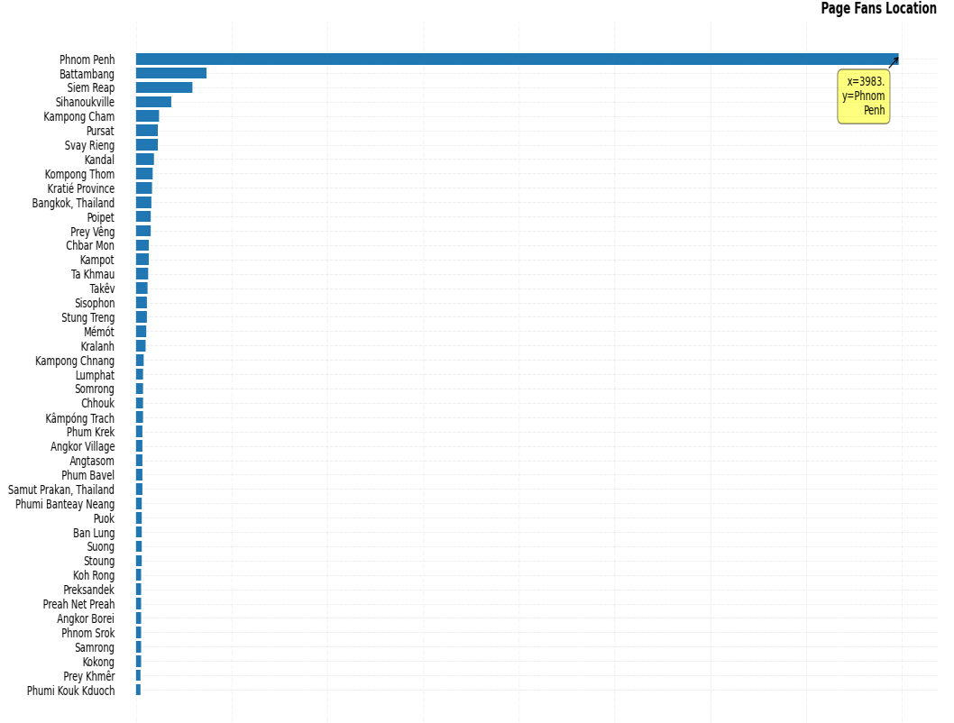
location data could visualize as the bar graph and map as
showing in Fig. 18 and Fig. 19. It can show the data of the page
fan location where user live.
IV.
CONCLUSION
The PageVis application has completed that have the
ability to visualize various data from Facebook pages by
extracting those data from Facebook Graph API. This software
is really effective for the business owner or advertiser
conveniently to understand the target of their customer through
the data extracted as the picture with clear understanding since
it helps encapsulate the data from the complicated data format
converted to the graphic form. It also helps them easy to
generate a daily report for their business.
However, there are some features that will improve the
PageVis for more effectively tools that include more potential
methods following:
•
Extend more metric to visualization in this application
•
Will be available to generate after visualization report
•
Integrate with category content using a machine
learning algorithm.
A
CKNOWLEDGEMENT
I would like to express my gratitude thank to my
Supervisor Kor Sokchea who is a professor at the Royal
University of Phnom Penh for introducing this project to me
and supervising the guide of this project and serving as an editor
for this project.
REFERENCE
[1]
A. Katal, M. Wazid and R. H. Goudar. (2013) "Big data:
Issues, challenges, tools, and Good Practices," 2013 Sixth
International Conference on Contemporary Computing
(IC3). pp. 404-409,
[2]
Kim, S., Jeong, S., An, S. U., Yoo, J. S., Han, S. M., Yeon,
H., ... & Jang, Y. (2015, October). Big data visual
analytics system for disease pattern analysis. In
Proceedings of the 2015 International Conference on Big
Data Applications and Services (pp. 175-179).
[3]
Resnyansky L.( 2019). “Conceptual frameworks for
social and cultural big data analytics: answering the
epistemological challenge”.
Big Data Soc
. 6(1).
[4]
Wang L, Wang G, Alexander CA. (2015). “Big data and
visualization: methods, challenges and technology
progress”.
Digit. Technol
.1 (1):33–38.
[5]
Stojanovski, D., Dimitrovski, I., & Madjarov, G. (2014).
Tweetviz: Twitter data visualization. Proceedings of the
data mining and data warehouses.
[6]
Al-Saqaf, W. (2016). Mecodify: a tool for big data
analysis & visualization with twitter as a case study.
Stockholm University, 1-15.
[7]
Sechelea, A., Do Huu, T., Zimos, E., & Deligiannis, N.
(2016, May). Twitter data clustering and visualization. In
2016
23rd
international
conference
on
telecommunications (ICT) (pp. 1-5). IEEE.
[8]
Gandhi, P., & Pruthi, J. (2020). Data visualization
techniques: traditional data to big data. Data Visualization:
Trends
and
Challenges
Toward
Multidisciplinary
Perception, 53-74.
[9]
Ali, S. M., Gupta, N., Nayak, G. K., & Lenka, R. K. (2016,
December). Big data visualization: Tools and challenges.
In 2016 2nd International conference on contemporary
computing and informatics (IC3I) (pp. 656-660). IEEE.
[10]
Facebook Users, Stats, Data & Trends. Retrieved from
July 20, 2022 from https://datareportal.com/essential-
facebook-stats
[11]
Facebook Graph API. Retrieved June 1, 2022, from
https://developers.facebook.com/docs/graph-api/

Fig. 4: Line graph display data Fan views in 30 days


Fig. 6: Area graph display data Fan views in 30 days
Fig. 5: Line graph display data New Fans like page and unlike in 30 days


Fig. 8: area chart display data new like and unlike in 30 day
Fig. 7: Area chart display Page Impression in 30 days


Fig. 9: Line graph display Page Impression in 30 days
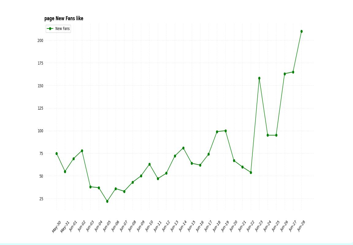
Fig. 10: Line Graph display new Fan like page in 30 days


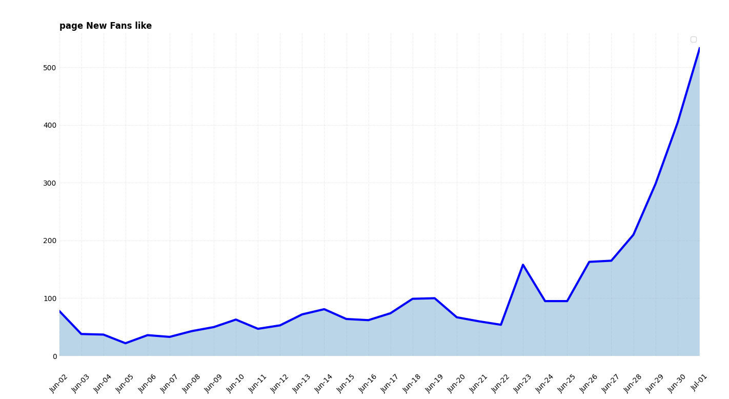
Fig. 12: Area chart display new Fan like page in 30 days
Fig. 11: Pie chart display gender data of page fan


Fig. 13: Donut chart display gender data of page fan
Fig. 14: Bar chart display gender data of page fan


Fig. 16: Bar chart display Fan age of the page
Fig. 15: Pie chart display Fan age of the page


Fig. 17: Donut chart display Fan age of the page
Fig. 18: Bar chart displayed the location of fans who like page

Fig. 19: Map displayed the location of fans who like page